Tuesday, 2 October 2012

Unit 7: Narrative - Studio Blog Design

Hello Everyone,

The studio blog design was a labour of love for us all purely because we were stuck with our studio name originally. Reaching a compromise we settled on Smoke Stack Studios, in my haste to get things going i worked on the banner image and the template design for the blog followed. Despite a few issues we agreed to stick with my original design, it was mainly because by then it fit in with everything and to adjust colours now would have meant an entire redesign of the blog... at this point we just wanted to get cracking with the work.
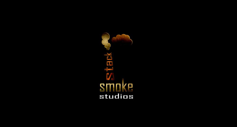

The image above is my first draft of the logo I wanted the text to convey something the text also felt perfect for studio I just scrunched it up. The stack took rasterising as I wanted to use the perspective transform tool. The clouds just came into there own and the texture over the top felt perfect giving it a bit of a old/worn look. It just felt simple but effective to me from minute one to my surprise it didn't take long at all.

The design I made was originally just a place holder until we had a decent alternative but in the end the first design made the most sense to us. The rusted metal background (shown above) was a later addition but once it was in I thought it really made the logo punch from the deep and dark. I love rust and grunge textures and if I can find a way of incorporating anything like that I do so, in this case industrial just felt ideal for this logo.

Having realised this design I decided to remove half for our banner I didn't like the logo being in the middle it felt like a side winder. Of course once i put it to the side I had no idea what could fill the right side. This bit was the only thing that felt a little out of place for me because I don't even think they were considering radioactivity back then so for me that's where the banner falls a little short. I might revisit this later down the road.
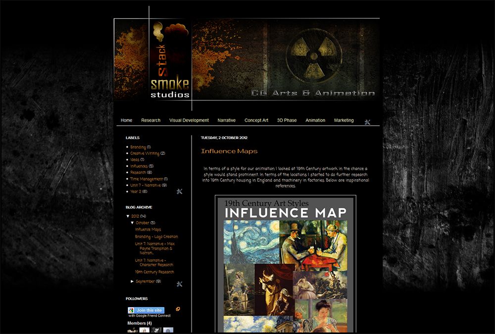

As you can see the design (above) just works on the page especially when you consider the rustic background which originally had colour but for me the main body of the blog stuck out more when it was behind a grey scheme. The blog colours work well with the design for the logo and no matter what I view it in the design works (including IPAD & IPHONE).

The last thing I created regarding the blog was a small uncomplicated version for documents such as scripts and research books. I figured you just want to see the logo there with no real complication. Originally I was going to keep the black background but I liked the text to work on its own in this instance (shown below).
Well that concludes this little post and I hope that the next few weeks go well for smoke stack studios. If you still don't know where are blog is and would like to visit we are at:


Take it easy people,

xXStItChXx
Unit 7: Narrative - Introduction to Mudbox Weeks 1 & 2

Hello Everyone,

I have been working on our Studio blog most of last week hence why the lack of updates on here, don't worry though I haven't forgotten my place... Our initial modelling introduction into Mud box felt like a lecture from Z101 purely because I couldn't help but notice the similarities between ZBrush and Mud box. The one big exception I noticed was that the Ctrl key did not mask anything instead it did the opposite effect of a brush that you are using (i.e. if you are bloating geometry it will subtract it).

What did impress me was the layering system where you can add detail above your model and dial it back should you need to or merge layers to reach further depths. The subdivide option is also present in Mud box with Shift + D adding further poly's to your geometry.


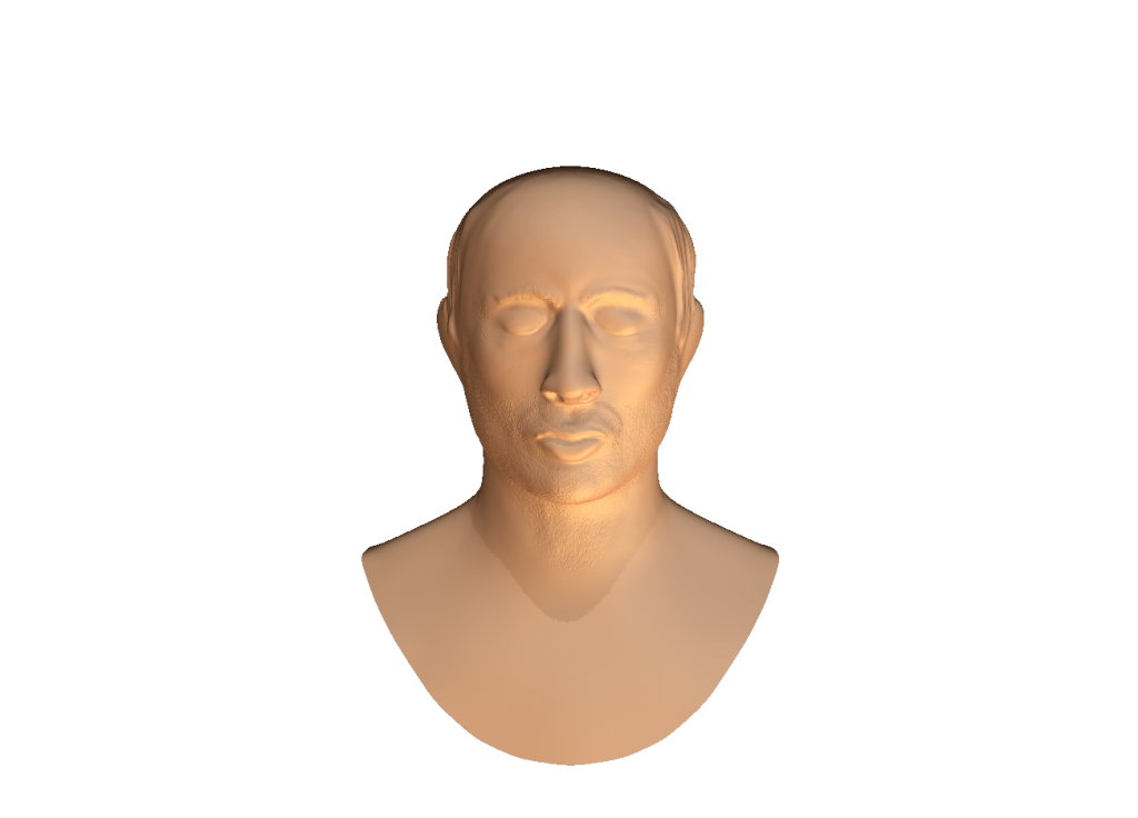
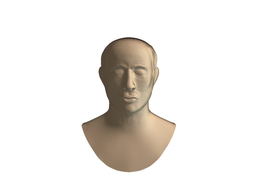
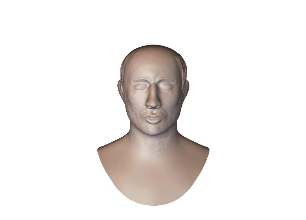
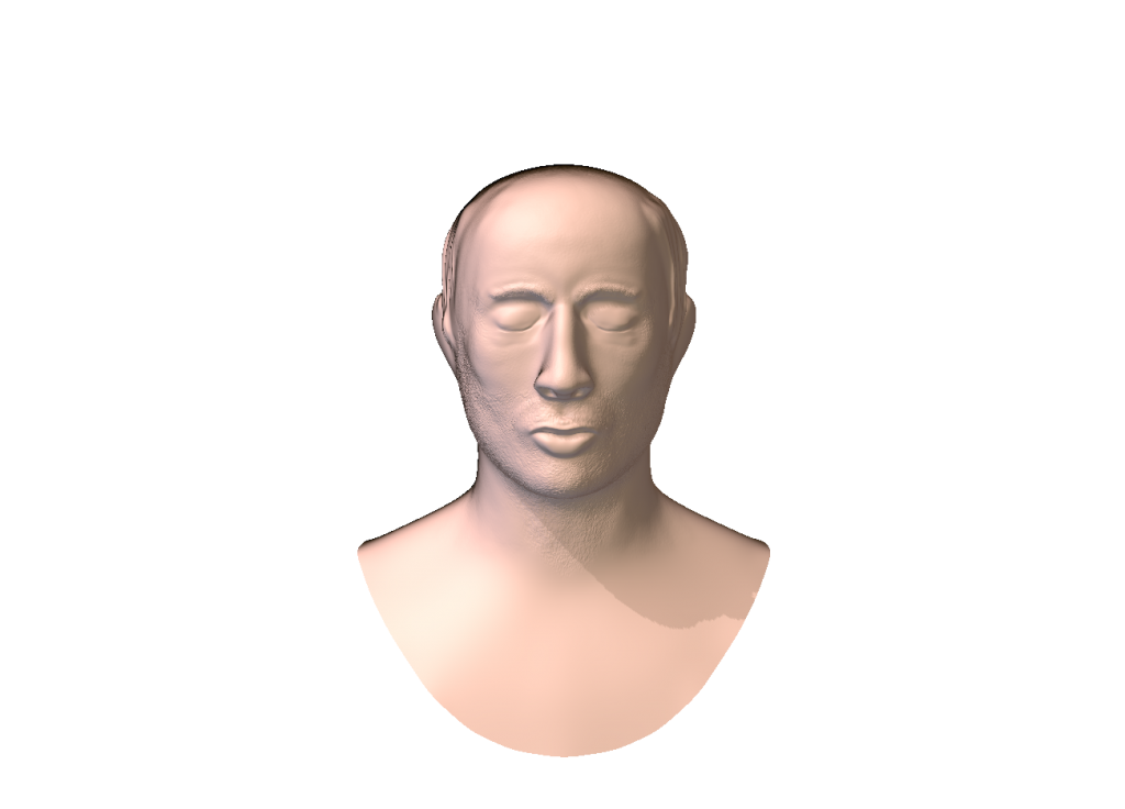
As you can see above the man is a little weird looking, this was our week one model just playing with the basic sculpting tools. There are many good things about Mud box but where it let me down was with the Move tool which is so blatant that it rips down any and all geometry without considering the outside poly's. So instead of a subtle move you get a giant ripping leap.

Next came week 2 which I got more to grips with the detailing side of things this came with me trying stamps (called Alphas in Zbrush) sculpting detail into the skins of our mesh and shaping the face how we'd like. I made my priority stubble because it was something I've always been curious about.


For the last few minutes I found myself playing with the Lighting and Render settings which was a bit of a treat as ZBrush has no backroundless PNG format. This was quite a fun experience testing different materials and lighting methods.

I can see how nice it is to work in and I'm sure there are ways of Mud box being as capable as Zbrush if you are smart about it. I personally prefer Zbrush still but now that I know what Mud box does I will certainly consider it for my organic needs in the near future... It has a few nice bells and whistles.

Anyway I think that concludes this little post regarding our Mud box lessons so far, I probably didn't have to post this but I figured keep the processes up and the mind engaged. It can't hurt me to do this in the long run.

I Hope everyone is having a good time out there.

xXStItChXx