Hello Everyone!
We are nearing our deadline for our Narrative project (closer every day) so I've been biding my time a little here. I will see about getting a link to our group blog put on my personal page (not sure how I do that yet). Alas we have to juggle a few things here, among those is an essay and lots and lots of drawing I'd just like to stake that I'm doing my best so I wont make excuses here... because I don't think I could change circumstances even though I really want to...
Anyway I wont bore with much more piffle, this week we had Justin for more character design exploits (something I have come to fear but also Love) there's nothing like talking about characters with a person who loves characters. I know this personally I work with one quite often and its nice to get a vibe when you are talking about something fictional.
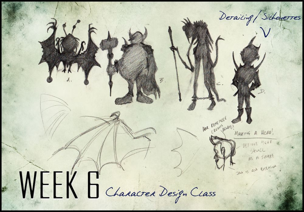
We were looking at detailing particularly with Silhouette, the silhouette being used as the basic character building block to create a visually attractive and workable character/pose. This was very valid to me - as Justin said some of my poses just don't jump from the page and the ones that do aren't really for my character in particular. He has advised me to step away from the sketch book and just throw lines up a page with freedom and confidence (this should be interesting - gulp)... He said he has confidence in me so here's hoping I don't disappoint....
Anyway onto the images I know you are here to see...
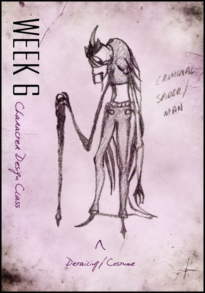
I only got round to 4 Silhouettes I was doing a tonne of tweaking before Justin moved on to some very important information for a Character head. I kept the sketch I made on the page but it was basically to say that the base of the head is a sphere the chin is the extension. The skull basically creates an L shape from the top of the head down the ear so look out for that. Information on hair and the crown was also invaluable it always going back to a root (I did this automatically but I never noticed why lol). Anyway from the silhouettes above I chose C to draw a costume/detail on...
I put this up basically because it was very valid to colour choices when we come to identifying our character. I had no idea colour had so much meaning but Justin showed us a number of images demonstrating the use of colour. The chart is above, some key highlights stem from obvious evil red/black themes while the green is contributed to sickness, etc, etc. It was very valuable to learn I don't mind saying... I will have to consider these very carefully with my characters mainly because my main character Evaline has potential to be evil so maybe blue attire to create distance...
The dude above is the silhouette I chose to detail, originally I wanted to do something very scary but it actually ended up becoming quite tame... Mind you I found myself chuckling when I wrote his description on the page - "Criminal Spider Man". I should have drawn him bigger really... it was quite difficult to get in there and draw further detail... This is making me consider Justin's advice to be even more invaluable noticing myself that poses I draw tend not to leap from the page and I really do want that to be shown in my final designs for my characters....
Well I think that's it for this week of Character design class I will get cracking on some pretty awesome sketches on the weekend. Going to buy a huge sketchbook today that I can place on my easel just to throw lines up. I want to be prepared for next week, hopefully I will get time to put some up on Photoshop and express myself more accurately.
Catcha Later people!!
Over & Out,
xXStItChXx


No comments:
Post a Comment