Saturday 30 March 2013

Unit 9: Adaptation - Stage 1 Concept "Day" Car

Hello Everyone,

Another car update this time in the ways of the "Day" car which is the 1933 Chrysler Imperial Roadster a very rare car - perfect to make an example of. How am I going to make an example of this car you ask? Well I will tell you! It was established when my driver's "Day" job counterpart was considered I didn't want a boring convention where your mission is just to drive a nice car. Oh no not me, the day mission is - you are given a rare car to which your boss instructs Driver to "put on a show" by performing 2 collision stunts with it. The first is an aerial collision and the second is a collision into a wall going a set speed. Ouch indeed.

It is therefore the mission of this here artist, yours truly (Stitch) to figure out not only how to draw this machine (which I wont lie was a nightmare - cars are not my bag), but how to cause it to look damaged which comes with defying perspective (also quite hard). Of course these are still only primitive studies so I didn't get into the smashing or breaking of elements which no doubt does come with car damage. Instead I just angled things bizarrely and did more or less everything my gut told me not to. I created a few pristine versions of the car but for my piece of mind some altered details in the final renditions.

These were quite interesting to make so I will enjoy expanding more detail in stage 2.

The initial roughs came slightly easier for this machine in the later stages but I had to adjust my perspective mistakes from the earlier models. I also wanted to examine the side and front as they create the 3 dimensional version. I had a few quick play tests with that. However I spent most of my time in the 3 quarter trying to hatch the design from vanishing points. I spent a day playing with cars and like the "Night" the image above shows the best ones. As I said though cars really are not me but hey I gave it a go I guess I got carried away with my Driver which gave these less time to flourish oh well...

Next I started looking into car smashing sadly I could not find one of this particular car but the principles can be applied to my car. More notably look at the swaying bumper the lights are therefore out of whack because the front is deformed. I only wanted to focus on the components, not so much the texture as of yet as that falls under detail in "Stage 2". I moved on to the final sketch but decided not to add the off kilter details until I had the facility to make versions of the car. This way it was just more simple to adjust things from the "right" to the "wrong". A smashed car looks wrong - mainly because its components are out of place.

The variations of the car I created actually fell into two categories "New" and "Smashed" for obvious reasons. The top line are the cars primitive details slightly altered, the bottom line are the cars details altered but also knocked out of alignment. From these I am quite fond of the far end - "Alt 2 & Alt 5". Like I said in my last post regarding the "Night" car, the details are best noticed when they are severely exaggerated. Anyway the smash tests were my way of understanding how the key details of the car (Lights, Bumper, etc) would distort when having impacted a wall and another car (Drivers Mission).

Last but not least I did another little animation to show the components of the car and then how they distort between the versions. As I said this was just my way of exploring the proportions of the car like I did with Driver in his stage 1 and precisely like I did with the "Night" car. The only real difference is I added a construction stage which I thought was quite cool. These should set me at a nice foundation for stage 2 when I get into details and color to make my car unique. I of course will be taking into consideration the elements which I am distorting to make my car that little bit stylized.

I could have done things differently for this stage but really there was not a tonne of exploration to do mainly because the details altered were to be kept minute. The car still has to look like the car and therefore the original imagery is still quite accurate. I just have to make it mine with a few little alterations which could come from the bumper, the wheels or the lights. What makes the Day car charming could be that it is smashed and what makes the Night car sneaky is that it is rusted and old. Who knows they are just more details to play with for the incomming stage 2 so be on the look out for those posts in the next day or so.

Anyway I'm done talking everyone's ears off,

Take it easy!
xXStItChXx

Wednesday 27 March 2013

Unit 9: Adaptation - Stage 1 Concept "Night" Car

Hello Everyone,

This is the first of many Car updates which have been delayed but I guess at least they are starting to materialize now. I am a little dissapointed there wasn't time for more alterations of the cars proportionally but it's one of those things I didn't prepare for when utilizing my time. Still at least there are 6 variants of the car to show that I was thinking about "other" options... not just the set standard design. I also did not know how far to push the exaggerated features. Doing it too little will make it virtually un-noticable you only really notice changes when you push the boat out to severely differentiate it from the original.

From my discussions with Alan we discussed exaggerating the features slightly which I was more then happy to do. Of course when applying it I realized it didn't make a massive difference unless I severely altered them. If anybody reading this post thinks one version is better then the other please let me know so I can be more selective nearer the time (like the heads). I will be doin this for the day car and dare I say it with some of the environment stuff I will be playing with shortly. I am aiming to have the stage 1's of these done today even if I lose sleep, fallen even further behind due to a few issues at home.... oh well.

The Stage 1 Development for the "Night Car" is below... Enjoy!

My initial roughs were mostly wrong to start with, I was having a job understanding the shapes that built the vehicle. I knew it was boxy which I am glad to say is the component I kept getting right, the curves were the difficult thing to place. When I understood it a little more I started stretching and squashing some of the features - this was mostly inspired by the Wacky Races cars, I have no idea why I thought that would work here but I thought I'd give it a shot. Also you probably cannot see it well but Sammy drew a robot on my page during the Maya class so thank you again for that Sammy....grrrrr.

Next I focused particularly on reference imagery just to get the details as accurate as possible, the reference image I took was perfect for an old beaten 1929 sedan. The real trick was using perspective lines to identify its placement which I haven't done in quite a while. The car was just too big to get accurate without them really, an object as large as a car needs a grid. Once I had my sketch I knew roughly what primitive shapes were used to construct it. The key features I discussed altering with Alan were predominantly the wheels and the lights. Of course in my projections I altered the body too and the front rail.

From the final sketch I Inked and created the Blank original in the top right of the image above. "Alternate 1" was born from me altering the size of the lights and the wheels. "Alternate 2" was from shrinking the lights and stretching the wheels, I also altered the body by squashing it slightly. The roof was also extended in addition to the front Decal of the car. "Alt 3" came from increasing the base of the wheels and the size of the lights, the roof was jumped a little higher as was the front rail. "Alt 4" was created using lots of Skew functions particularly on the lights and the front decal. "Alt 5" was made using lots of squash almost ridding the size of passenger compartment... I am a little torn between the "Original" and "Alt 2" they are the best in my opinion.

Last but not least I created a small animation of the 6 variants of car that materialized from my original. The colored sections on the cars are the parts I altered so people could distinguish the originals features from what was changed. That's only if it wasn't obvious that the car variants looked different from each other. I did a similar thing with my proportion studies for the Driver himself, it took a little longer to get the car ones off the ground. People should not worry for when it comes to color I will be using darker blacks and if I can a little rust as my reference imagery suggests.

With my proportions for this car explored next I plan to get involved with the color choices and maybe arranging some of the details that the car will eventually have (this is stage 2). From there I will do one final image which will be my stage 3 - these will be done for both cars then I will get involved with the turnarounds to finally be where everyone else is at this stage - modelling. I had planned to be further ahead by now but don't worry I know it so I will do what I have to to catch up with everyone else. I had written off Easter anyway so I will have time to do the leg work and return with some time.

Hope everyone is doing good out there!
xXStItChXx

Monday 25 March 2013

Unit 9: Adaptation - Driver Expression Sheets

Hello Everyone,

This weekend gone was mostly about cars but I did have a few moments to sit down and crack out my Drivers expressions. The car stuff is on its way to the blog I have just been getting bits nailed down so I have plenty to show. I have been playing with a number of styles but I will probably be going with Alan's suggestion, just to slightly exaggerate the vehicles so it is clear what they are and from what period. People that know me know that I keep a few things close to my chest for a big unveil so stay calm your day in the sun is coming very very soon :)

In the mean time I will talk a little on my Drivers expression sheets which were a bit of a pig to get together but they are here now. I didn't colour them mainly because I like seeing the line which is slightly liken to my comic book background. The main trial of drawing them was keeping the proportions consistent so the character looked the same. This is a battle I usually struggle with especially when I am contemplating specific poses and emotions. Structure just usually gets pushed to the side till the very last minute but I have got them to where I am happy.

Now lets move on to Drivers expressions.

Now I will begin this post showing the further development post "Finding the front" which gave me what I would consider to be Drivers base shape in line art. I wanted to start here so people can see the journey the face has taken and contrast it with his range of emotion. Of course I will take this moment to say that some of the expressions below are not likely to be used, Driver worried I do not envision cropping up too much, Angry is more likely. Still I thought I would do it for my own curiosity I would say concerned is a more accurate portrayal.

 
Driver Expressions 1 was where I began, I started by just altering Drivers blank stare into a bit more of an emotional one with "Annoyed". It seemed quite easy to transition and I wanted a face on expression in the mix to show variance. "Focused" was more for of an expression for when he is driving (evading police etc). "Threat" was inspired by the film "Drive" when he leans over and points at the girl - I couldn't resist I liked the expression. "Sad" was a less desirable but there are moments where Driver loses someone close to him so it was an emote that had to be there.


Driver Expressions 2 was next, I took this chance to battle the obstacle of the "Side" of his head I knew I would need it for the next step of this little adventure. From the side I turned it slightly to get "Cheeky" possibly my favourite. I then actually rotated things a little more and lowered the brows more throwing in some spiked collar to get "Action". "Business" came from my want to reintroduce the Cigarette but I also loved the dead eye expression shown in most of Drives cover art (in case you haven't seen it - hes walking from his car with a hammer in his hand - emotionless).


Driver expressions 3 were mostly the rejects pile with the exception of "Inquisitive" which took a while to get but I think it does have uncertainty which I like. "Worried" began as a kind of threatening stare but something to lost when I inked it sadly. The "Concerned" face was for Drivers potential love interest should she get hurt but other then that it wouldn't be used. The same deal for "Happy" mainly because they are only used in otherwise "Romantic" situations. Not necessarily the plot for my game but the undertones are in the text so it had to be prepared for.

I did this exercise mainly so I could explore the remit of the Base face which I sketched up the other week. While some of the features on a couple of the faces are questionable I think it's actually worked out great from the original head that I started with. All of these faces automatically give him more personality then the one dimensional hero, I know its not briefed but I really wanted to feel more for him so this part was kind of key for me. I will probably have a play later with the 3D version when I have it just to see if I can recreate any of these in 3D - it would be cool.

Anyway that does it for expression sheets, I only have a couple of other bits to post up regarding "Driver" before I get down to 3D so you may have to wish me luck there.

Take it easy!!

Over & Out,
xXStItChXx

Wednesday 20 March 2013

Unit 9: Adaptation - Finding the "Front"

Hello Everyone,

This week has been a bit of a love hate journey but bar a few minor developments and my night car stage 1 stuff will be ready to show the masses. The cars are going a little slow (as I knew they would) but I should have that sorted by this weekend. Anyway to keep people happy I thought I would create another post which I wasn't going to bother with but it was a bit of a journey so why not. You will have to excuse the title of this post but I couldn't put it any other way because as far as I'm concerned this is not a full profile it is just a part of a profile.

I was going to save all final head developments for the expression sheets post but I thought it would be nice to show how I found my Drivers face. The real trick here was "adapting" - yes I used that word a piece of 3/4 concept art into a flat face. Now sure you could do it with lines and map out the details or do it from sight. Of course me being me, I found another way which I'm sure isn't official but I think it worked here. I'm not going to lie I was sceptical when I was figuring it out but the face that emerged started looking more and more like my driver.

Believe it or not the exploits actually began in 3D.


Well the image above shows 2 images, my final head (slightly changed again to make it dimensional - Alans advise) and a crude naff outline mapping out the essential details. I didn't want to over complicate the look I just wanted something I could use to map his features. I was able to be objective establishing his chin as a strong foreground. The cheek bones supersede the jaw line ever so slightly, the nose is prominent over the eyes and mouth - this detail I adjusted slightly. His combed back hair was just a basic shapes - as I said avoiding all detail at this point.


The next stage in the process had me going into Zbrush and loading up an image plane. The main issue was turning the model to fit it. I rotated my crude face and "adapted" it somewhat into his by crunching the features. As I said at this point my only goal was to get the key features in their correct location. From there I took a face on render and threw it into Photoshop. I then noticed other slight anomalies so I just cut and moved the key features of the face. I would use these as building blocks to construct my front profile, which was somewhat accurate with the 3/4 view.

Next I went back to the root of the design finding what constructed the face I was planning to draw from different angles (and in different expressions eventually). I then added in basic primitives to represent the skull and of course his hairline. I was constantly referring to the 3/4 image at this point because some of the features from the model did not line up despite being adjusted to the image. Still it  wasn't much of a stones throw from what would become the final rendition. It just bugged me how sometimes I could not get different sides of the face so I thought further investigation was needed.

Finally (image above) what I had was a somewhat accurate front profile of my Drivers face. Using the primitive shapes I just blocked in facial curves to stop it from being quite so rigid and again adjusted his features to match the 3/4 concept image. As I stated above there was a detail I changed from the main concept image and that was the size of his eyes. I kind of feel that there is more personality in him if his eyes consume more of his face. Other then that everything is the same, the big nose, the small mouth, the strong jaw and the crazy combed back hair.

Well I hope onlookers enjoyed this little journey into yet more head development of the Driver but never the less it is still pertinent to the project. The next stage will undoubtedly be to get onto doing more and more concept for my cars. I do have a number of things to do towards their development but I think things will pickup once I get into the flow of drawing them a personality as opposed to just drawing them. Next week I will be looking to start modelling my Driver so most of my Pre-Prod will end this week including a lot of concept art so be on the lookout for that!

Well I will be back with more very soon!
xXStItChXx

Saturday 16 March 2013

ACT Speedpaint Challenges: Week 2 (6-10)

Hello Everyone!

It is the Stitch back to do a bit of rambling on his blog but don't worry I promise not to disappoint the masses (if there were masses). I have been collecting my speed paintings for this final week of 5 minute etching sessions and here I am placing them up. The only point I will make here is that I have been experimenting with a few different techniques for Week 2, trying to express my imagery in different ways utilizing quite a few different brushes. I have to say I was not aware of some of the weird brushes I have collected over the years but they are quite out there lol.

A lot of this weeks speed paints kind of falls into the graphic design category but let me assure you I did paint these on they were just a variety of alternate brushes. I guess after last week I wanted to express myself a little differently not so much with paint strokes. Of course I do return to the style towards the end, I am a creature of habit where I usually like to attain some level of harmony between the beginning and the end. I feel as though the end of anything is just the start but in reverse, mind you that is more likely just my way of looking at things.

Now lets get down to those final speed paints!


Challenge 6 of the speed paint challenge was quite menacing to start things began to feel a little more sinister not so sad. I don't know I just kind of made wispy shapes to begin with but everything began to feel quite mechanical probably what inspired the cogs a little. Of course when things began to let up a little I felt the need to gradually gradient things from dark to light. Things just began to feel more eased. The final over the top shape was a swirl brush but If I'm honest the entire image felt like an over the top musical sheet, albeit with machinery.


Challenge 7 was much more lively earlier on, I felt like knocking together lots of curves and colours but then I found myself delving into high colours. If I'm honest this entire segment felt on the go constantly. I didn't let that interrupt my sinister grunge however. Things gradually became more gentle at the end which I tried to communicate again through the broadness of the central colour (the blue tube). To be honest though I felt the focus of this musical extract was very loud and broad so it felt completely like a bright colour explosion.


Challenge 8 was my journey back to the land of painterly grunge brushes. Things began to feel a little more relaxed but there seemed to be a certain order expressed by the percussion. I have no idea where it came from but I really felt like I was in a rendition of Steve's consumer related short. The pink colours I don't know, they just felt right... Very bright again which isn't me but we had come a long way from the sad introduction. The worn paper divide made the entire thing feel like it was held together by a thread awaiting some kind of explosion.


Challenge 9 was loud in every which way, the high screech instruments actually set my mind on edge a little I think I listened to this extract the least just because it bugged me. The feelings I had felt in the prior image about it being the calm before the storm were actually correct. I could see myself travelling down some kind of mise en abyme style image where things just kept repeating and getting louder the further I fell. This entire section was like falling back down through all of the paintings I had done this far, it felt like I was returning to the start.


Challenge 10 was back at the sea where I started only now we didn't need the light of the candle in the waves. The sun was emerging, with a nice purple sky. This felt like a correct place to end things, as the music gradually faded gently. Towards the end of the music I could almost hear the crashing waves of this image probably the most I have felt my own internal sound effects lol. I was also glad to be returning to the painterly effect. I was going to return the bottle but It just didn't feel right, the ending just needed to die down with a nice sun rise.

Well, that's all she wrote for the speed paints. I have done 1 a day for 2 5 day weeks for the duration of 5 minutes (as defined by my mums egg timer). I suppose more then anything I wanted to stick to a schedule, those of you that know me know that I love order and a way of doing things. Most of the time its limiting but I have the occasional day when something clicks and everything works out, I guess those days make it all worth it. At least here it was my chance to get into something and drop it again like our speed sketches in life class. I didn't like them but I learnt something.

Hope you all have a good day!
xXStItChXx

Wednesday 13 March 2013

Unit 9: Adaptation - Stage 2 Concept Driver Costume

Hello Everyone,

Sorry for the delay on updates, still been fighting off the food poisoning been having a few on off days but I think I'm finally there now. I was meant to post this up earlier not long after the portraits final for Driver but I guess at least its here now. Anyway this post is fundamentally about the Driver's costume and any resulting development from the basic forms I had explored in previous posts.; I have done a number of costume tests ultimately combining elements from each of the test samples. I wrap it up with a bit of a lighting colour test which didn't work out brilliantly but its a start...

From here I also start the car development from today onwards, this will hopefully be more simple because I was instructed not to derive too far beyond the cars realistic dimensions. This should mean any alterations I make to their base form will be slight. Alan advised me just to make the tires a little bigger or the lights a little more flared etc. The real challenge will come from making them look old and specifically from the day car (it being smashed up). I also have a few poses to knock up just to finalize Driver in his costume fully complete and obviously expression sheets. Then I have his final pose which I will go into detail much like his final portrait.

Anyway lets get onto this post, we will have to see how this goes...
Everyone by now who saw my OGR and if they hadn't any posts before this one would know that I created these basic forms by altering shapes in a primitive skeleton. Form J (image above) was the form I liked from the get go so when I knocked a basic costume around it I made sure to include lots of the details I wanted (the most important being the leather jacket). This form was the first of 3 final forms to which I would combine and adjust to make one very final form. My favourite attributes of this form were the tough upper body contrasted with the small lower body.

The 3 form variants from rough (shown above) were created from the original rough form at the top of this post. Fig 1 was a basic jacket but I felt this looked more like a fleese (something I wear every day) so I was worried that was rubbing off on the final design of the jacket. Fig 2 was more jacket like and I loved the idea of a cut across the jacket. I also removed the laces from Fig 2 just to see how it would look. Fig 3 I shortened the jacket more and dragged some unkempt shirt tapers from under it. This made the costume feel a little more dynamic then it was so I liked this.
The final rendition (Built from sections of the final 3 figs) felt much more correct to me. I didn't like the jacket being too short so I used the base form 2 to get the length correct. I took the shirt tapers from 3 and just laced them in. I also liked the shape of the shoe in Fig 3. I also was not sure about the gloves or not but I felt it would work if they had holes in them. I wanted to remove the thumb from the right glove it might make it modern but I thought I could make it seem as though it was ripped. The pockets also felt more robust and less like a soft fabric much more like leather.


Next I decided to do a few colour variants but I couldn't fall much further then A it even worked with the rough original I drew of the jacket. Then I still was a little worried that A was again more modern, the white shirt felt right. If I was to say another it would probably be E or F. I really thought they kept the feel very drab still the scheme felt right to the time period. The one constant throughout all of these was to keep the number "37" in white on his jacket which is mainly because its written in amateur paint. This was mainly to keep it in toe with the jackets reverse side.


The image above shows the final choice made with some slight lighting test being utilized (B) this is what I mean to talk to Alan about this week. One of my biggest weaknesses is getting the lighting right when I actually start to get into an image. Often it feels as though I am making the light way too dense for the image as opposed to other artists who use a much more subtle palette. I even had this issue on the Drivers portrait but because the face is localized I found it easier to establish the light source. In this case everything feels a bit too lit...

 I will raise my concerns with Alan today and hopefully get to final poses for this guy and begin getting into car mode. I know I have been saying that for a while now but today really is the day I have the cars printing as I speak. The real challenge here will be drawing something which is not organic. I'm usually terrified when I have to start working on anything that doesn't involve flesh probably the same reason that the lighting on clothes is an annoyance to me. Anyway hopefully by the end of this weekend I should have more things underway.

Take it easy people!
xXStItChXx

Sunday 10 March 2013

ACT Speedpaint Challenges: Week 1 (1-5)

Hello Everyone,

I thought I would post these speed paint challenges up, sorry for the delay for their appearance on the blog but I wanted to cluster a few up before actually posting them here. It just felt easier to me to get a few so I could do a decent post. Anyway where was I? Ah yes, my process for these speed paint challenges was to listen to the musical extract posted on the group blog about 5-6 times and then once while throwing shapes and lines on the canvas. I stole my mums egg timer set for a 5 minute duration, at the end of the 5 minutes I stopped and posted the result in the drop box :)

I didn't want to spend too long trying to make things look pretty, this exercise was just about doing what I felt in as quicker time as possible. I knew if I didn't do things fast I'd start thinking about it and then would try to refine areas when this is meant to just be about what the music made me feel. I am pleased to say that It did change every day, so obviously the pieces have been making me feel different as the music changes. It was kind of soothing to just throw stuff on a canvas doing what my arm told me for a change not using my very small brain too much lol.

Anyway the paintings are below, sorry again for their delay.


Speed paint Day 1 (light in a bottle) was my first, the music felt very sombre and I'd know as I spend most of my days listening to sad music lol. The first thing I saw was the waves just rippling in a stormy night. The bottle came towards the 3 minute mark I felt like the tune was following something and the bottle just materialised. The light inside represents something which I kind of hold dear - "finding that light in a sea of darkness", its never an easy thing to do but I think on some level the opening made me feel that way... Quite a bit of food for thought I don't mind saying!


Speed paint Day 2 (Underwater fish tank) was where my mind took me from the first, I listened to the two pieces together to attain some level of continuity. From the bottle the music sent me under the water to the floor, the erratic nature made me think that my computer screen was going to erupt with water which is where the overloaded screen comes from. Still there was something that took me underneath the water, it was like I was carried by a ripple of water or something. Can't be 100% but the tune did gradually sound more chaotic as it went on.


Speed Paint Day 3 (The Space Geyser) was when the fish tank erupted. Still the music did calm down a little here which made me feel like I was in a space scape. The spiral is the Geyser just in case you were wondering but it felt right with the planet shapes to knock up a solar system using a spiral (Fibonacci style). The track continued an erratic natures but towards the end it certainly began calming down a little. The finishing touches of the piece were just afterthoughts as the 5 minute timer ticked past its final few seconds and then bing it was done - Drop boxed!!


Speed Paint Day 4 (The Insane Plaformer) was a mix and mash it felt like the calm before the storm so the first thing I saw was fire gradually rising. The platforms themselves did not come in until we got towards the end as I knew it was building to the big finale. I kept a normal standard brush for this entire speed paint just because I really wanted to have a stab at some little features. I think this is the only piece that I did which came in under time, (2 whole seconds under time). Not much but still it was nice to have that as a little feat of my own haha.


Speed Paint Day 5 (The Flustered Forrest) was my big finale for the end of week #1 the track really felt sinister as I knew it was building to it. I knocked in a rather crude little window from a grunge brush and placed overgrowth everywhere. It just felt very haunted house to me. As the speed of the track rose I imagined leaves falling from the brush almost like an earthquake with leaves. I had thought about colouring the window a slightly different colour but then the buzzer buzzed for my 5 minutes so I left it, now that I look at it its quite bright... My tablet made all of these darker lol.

I have to say I have been terrified of having to do these quick images as I said to Phil before all of this started, I don't do things quickly, I like to refine. Still I don't think I did awful here even though speed really isn't my thing. It was quite nice to a change to beat the punch before my thought machine kicked in. That's the main reason I gave myself the 5 minutes, any longer and I knew I would probably get too into it and try to refine it more then I should. The goal of these exercises is just to capture what the piece made you feel and the best way to do that is quickly.

Anyway, I think that concludes this little post, again apologies for the delay in getting these on the blog I just like to cluster stuff like this up to do a decent post. Its also nice to be able to run them off of each other, I can literally see the journey that I had throughout the song... I don't think I would have noticed if they were far apart or separated by another post lol.

Catcha Later people!!
xXStItChXx

Saturday 9 March 2013

Unit 9: Adaptation - Stage 2 - 3 Concept Final Head

the Hello Everyone,

Thought I would post up my final head developments for my "Driver" character for all those to see. Feedback from our OGR the other day had me committing to a design method - what I prefer to think of as the "painterly" style. This was largely due to my rather inspired Driver cover art which was very loose but held together at its core by detail. Prior to the OGR I was knocking up other images but I didn't really consider any of them "final" more stages of development. I was also instructed to consider an alternate branding method by Phil something I am already looking into.

Well this post will be signifying the very last of head development as I go forward as far as I am concerned after this post the final design choice has been made. 
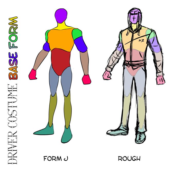
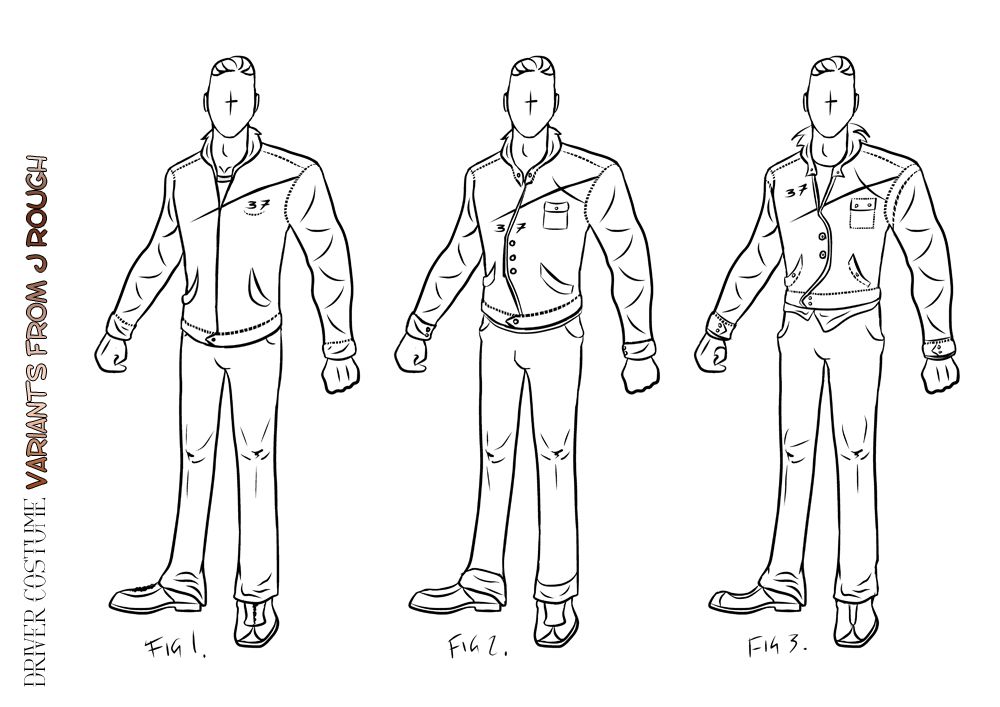
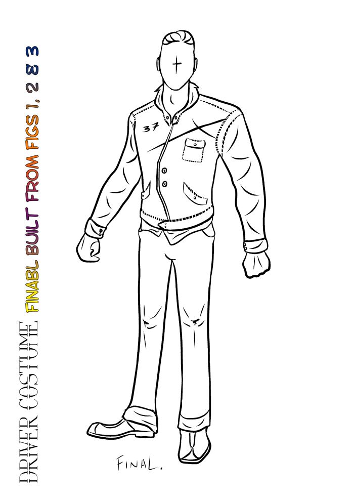
I will come back at some point to look at expression sheets just so I can breathe a little further life into the characters face. This does not mean that Driver has reached stage 3 just yet, I have to do my full posed version and of course my turn around profiles when I get to those so I can begin building him in 3D. 
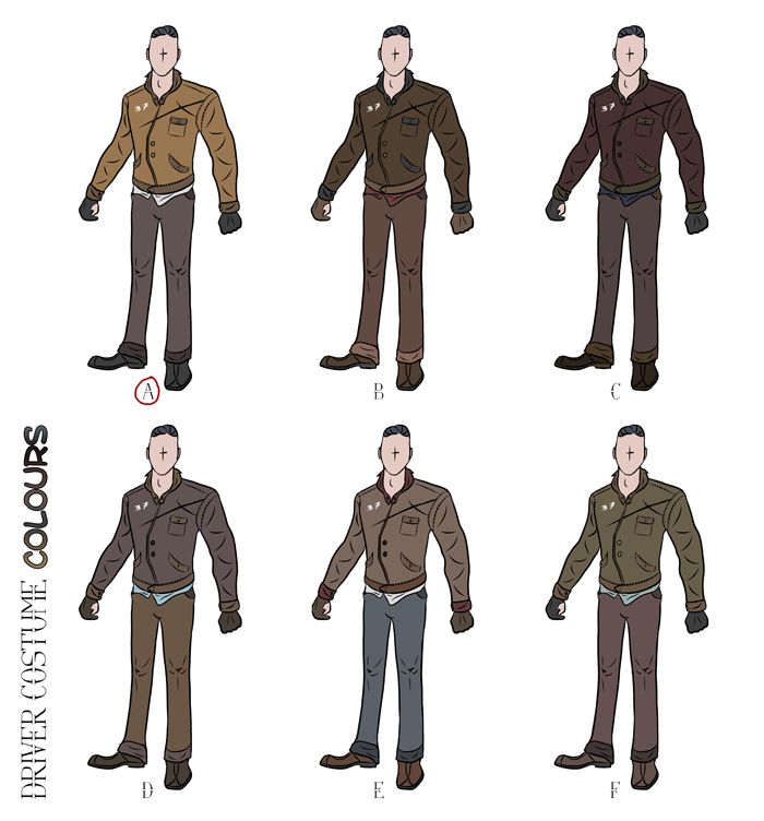
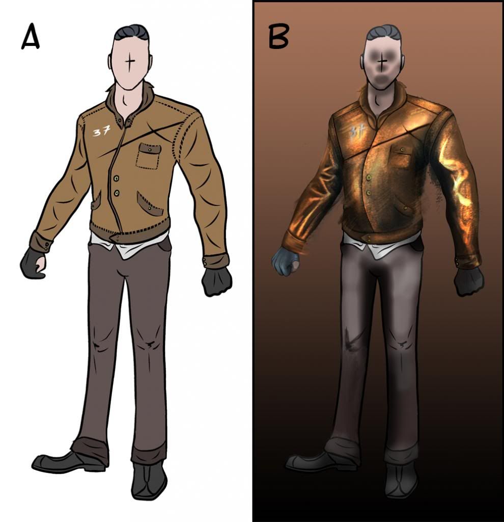
The posed version will be the final costume with the final colour palette, all in all a complete entity.

Lets get down to the final facial and head developments - "Stage 2 - 3".


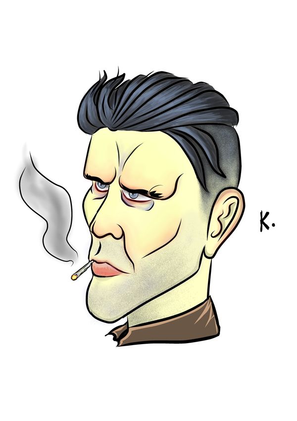
I thought I would kick this post off by showing the final facial concept which I spent all of yesterday knocking up. I wanted to maintain certain unique elements of the face but also bring about a sense of realism. The painterly effect tends to tighten in on detail for specific elements of the face (the eyes, the nose, base of the face, etc.) when it comes to the edge it is to essentially become more rough (the jacket). I also kept the background loose doing lots of active blending using the transfer effect on a custom brush. Believe it or not this entire image was made with a brush I got with a book.
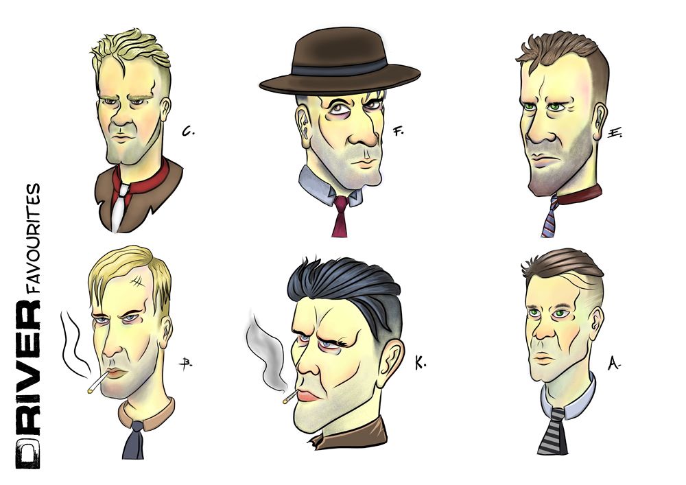
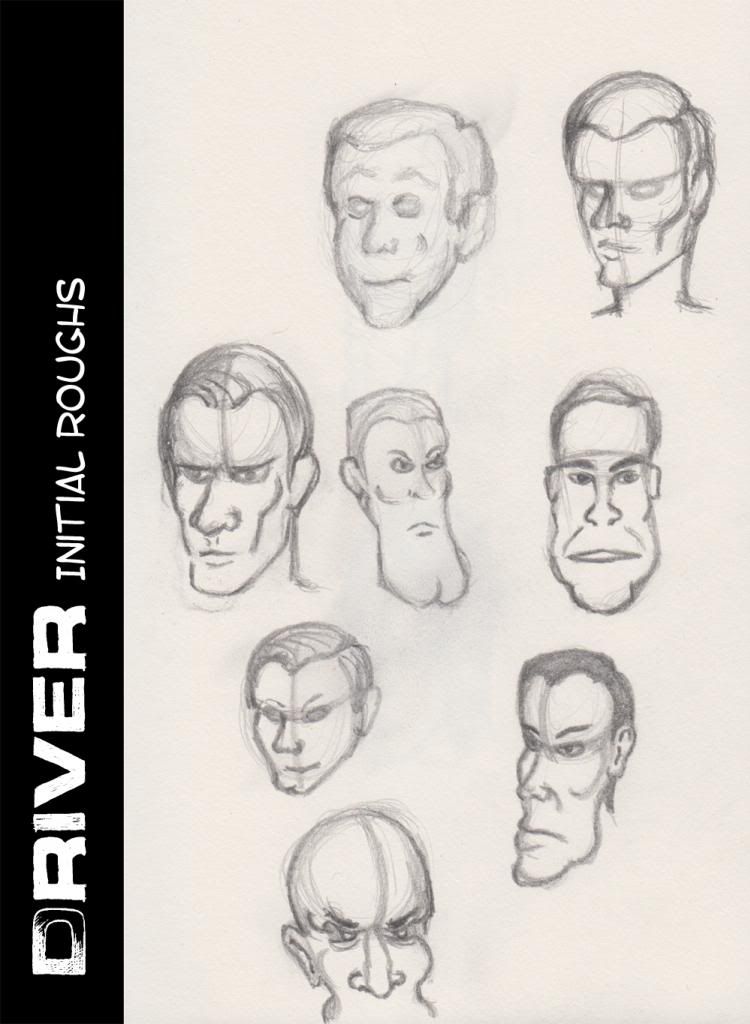
Next those of you that have been following my progress will probably recognise the face I call "Mister K" a face which just felt right to me deep down I couldn't explain it. Other people including my core demographic (Teen) gave this guy their vote fighting off "Mister F" which I have to say I thought would be more popular. Still I am not to stick my nose up at a design strategy when it is more favourable. I have to say I like the journey of this face has taken. As Phil has always said to me "a feeling in your gut is usually your minds way of trying to tell you something".
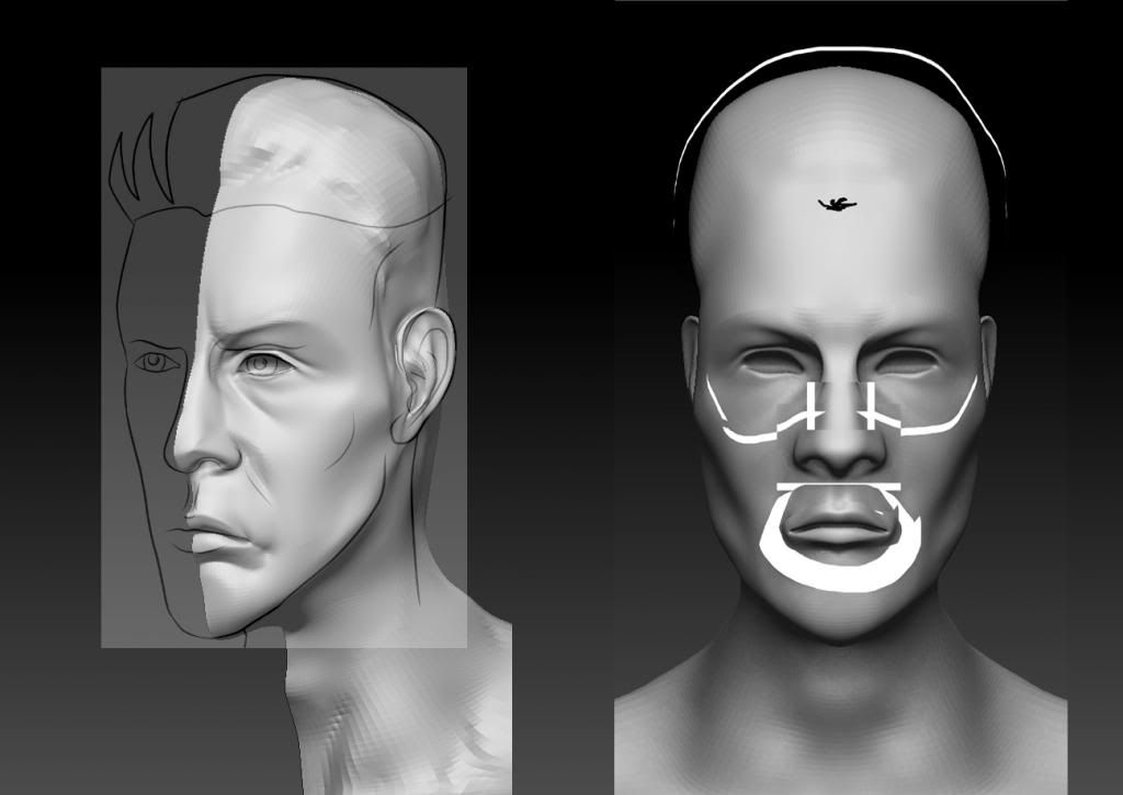
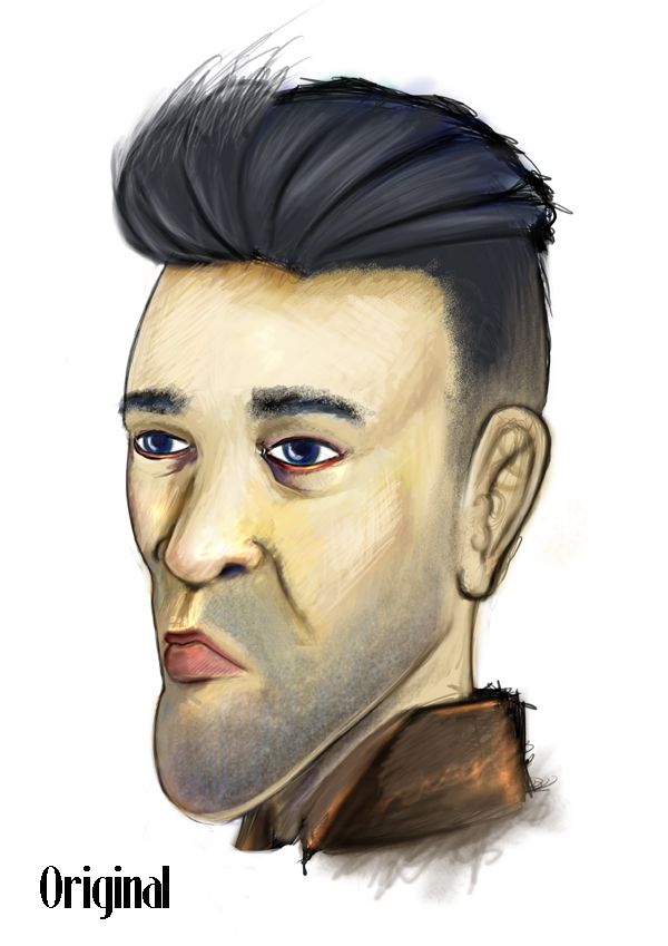

The image above (Original) shows my very first attempt of trying to drag the face into a concept, suffice to say this version creeped me out. I tried so hard to retain the features of the face while trying to adopt a strong colour palette which ended up becoming my downfall. Simply put the face was too bright from the get go, also it kept bothering me that the eyes were never exact opposites. That's currently my biggest Achilles heel, knowing the two sides of the face and how they look in perspective. I am learning but it tends to creep in if I don't pay attention - case in point.

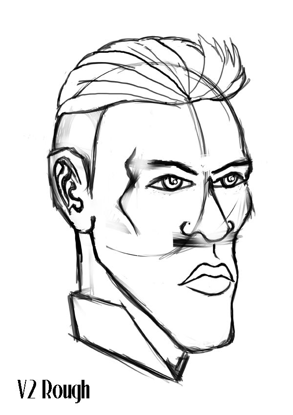
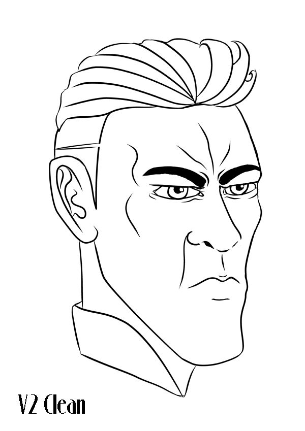
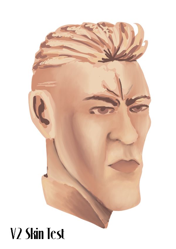
The images above were about as far as I took "Version 2" of Drivers head. I liked it and I found it interesting to begin learning about painting skin tones but the face felt way too Disney. Now Disney is great if its your thing, my style prefers to be the exact opposite, "something in the middle of hell and earth" as I like to think of it. My business partner does the bubbly characters I deal in everything and anything sinister. The fact that the Drive Novel is Noir really made me want to use the darkness I have inside, something which I have always been told to hide, I guess it took these images to make me realise I had to let the beast out. "Thanks but no thanks V2".
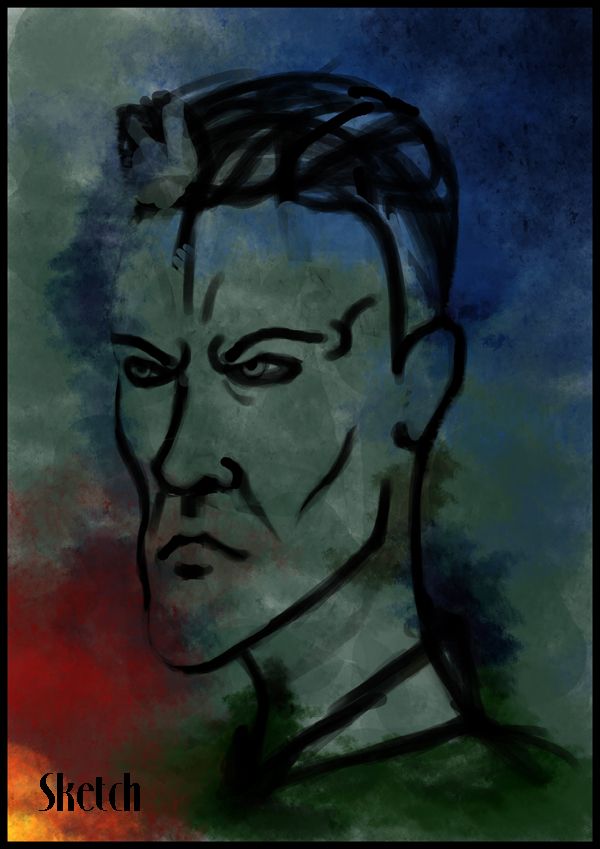
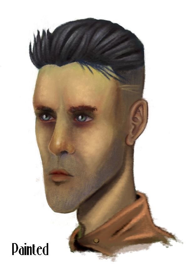
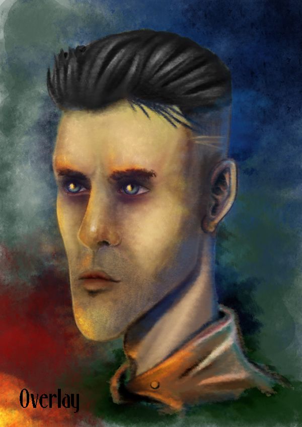

Last but not least 
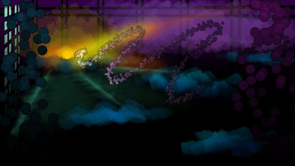
"Version 3" (from Sketch to Paint) a complete burst of colour which I could not help but drape over the background. The sketch faze had Drivers face looking more sinister and a little older something which I felt more in need to lose as I went deeper into painting him. The painted final was to attain detail in the main features and gradually lose it as we depart his face to the jacket. The overlay was my attempt at complementing the colours, I wanted it to look as though an explosion had happened off screen and Driver's watching it marvelling at himself.


To get the final I found myself muting the colours with to make it seem a bit older and a little more sinister, a pale yellow was key. I have to say I am happy with this version, not only is this a completely different style to my usual way of thinking but it feels more refined by not being refined. I love that his key features are still present from the original K image (the strong chin, small eyes, thin lips, the cigarette which made the heads so addictive to draw, and the HAIR!). I think this finishes the thought of the heads pretty well and keeps it to that painterly feel I was advised to keep at the OGR.

Phil's advise also stuck with me from the Interim which said basically that I needed to reconsider my branding so I found a font which I think complements my thought of 1930s. Its more professional for the period but if I find something better before then I will probably look into it. I have learnt quite a few new tricks since starting this Unit, some I never thought I'd be able to do. Weirdly enough they just kind of came to me when I let myself go and let that inner noir monster out. I really have missed him, been spending too long doing things that are not me... he's angry lol.

Anyway that concludes this post, hopefully the next stages for Driver will be in the form of posed concepts with his full costume pulling some pretty cool actions. I have one thing I can check of my list now - heads complete :)

Take it easy!!

Over & Out,
xXStItChXx

Monday 4 March 2013

Unit 9: Adaptation - Stage 2 Concept "Driver" Heads

Hello Everyone,

Been MIA most of the weekend but mainly because I have been trying to get into the head of my "Driver" character, far enough so I have enough development to show for the Interim on Friday. I am glad to say that I have been exploring vastly going with what Alan advised me to do last Thursday "go with what I feel is right". So I sat down and started knocking up facial sketches of "Driver" just trying to find out who I think he is as opposed to what any book says he should or should not be. I still have the body and clothing options to explore for stage 2 but after that I only have to consider a sole stage 3 concept, of course before then I will be exploring my turnarounds for the 3D models.

I have also not forgotten my other stage 1 concepts which are my other cars and some brief environment sketches. I will aim to have the majority of stage one complete by Friday after I have further explored my stage 2 Driver concept pieces. This shouldn't take too long I hope as stage 1 are just mostly sketches and are just me dipping my toe into the idea and quantifying it with a bit of research. This gives the stage 2 process more body and makes stage 3 look unbelievably polished, well it did for the last couple of units anyway :) I also have my target research to turn into a document and of course my character bios these will defiantly be done by Friday for the Crit.

The image above shows my favourite renditions of Drivers head, I even went so far as to do a bit of colour work on them. Originally F was actually my worst one but as I went through refining it, somehow it became one of my favourites. I also like B as it portrays the driver as more of a rough cut renegade. That being said K is also pretty awesome for being cool and yet professional. I wasn't sure that K would work however especially after Alan kind of guiding me down faces that are more 30s then modern. I think F communicates a classic style face more then any, the others are kind of sinister but I suppose A comes close to a more gentle featured Driver...
The Research above I had done last week but I like to rack a few things up before posting them up on here in a relevant post. Alan advised me to ask myself who this 1930s Driver is to employ an actor who I would employ to play them in this video game rendition of "Drive". Alan said I had to find faces that fit within the period so I grabbed a load that I thought could play this Driver. C and E were among the popular choices when I asked people what they thought. Alan thought the hair of D was more perfect so I went to replicating that and stylising it in my refined ideas (shown in Driver Favourites and Driver Others). The key element which I had wrong was the hair in my initial designs.


These were my initial roughs which I found myself playing with after studying a caricature book which I purchased from Amazon. Alan told me to find my way but what was bothering me was the fact that all of the faces I was drawing were not so stylised. I found myself slipping into a generic facial style. This was before my discussion with Alan but suffice to say after exploring this approach I could see where I was going wrong. I found myself even in this stage heavily dependent on the iron jaw, if anything I wanted his face to break iron. This is when I started exploring various head processes to structuring the human male skull.

This head process was originally knocked up in my sketchbook but I wanted to note this for my own understanding should I forget any of the fundamentals. I suppose I wanted to understand why some of my heads fell out of perspective when I drew them and it was largely because I find it hard to define the opposing side of a face mainly because its an issue of perspective. It has always bugged me when sometimes I draw a face and it works and sometimes not. I managed to refine this when I was playing around with my Stage 2 Driver sketches as they came closer and closer to the final designs. This process helped when I realized that the alignment of the brow is key to working out head perspective.

The image above shows my initial head designs which me and Alan both agreed were a little too generic. They just looked like text book images with nothing that really communicated a style to me I just wanted to explore it further. Alan also was not sure of the Tie in A and I almost felt like saying well that's actually a design I took from a 30s fashion catalogue but I managed to bite my tongue haha. This was also the conversation we had about the hair, which in these images is quite frankly too generic and does not have any wispy ness or any sign of grease. Still it was good to rule these images out as design options, they also got me thinking more of how I wanted to stylise Driver.
The image above (Drivers Others) only consists of 4 heads as I built 10 variants which I went through the shading process with. These were 4 others that got put on the side I was kind of gutted that I didn't get to explore D or J but I went with the ones which I preferred. G was my one and only play with a moustache, it being the in thing back then but when I considered my target audience (Teens). I thought the character had to be cool to Teens so I decided against using the moustache for the foreseeable future in my Driver design. Stubble became the key feature in all or most of my designs varying in amount. J was also my play with the old man cap still not sure about this for a prop item.

Tomorrow I will be cracking away on a lot of stage 1 concept but I will touch on my Drivers attire and physique, right now I would just like to get a little background for other elements in my final adaptation project (these being the cars and the environment). I need these covered somewhat so I don't go into the interim with only a character design to show. Still I am glad that I have explored Driver this far and now at least I have the head component somewhat fleshed out a little. I will probably be settling on the F head for the final design. Of course I will discuss my options with Alan and of course listen to any feedback any of you onlookers out there wish to give :)

Anyway, I have a full day tomorrow my graphics tablet is going to be busy of the next week or so just before my descent into the scary Maya and ZBrush territory. Still it will be games meshes so I am aiming for low poly and awesome texture detail.

Hope everyone's doing good!

Take it easy!
xXStItChXx