Wednesday 30 January 2013

Unit 8: Character - Time Management Deadline Complete

Hello Everyone,

Just wrapping up the last Unit with my signature Time Management Deadline Complete Post, It is the exact same as the Unit 7 one as I am using the same post Its. This is just the delayed post as I had an extension for the Character Unit. This officially marks my arrival at the middle point of my degree and to think it only feels like yesterday when I was sweating away at the requirements of Unit 1. I am amazed I actually made it this far, so anything that comes after this I will have certainly proven myself to... well myself. I began really sweating things around Unit 5 when I was sleep deprived, then of course the tragedies that surrounded me on returning for Unit 7 & 8... Its been tough but I think I'm getting back my drive so to speak lol.

The next or should I say current Unit is Adaptation which I will be talking about solely from this point onwards. I have discussed my idea with Alan and he has given me a few nice Ideas to focus my presentation on tomorrow when I go in and briefly present what I will be aiming to achieve with this Unit. So as I mark the closing ceremony for Character I will say that it has been fun and I just hope I didn't do too badly with it.


The fabled task board was set up in parts for this Unit hence why it is weeks 6 -12 just in case people are not aware from previous posts. I am hoping that in the future we have singular briefs, I'm not saying its impossible but doing 2 Units at once was not overly enjoyable... I had the dilemma of not knowing which to prioritize and even though I had an extension It just made things more difficult at the time of the Narrative Unit. I'm thinking for forward planning I may start writing things down more then just using the post its, I can get a little more detail that way...


Yes the image above is me being overly dramatic but as I said to Sammy the other day I try and shake up the time management pictures with me in. I am going to have to think up some new poses to strike in future ones. I found that I have been duplicating the same ones (although recently they have become a little bit more sinister (hence the one above). Oh well. I have since scrubbed the task board and I may see if I can fit all 12 weeks on this board to save myself numerous time management posts I don't think people need to keep reading multiple of these they are just more of a check box exercise so people know that I am on the case and this is the time I had to complete University Units.

Anyway I wont waffle on any longer I have a lot of stuff to archive and then I am right on my presentation for tomorrow. I just hope I don't make a complete mess of everything and get the fundamental points of mine and Alan's discussions. So I will leave this post by saying goodbye Unit 7 & 8 and hello Adaptation (not sure what Unit number it is yet). I also have creative partners for this one so I have to get over to their blogs at some point and do some much needed commenting so they don't attribute me to a lazy git.

Ill see you all in the next post hopefully later today!
xXStItChXx

Unit 7: Narrative - Smoke Stack Stitch's Posts

Hello Everyone,

Not going to waffle on this post just know that this is all of my posts throughout the course of Unit 7 (our group project). Alan advised me to post a glossary of my contributions so I am doing so, just for those that want to see what I contributed exactly.

There is a tag that only I used throughout the unit (Year 2) which people can use to find my posts I will place that below (first), beneath that I will list every other post individually.

xXStItChXx


Click the Image above to go to the tag to my posts.
 
-----------------------------------------------------------
 
Individual Links:
 
Time Management
 
  • Part 1 -
http://smokestackstudios.blogspot.co.uk/2012/09/unit-7-narrative-time-management-part-1.html
  • Part 2 -
http://smokestackstudios.blogspot.co.uk/2012/10/unit-7-8-narrative-character-time.html
  • Complete -
http://smokestackstudios.blogspot.co.uk/2012/12/unit-7-narrative-time-management.html

Research

  • The Industrial Revolution
http://smokestackstudios.blogspot.co.uk/2012/09/unit-7-narrative-industrial-revolution_30.html
  • The Industrial Revolution Visual Influence
http://smokestackstudios.blogspot.co.uk/2012/09/unit-7-narrative-industrial-revolution_1315.html
  • Art Style - Visual Influence
http://smokestackstudios.blogspot.co.uk/2012/09/unit-7-narrative-visual-researchimagine.html
  • Misdirection - Primary Research
http://smokestackstudios.blogspot.co.uk/2012/10/unit-7-narrative-misdirection-or-is-it.html

Ideas/Creative Writing

  • Early Rough Ideas
http://smokestackstudios.blogspot.co.uk/2012/09/unit-7-narrative-rough-ideas-for.html
  • Narrative Step Rundown
http://smokestackstudios.blogspot.co.uk/2012/10/unit-7-narrative-max-payne-transition.html
  • Version 1 Script & Narrative Development
http://smokestackstudios.blogspot.co.uk/2012/10/unit-7-narrative-version-1-script.html
  • Version 2 Script & Narrative Graph
http://smokestackstudios.blogspot.co.uk/2012/10/unit-7-narrative-version-2-script-ashen.html
  • Ashen Bloom Final Script
http://smokestackstudios.blogspot.co.uk/2012/10/unit-7-narrative-final-script-ashen.html

Storyboard & Animatic

  • Storyboard
http://smokestackstudios.blogspot.co.uk/2012/10/unit-7-narrative-ashen-bloom.html
  • Animatic
http://smokestackstudios.blogspot.co.uk/2012/10/unit-7-narrative-ashen-bloom-animatic.html

Concept to Revised 3D Profile & Transition Tests

  • Charles Sketches - Stage 1
http://smokestackstudios.blogspot.co.uk/2012/10/unit-7-narrative-character-sketches_20.html
  • Charles Concept - Stage 2
http://smokestackstudios.blogspot.co.uk/2012/10/unit-7-narrative-character-concept.html
  • Charles Revised 3D Profile
http://smokestackstudios.blogspot.co.uk/2012/10/unit-7-narrative-revised-3d-profiles.html
  • Transition Tests 

http://smokestackstudios.blogspot.co.uk/2012/10/unit-7-narrative-shape-tests-transition.html

Charles Character 3D Model Progress

  • 3D Model Initial to Final Development
http://smokestackstudios.blogspot.co.uk/2012/11/unit-7-narrative-charles-3d-model.html
  • 3D Model Pipeline/UV Layout
http://smokestackstudios.blogspot.co.uk/2012/11/unit-7-narrative-charles-pipelineuv.html
  • Character Rig with Poses
http://smokestackstudios.blogspot.co.uk/2012/12/unit-7-narrative-charles-character-rig.html
  • Character Facial Animation
http://smokestackstudios.blogspot.co.uk/2012/12/unit-7-narrative-charles-facial.html

Pre-Visualisation
 
  • The Final Viz 
http://smokestackstudios.blogspot.co.uk/2012/11/unit-7-narrative-ashen-bloom-final-viz.html
  • The Final Viz Mk2
http://smokestackstudios.blogspot.co.uk/2012/12/unit-7-narrative-ashen-bloom-final-viz.html

Crit Presentation & Disc Artwork

  • Crit Presentation
http://smokestackstudios.blogspot.co.uk/2012/12/unit-7-narrative-crit-presentation.html
  • Disc Artwork:
http://smokestackstudios.blogspot.co.uk/2012/12/unit-7-narrative-dvd-case-display-cd.html

Physical Items/Branding

  • Art of Printing
http://smokestackstudios.blogspot.co.uk/2012/12/unit-7-narrative-art-of-blurb-printing.html
  • Rapid Prototype Charles
http://smokestackstudios.blogspot.co.uk/2012/12/unit-7-narrative-rapid-prototype-charles.html
  • The UV T Shirt
http://smokestackstudios.blogspot.co.uk/2012/12/unit-7-narrative-merchandise-t-shirt.html
  • Ashen Bloom the Book
http://smokestackstudios.blogspot.co.uk/2012/12/unit-7-narrative-ashen-bloom-book.html

-----------------------------------------------------------

30 POSTS TOTAL 
 
-----------------------------------------------------------

Unit 8: Character - "10 Waves" DVD Case, Display & CD Design

Hello Everyone!

I meant to post this up the other day and nearly did until I realised that time was slipping through my fingers, I literally looked at the clock and realised I had about 2 hours to get a presentation together so this kind of got pushed to the side while I prioritised that. Never the less the design aspect was not overlooked in fact I kind of liked the result using the whole classic map vibe to create not only my design doc but all of the case side of it too. I had planned to print them all out and present it as a kind of treasure map but again time constraints so I had to get this going never the less it still looks pretty cool and I did my best so I am pleased to be able to say that.

I kept the design very simple I even created the custom paper here using the grid layout to construct it 2x its original size in my book that makes the entire layout mine haha. The only problem is when I shrank the "X waves" logo image it kind of disappeared into the CD design, a bit annoying but the characters on the bottom created a nice counter balance. Anyway I hope people are having a good time out there I will be with you all very shortly!!

Lets get down to the case design!


As I said above the CD design is cool I'm just a little gutted that the logo disappeared I probably could have corrected it by strengthening the drop shadow but then I feared it would no longer be right for the design as faded lettering is key for an ancient treasure map. I was kind of fighting logic against fantasy again so its hard to say. Still when I placed the characters in things seemed to be popping a lot better and despite it being redundant the text on the edge really makes it feel like an authentic disc (a personal touch of mine).


I love the case Design - I used the Vivaldi font to create a classic hand written style lay out - very me I love my books and hand-written fonts. I don't know if many of you noticed but my design style tries to communicate the theme of the period or situation in documentation or paper. I want to tie as much as I can into the world I am trying to create, it makes it more real for me on a personal level. I don't like making an outfit and slapping it on anything, it needs to mean something to me and if its fiction I have to be involved in that world for it to exist, If I can't go there myself then I don't see the point of it existing. Fantasy has to become reality for me for every idea...
This is the classic case display that I tend to use for all of my layouts, really digging the X marks the spot idea I had for this unit, it really plays a good part. I'm also not sure if anyone noticed but the map in the background is of the coast of France (where my project "X Waves" characters are set), just off the coast of France that is... somewhat lost on the lucid dream. I'm not sure if its that clear in my design document and I've already had one person (you know who you are), comment on my hero saying that she looks evil... She's kind of meant to, she has the potential to be evil, its only her human side that isn't evil. Justin told me to focus the pose on action so I did, but transforming would make her appear evil... that's the point!

I have enjoyed this unit even though it has been a bit more of a chase then a catch up. I am glad its behind me but now I have to be up to speed with adaptation and I will be getting on that ASAP throughout most of today anyway. I hope that everyone is having a good time with their respective tasks, I have been checking peoples blogs out, I am loving the progress, making me feel even more guilty for being behind lol...

Anyway I'll catcha ladle!!!

Over & Out,
xXStItChXx

Unit 8: Character - The Art Of Weta Character Design

Hello Everyone,

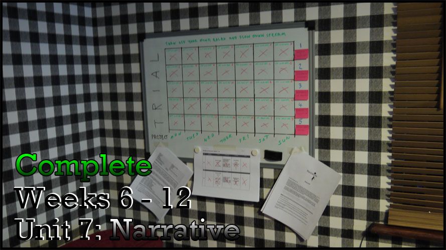
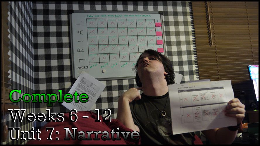
Just firing up the last remaining posts for the last unit not really for grading purposes just because I did the work and it would be a waste if I didn't submit it for the masses to view. I have submitted the unit so whatever will be will be now... its out of my hands. Anyway I will now move on to what this post is actually about if the title was vague to you.

Basically over the Christmas period I bought a 3D artist issue which coined a phrase I was unfamiliar with "Weta Character Design" I later found that "Weta" was a workshop that conceptualised characters. 
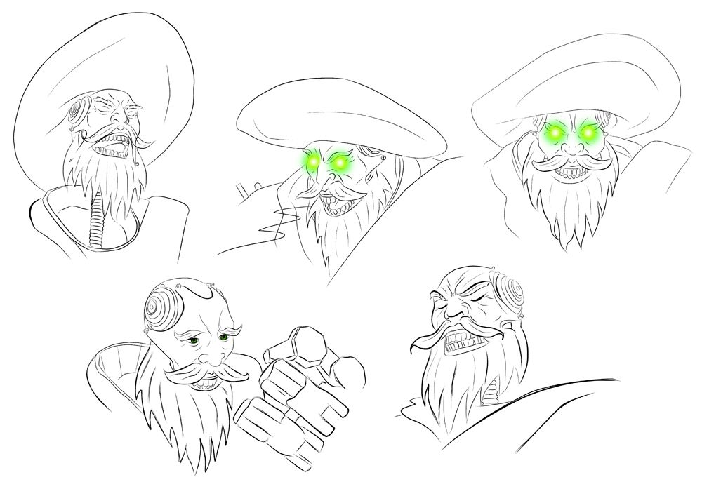
Anyway, the issue delved into quickly exploring ideas in 3D form using ZBrush, ironically it also gave me the final idea for Peter Creeks Face. Originally I was just going to build all of my Characters in 3D and submit that for the Character Unit (but the brief Criteria worried me saying everything had to be drawn so for that reason this step was scrapped).

However, the Weta Design method looked amazing so I set out to make myself some amazing reference... Instead what I ended up making was my first run at various render passes and blending methods in Photoshop. As I was pushed for time I dragged a base mesh from the web and made it blocky using trim dynamic and adaptive brushes from ZBrush's arsenal, (sadly I had no idea I would be using it in a post so the steps of me building him are lost).

This post is about the rendering process I went through once I had built the model, 
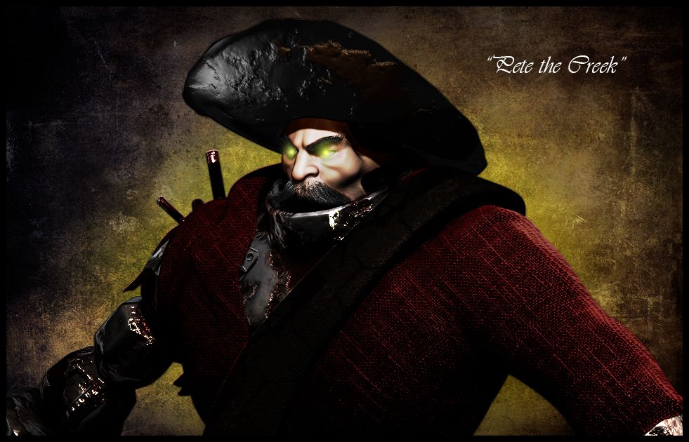
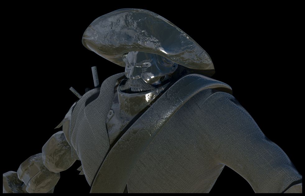
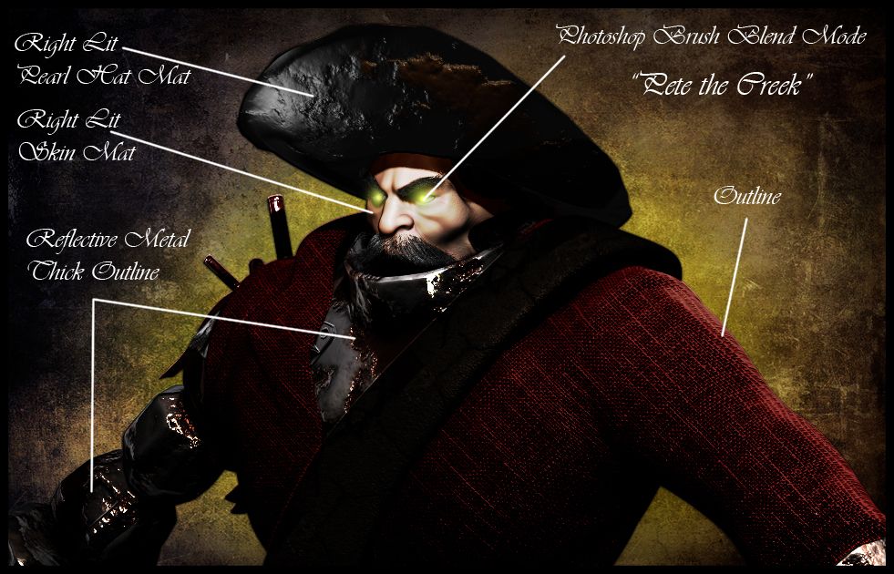
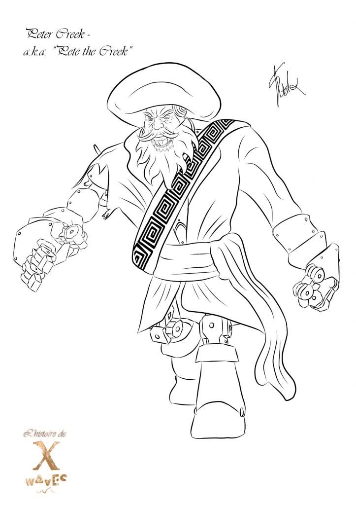
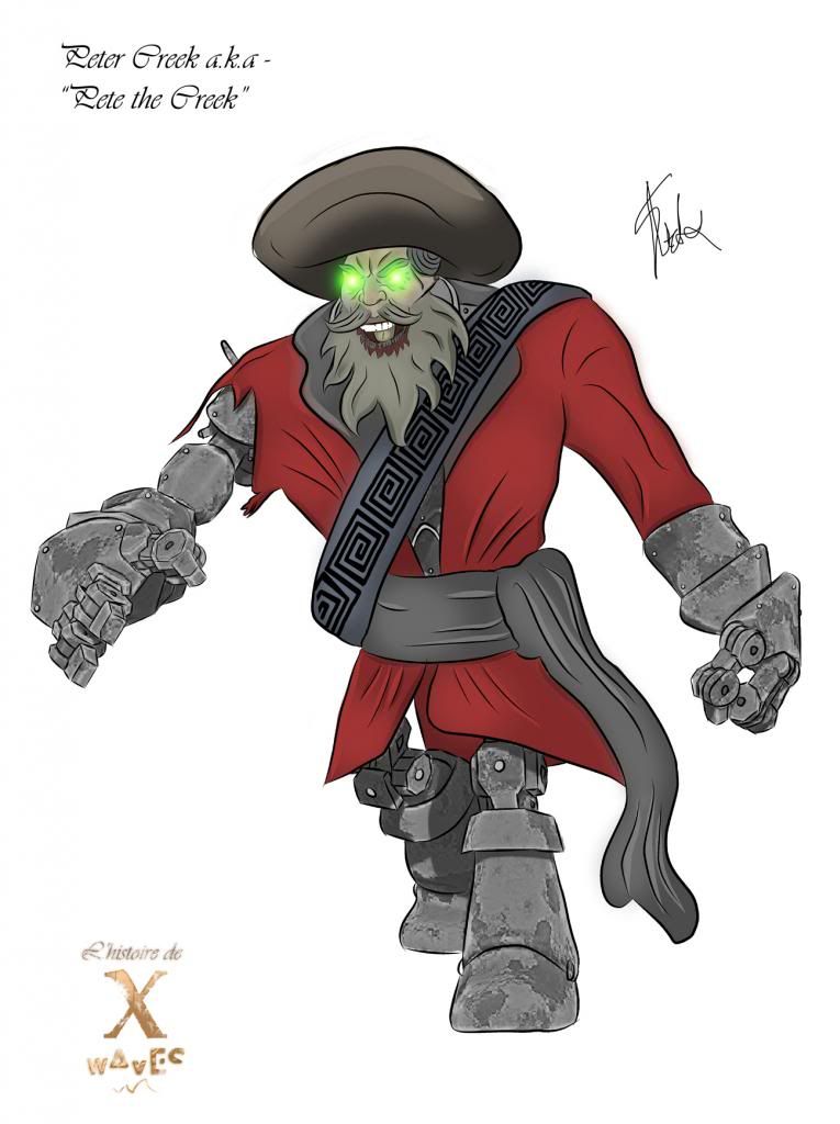
it also shows the end result which I will post first - See below:


As you can see the image I produced looks awesome , it is actually constructed of numerous render passes (including the set menu - AO, ZDepth, Shadow and DIffuse). Masking was the key to the success of the image but again its one of those things you have to understand to use really. I will go talk about this process first before breaking down some of the components that build this image (shown above). The only thing this post will not cover is the quick sculpting process using Zspheres, the use of fibres to create hair, and the use of noise to create basic surface mesh deformation. This post is entirely about the rendering process in ZBrush, nothing more, nothing less... Those of you interested read on, those of you that are not oh well I tried lol.
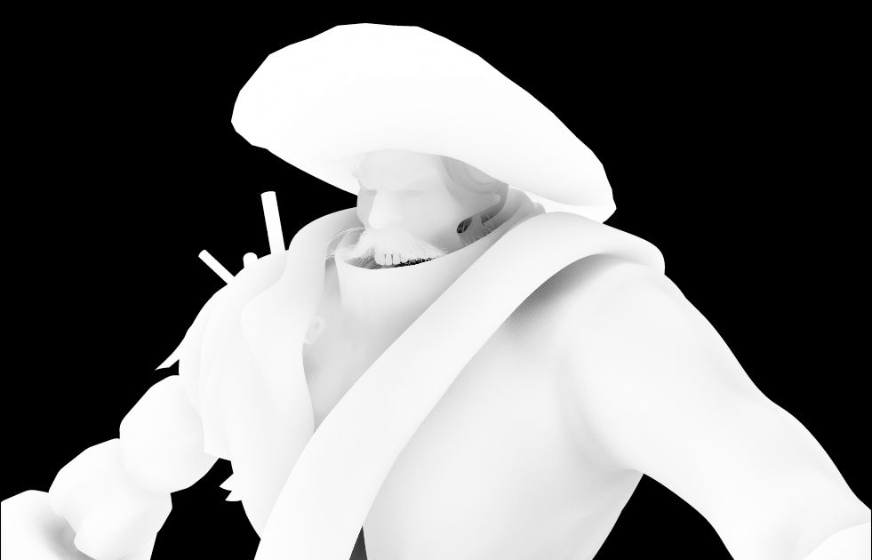

1. MASKING

What I did not realise (when doing the first render) was the importance of the mask in ZBrush, no it doesn't just make the background darker for your character, it allows you to isolate sections of your character so if you want one bit to shine a particular way and another to have a colour but not the rest then you can pinpoint those areas by simply selecting the subtool while having your tools filled wit the diffuse mat. Its essentially a localisation tool allowing you to select the components you want to render out. Another thing about ZBrush is, its renders do not come out background less (a design flaw if you ask me) so you have to remove the background (after pre-setting it to a block colour) to be able to plant your character into a scene... Masking allows you to delete that rather annoying background easier and I suppose its better then nothing...


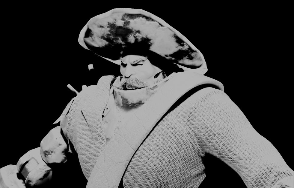
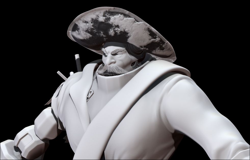
2. BASIC RENDER PASSES

Next comes the Basic passes, now I bet you are asking yourself why are these basic you still have to make them. That is true but the reason I call them basic here is because ZBrush makes them for you automatically in order to use its rendering system. You do not have to go out of your way to make them, hell I didn't. for the ones above. If you go into the BPR render settings in ZBrush you will see the model with the passes above already available so you just click each one and download it. Of course I can only speak of this in a conceptual sense and not a running video... as I understand it rendering a video with passes in ZBrush has a few more things to it but when I know I will post on here...

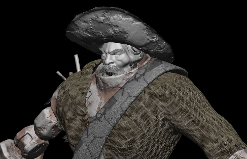
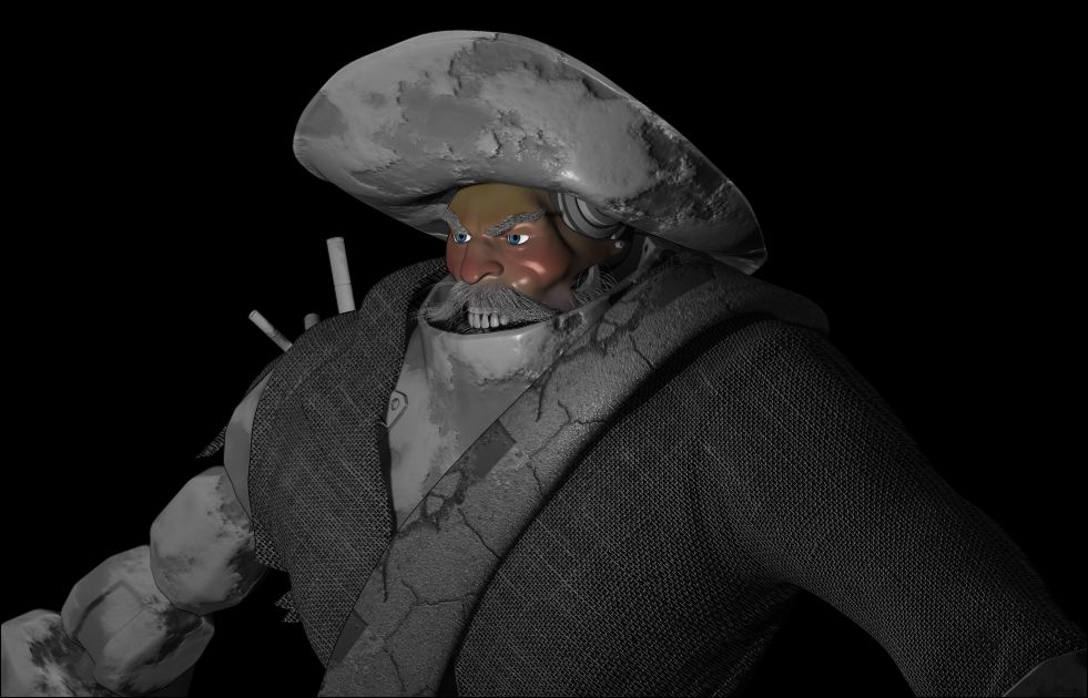
3. MATERIAL TESTS (ALOT OF THEM)


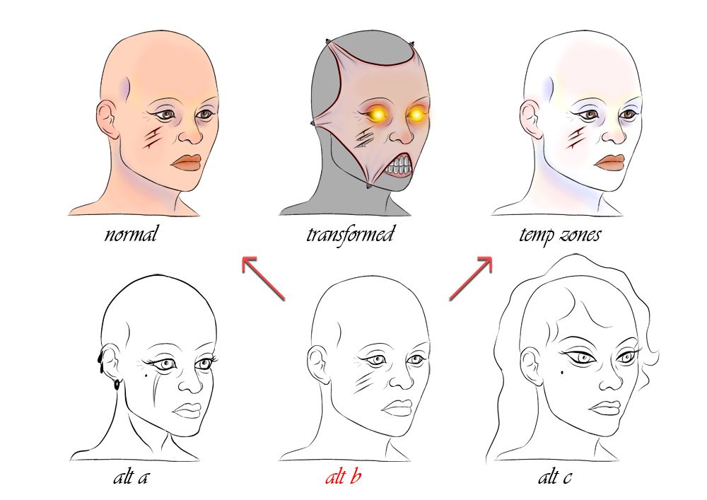
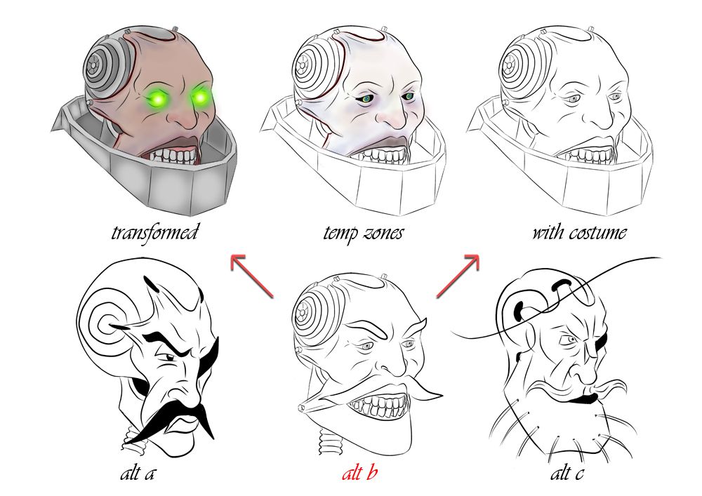
The Material stage is where you will be having the most fun, because its all new, you can start experimenting with lots of things . In Pete the Creeks case I really wanted his arm to ring shiny/ rusted metal. That really came together when I brought in the outline and reflective materials because they both fed of each other and what I ended up with was a shiny mess look at the result of the arm in the image at the top of this post. The Skin shader mat for the face was also a very appreciated attribute especially after I started adding temperature zones to the face. The pearl mat was entirely for the hat because I was worried that it was too shiny and it was. I only realised later that I had been rendering him with his eyes off... so I turned them on masked them and then stuck them over the top of everything else... why? because I COULD!
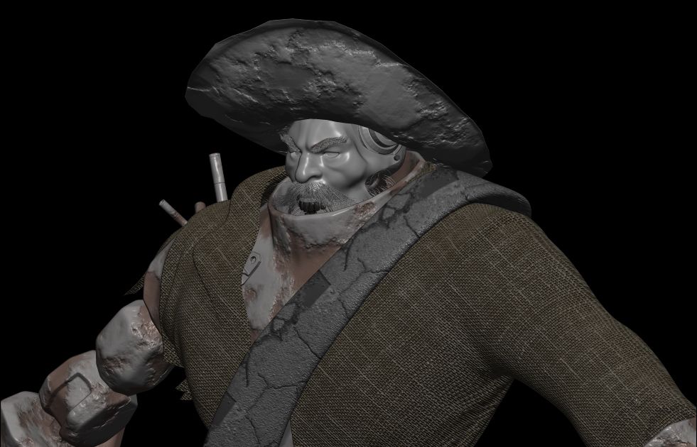
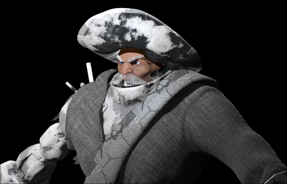

4. THE FINAL FACE

For this pass I went to town on the details for the face, I really wanted wrinkles, If I had time I would have done a cavity map which would have really accentuated the imperfections in his face but that is something I will have a play with possibly over summer or dare I say it maybe for this brief we will have to see how it goes. This model was rendered very much towards the conceptualisation phase, poly count was not considered so this would not be preferable for a games mesh (which is the career I'm aiming for. Never the less I will probably be doing most of my polypainting in ZBrush as I did for Charles in Unit 7 so it will be nice to dust off those utensils. Anyway I cut the face from this image and placed it over the render passes I already had and just like that it popped...

 
5. LIGHTING

Last but not least were my lighting passes, I clicked on the light to invert it making it mostly a rim light the second pass was from a light to the side slightly muted I figured together they would contrast really well if blended correctly in Photoshop. I probably could have spent longer here but by this point I was just rendering out lots of tests and seeing what did work and what didn't, there wasn't really a process I was just keen to see the results I could achieve with a model devoid of polycount or purpose. As I said it was entirely from curiosity that I stumbled into something which I loved the result almost to the point that I just wanted to use it. Still there was no time and he was not posed for such an occasion...


6. THE BREAKDOWN!

This is the final result broken down I wish I had saved more steps of the entire process but I was never intending to create what I considered to be an amazing render. Broken down the hat was lit from my right light pass and dampened with the pearl mat. the face was dimly lit from the right light and of course had the skin mat. My favourite part, the reflective metal was a reflective mat with a deck image loaded in and it had a think outline mat just to accentuate the metals blemishes. The jacket had some of the outline from the rim light as did some of the right side but you cannot see that clear. The rest was done in Photoshop with some FX passes and glow brushes. Of course the background was just a texture but it works with him haha.

I'm glad I could set aside some time to do this post, I had intended to do it sooner and if there was time pose the model and submit render passes based on that. Sadly it only got to the testing phase I only created the model of him as reference originally but now I know this avenue I will be considering the idea of Weta 3D Concept, this will certainly be an avenue for when I am only brainstorming an idea just to block out the process. I like things being dimensional something which I cannot always achieve on paper so its nice to know there is a 3D alternate...

I have begun researching my next unit and I think I have a few nice ideas I just have to get these final posts concluded and then I can begin with a whole new work load. I Hope this post has been educational to some and at least some nice eye candy for others!

Take it easy people!
xXStItChXx

Monday 28 January 2013

Unit 8: Character - "10 Waves" Final Posed Characters

Hello Everyone,

I have been slaving away and finally have completed the final poses for this Unit. I didn't want to rush which is why they took so long. Usually if I rush I create utter garbage which these poses were up until yesterday. Anyway I am counting down to my final few posts now, lets hope I have time to get the last few up. I am providing 2 passes of each concept just to cover all of my bases, I think the line art is cooler then the coloured versions (I dunno call me crazy). It's just I've never been good at line art so its a breath of fresh air to have a few that I am proud of. The poses I have done feel dynamic to me and are not so "stiff" or "rigid" I really like the fluid movement of the pose I got on Clare, even Banner doesn't feel flat and oh my god if I could relate to you the nightmare of drawing Pete's hand in perspective... complete nightmare...

There have been a few uphill battles as there are in all of the units I have done till this point, I am usually up on D-Day finishing little bits and pieces but when the chips are down you have to be willing to make sacrifices for the best work possible. I will be posting up my red light crit post after the submission disc artwork (which is standard for me). I still have a few hours to get a few little bits together for the current brief (adaptation).  I'm just glad to be almost up to date, still I only have myself to blame here, now is the time to return to the zone and get the best work possible complete for any and all tasks the university set me!!

Please enjoy the final poses, I just hope they look good I have been working hard on them...

 
HERO

Well as you can see I have gone to town with Clare, I have put a couple of hints of metal on her but the main focus is the eyes and chain. I toyed with the idea of making both arms chains but this felt more correct to me. It shows the conflicting sides of her and I think that's pretty cool. The clothes are pirate, I have books from the library to thank for the costume design as I said, I have never been big on clothing so I am proper glad that this worked out in the end. I also think that Clare and Peter Creek contrast well, as Joey wrote down below you have different colours for different moods. Clare has the red sash which could be confused for villainous but also cream which is comforting... I like this contrast kind of sets me on edge a little...

 
SIDEKICK

Like usual Banner is second, I found him once again rather difficult but I wanted to give the sense that he is afraid, afraid of what his masters have/may become. I found fear difficult to communicate but from research I found that dogs cower when threatened and of course the classic tail between the legs, that had slipped my mind until I dug it out from Google. I have mentioned previously that I am no master of drawing animals but I think this pose catches the emotion I am trying to convey. I am not 100% happy with the face, I kind of wanted something a little more sad. I kind of ran with one of the expression sheet images I drew previous and took it into a pose... perspective may be a little out I think the tail should be a little father back maybe...

VILLAIN

Last but not least the infamous Peter Creek, my true Robot/Pirate, I will take this initial point to apologise about the pattern on the belt I was rushed so I didn't have time to align it properly, the hands and feet took the longest. I also ran a small temperature zone pass on the stretched face not that you can see it very well past the glowing green eyes. I could have done a little more work on the lips but it got to a point where I just wanted to get it done and begin cracking on with other things. I am rather proud of myself for having to be able to get these done at this level. Problem with me is I usually dread the brainstorming process, I love doing the job once its decided and I just have to create the body of work... I think I live for that little moment... Alas we must do it all to be truly creative!

I only have a few more posts to put up now that this concept has been created, I don't think I will have time to post the little bonus that I was going to but I will get that up at a later time once I have played with it more. I will take this moment to tell you that it is awesome and its the future of character design for concept artists! If you are intrigued you should be because its totally awesome I will post about it in the near future when I am not catching up on a backlog...

Anyway I think that's me done for this post, I hope this process has been appreciated even though it is late and I'm sure Justin is doing his thing by now, but as I said its my bad I just have to keep my mind in the game from now on and try not to stop to think for too long...

Catcha Later People!
xXStItChXx

Unit 8: Character - "10 Waves" Size Comparison

Hello Everyone,

Another smaller update, these are my size comparisons, which I knocked up after a class Justin gave us on understanding the size of our characters. I especially liked the idea of comparing them to the sizes of other known characters. You may have to bare with me on the accuracy of these sizes, for example I'm not sure if the size of captain hook is accurate and according to most terminator websites the sizes varied but they are about 6 foot. I compared these to the projected sizes of my conceptual characters. so people understand how they size together. Clare is not a tall woman, just towering above five foot while Peter Creek towers into the 7 foot area (Andre the giant anyone?). Anyway I compared them to the popular cultures "Robots" and "Pirates" just to keep it in the scheme of my project.

I would just like to make the point of saying that these are up in the air, but I did want a considerable difference in size between my characters. Peter had to tower over Clare and Banner had to be wolf size not a freaky giant wolf. I tried to keep it real while also adopting who they are in the story, Clare is swift, Peter is Clunky and slow, Banner is nimble with a very sharp set of teeth. I knocked these up quick so you will have to spare the design aspect, they look better in the final layout you can bet your life on that haha. The next post will be about the final poses I just hope I have time to get the final aspects nailed down tonight.

The size comparison sheets are as follows!


As you can see in the image above I have referenced both of my archetypes for this project and they look pretty cool with my characters beside them. I am a little bit gutted that I didn't have a better pose mapped out for this stage but what can one do. I can see how these are so useful, its really nice to get an idea of where you see characters going and its amazing how something like height can tell you quite a bit about who they are. I had to darken the ink on these images mainly because some of the strokes I took are quite fine, just hoping I don't get that kind of issue on the final layout. I have to get this wrapped up quite quickly though, I have other posts for tonight, one of them being the final poses and I really have to get down to that.


The image above is just of my characters alone so there is no confusion not that anybody could mistake me for the creator of terminator or hook lol. To be honest I'm actually amazed that I'm finally at this point, it seemed like this would take for ages a couple of weeks back but its nearly over already...

I am quite chuffed with my final layouts, its a body of work that I will look back on and probably wipe sweat from my brow. I even have a little plan for the presentation of this unit, I'm just hoping that I will have time to do it before tomorrow ticks around.

Well, I think I am done with this post for now, I will be back on in a few hours to post up the completed poses  and if there's time a few little additional things that I was working on over Christmas when trying to find inspiration. With any luck I'll at least have something cool to show you guys soon! Hope you are all having a good time out there tonight!

Later Doods!
xXStItChXx

Unit 8: Character - "10 Waves" Final Detailed Turnarounds

Hello Everyone,

I have many posts to get through tonight so be ready for a tonne of fun. I have spent most of the day knocking up the final posed images... not too sure if they are good enough but they will have to do, I also have a few little extras, not sure if I will have the time to post them though so they may have to wait until later on. I wanted to be sure that my final posed images were Dynamic enough, my talks with Justin told me that I had to basically make poses that were action and not "Rigid" a problem that drives from most of my concept art. The difficult thing about dynamic poses are perspective, you have to look for S curves in the pose itself, and perspective has to be factored into the final outcome. From flipping you see miscalculations which is why most artists have to flip to check that the image works.

I have kept these turnarounds simple with slight detail (with a lot more detail on Clare) I was going to lather them all up and have a coloured layer for detail but again time constraints so I decided to keep it simple. I decided to keep the primitives in place so people could see how the body was constructed through the minor detailed layers. The shapes are key to the character after all, and this should also work facially, I say that with a little scepticism because I am not perfectly accurate when it comes to variance or drawing multiple of the same thing... it takes time, but I'm learning.

Here are the final turnarounds with clothes...

 
HERO

This is the final turnaround for Clare my story's hero. I had placed tonnes of detail earlier along with other things which I didn't want to lose... You can see these details via the colour codes, Green is basically the fabric detail, blue is the basic building blocks of the Characters body, black is the over the top clean detail. I kept red for the facial details only, this is just so people are aware of the zones and should anyone choose to make her (lol). I am quite happy with the final result I love how clean my ink is for this image. Its nice to be able to contrast the various details with colour hues something I may even consider doing if I ever have to do this again. Just keeps it nice a concise the hands probably took the longest that and the feet... I've never been good at these though.
SIDEKICK
 
Next comes Banner, something I once again had a few issues with. The perspective is probably what gets me most as the dog is learning the mass of his body forwards, its just difficult to visualise as much as I did try. Still the side is more or less on the nose here (as I said its a perspective issue with me). Having not been one that can do animals very well I think I did an okay job though, its not as perfect as I would like it to be but its still better then I thought I could do. The details are once again hard Black with the basic primitives being the purple. The only real costume detail is the scarf when you exclude the fur. Its as I said I didn't want to overkill him by making him about more then he is meant to be about, he's a wolf and he has a sash necklace.... THATS IT! Its who he is that's important.
 
 
VILLAIN


Last but not least "Pete the Creek" my villain, probably my favourite turnaround. I love the clothing choice and the line work looks simply awesome. The real detail is when it comes down to the nuts and bolts of his actual body. Turning each shape into a metal joint was actually quite fun I thought it would be rather taxing but I actually enjoyed these little details. The hat is inspired by Barbosa from "Pirates of the Caribbean" not sure I mentioned that before but there it is and I used it directly as reference imagery. The Jacket and belt were another story from my trips to the library and chatting to other creative individuals. One of the guys at my convention loved the idea of a ripped sleeve which is what really inspired that (he even asked that I pitch my idea to him lol).

My time at the games convention was fun and I learnt a lot of things, a few new tricks when it comes to pitching... one day if you need them you know where I am just don't take the mickey haha. I have spent a lot of time refining this idea "Robot Pirates", who knows maybe it has potential to become something awesome, I have more appreciation for it then I did a few weeks back. When it was an idea you never really appreciate it, then after a body of work it suddenly becomes interesting...

Well I think that's me done for this post, I have many others to do so hopefully things get underway tonight pretty snappy. I have submission disc stuff to post also!

Take it easy!
xXStItChXx

Sunday 27 January 2013

Unit 8: Character - "10 Waves" Expression Sheets

Hello Everyone,

I have been slaving away at these expression sheets just so they make the impact required. I wanted to aim a little higher then my usual level but in order to do so I had to gather a lot of research and run lots and lots of tests before I could approach it. I even checked perspective with lines and did the standard flip horizontal test. Of course I had to do this for every image and I didn't stop until I was at least partially happy with the results. The only part where my heels dragged a little was the Wolf mainly because as I said animals just are not me - I'm the anti - tom lol. I am somewhat happy with Clare's I even snuck in a little extra emotion for her just because I wanted a transformed phase.

I have many other posts to do before today is over and then I have another brief to prepare for - looks like I'm going to have to dust off the old task board. The expression sheets I had planned originally for a complete 6 per character standard but due to time I decided to keep it lower at a standard 5. Clare was a freak accident mainly because I really wanted to see the transformation phase on her face and I wanted to demonstrate that to the masses. I was originally going to do a transformation stages post but again time has caught up with me so that will have to be dragged from previous posts.

Anyway lets get down to those lovely, lovely expressions.

HERO

As there are so few of these emotions I decided not to label them but you will know the ones I am talking about. For instance you can tell which one is the transformation one, so already you know the extra addition for her expression list. When she becomes angry her eyes glow and then when she has transformed they become much like Petes and her skin sheds off leaving a metal skeleton (except of course for the upper face). This is only if she embraces the machine in her. I kept the docile expressions in greater number as her human side has to be more important then the machine underneath. Her features are gentle, I loved that from the earlier sketches and its a good example now that we are at this phase.

 
SIDEKICK

Next comes Banner, I will apologise for these designs as they are kind of rushed but I think the key features are still present. I like the fact that he now has a gentle side as much as an angry side if he needs it. This is something that was gradually lost in the final face tests but I think now I have managed to bring it back to make Banner more appealing then he originally was. Yes he has to be fierce on occasion and has to protect Clare, but he also has to be the embodiment of innocence and a trigger for her lingering humanity. Clare has to overcome the monster within her and to do that her sidekick has to be sympathetic. I tried my best with the poses but as I said I'm not very good with animals but I gave it my best shot so at least I tried here...

 
VILLAIN

"Pete the Creek" was the bane of my existence at the beginning of this assignment (Justin knows), but I love the expression sheet I managed to do with him. I particularly love the pose where he is temporarily human - coming to his senses. I imagined a part where he snaps out of it near the end and realises he's being manipulated. That image is my favourite and it took the longest particularly because I wanted him to look at his machine body and the hand was closest lol. Other then that I had a few plays with his hat... Taking it off seemed more beneficial to demonstrate the Robot theme and the pirate theme. At least this way they are both present and this should satisfy the brief and what was given to me individually - The Robot Pirate.

I will take this moment to say that these expression sheets were difficult to pull off. Having never done anything quite on this level I am rather chuffed I actually managed to do it (with the cost of a few hours sleep). Still I will make a point of saying that this took ages to do and in the future I will probably be doing more rough sketches because they generally give the best poses other then flying by the seat of your pants in photo shop without an idea. A hard lesson but I have learnt it now and know what to do in the future.

Not long now so I will get cracking on with other things on my list and hopefully I will have a few more posts to show you guys today and till the early hours of tomorrow!

Over & Out,
xXStItChXx

Unit 8: Character - "10 Waves" Props - Cursed & Weapon

Hello All,

Got another update, sorry for the delay on everything I am just putting the finishing touches on some of my expression sheets and hopefully they will be ready to go by later tonight. These prop designs are a little lack luster as I never really had delved deep into the practice. My characters props are mostly grafted to their bodies so they will inevitably be drawn when the final images are up. Alas I thought it was best to put a few down on paper so I dug out my earlier sketches and decided that they were at least a little forethought into additional props if any.

The wedding rings are probably my favourite as I always had envisioned Clare carrying his and hers wedding rings on her neck. Keeping them is her way of clinging onto hope that Peter will not stay the monster that he is and she will have him back one day. The rest are just standard issue weapons from the pirate era mainly swords. The cursed objects were researched earlier and I took the liberty of trying to come to terms with the style I should have been looking at for voodoo objects. This probably went better then the weapon research, it kind of gave the cursed objects a personality but I didn't want nothing too high tech I still wanted it to fit in my era.

Well as stated in previous posts the tale begins with a chest being found, double locked and chain wrapped of course it was never meant to be opened. Not heeding the warnings a rather foolhardy Peter Creek cranks the chest open a big angered when all that's in there is a load of junk. Peter rummages through the chest until something peaks his interest from nowhere, he is excited but he doesn't know why. The object is triangular and peculiar looking, not something from the era, after a while Peter becomes fixated on the object. He no longer cares for anything, but the safety of this object, when his partner Clare tries to intervene he attacks her, causing her to fear him. During the scuffle he cuts his arm but it does not bleed... only metal lies underneath.


My cursed objects ranged from cursed gems through to pendants and necklaces - I didn't want to be pirates of the Caribbean and say that gold is the cursed object... besides gold wouldn't fit right for the uncanny ability to become a machine. I liked the fabled cross but again I didn't really see a place for it I drew F and then came up with the idea for D which I felt was the winner of these objects. G was a tool that I thought could be cursed but then it wouldn't make much sense to the futuristic robot theme. D was the obvious choice here. The balance looks just right and at least that way he could hide the object on him, its not a handful and can be worn or stashed in any crevice to avoid detection. It was just a much nice idea...


Next came the weapon design which I have to be honest felt a little redundant, any props that were going to be on them were not really going to be used, just more for decoration. The wedding rings (H) was probably the only thing I really thought could work, and I bet you are asking why is it a weapon? Because her goal is to turn him back into a human, what better weapon is there then showing a sign of their love. Swords felt right, I began sketching the gun (D) but then decided against it... I didn't want weapons in this. The only weapons that were significant to me was his brute robotic strength and her quick whip fisted chains (I) anything else is decoration... After all how can you hurt a robot with a sword? and I think we found out from the terminator days that guns just don't work... especially old fashioned ones...

Well that concludes this little post about props, I really did work hard to try and figure out ways in which more of them could be used but if I'm completely honest they never made sense to me in the context of this story... well from a weapon point of view anyway. Which is why I preferred the props which were less cosmetic (Cursed objects, wedding rings). I drew them mainly just so I could get in the mind set of the era which I did eventually...

Well that concludes props, I will be posting up more very shortly, I am quite glad that I can cross this little one off of my list and get down to the core of my idea.

Take it easy!
xXStItChXx

Saturday 26 January 2013

Unit 8: Character - "10 Waves" Clothing Tests

Hello People,

Its been a long few days but I finally have my costume tests to post up, I did this before but as mentioned in previous posts It has been lacking the finishing touches (inking). Never the less they are here now, I kept them rather loose because some of them were never going to work I just wanted to see how things could look if this was about another story. The wolf Banner probably has the least costume options mainly because I didn't want to trinket him up, he's a trusty companion... not a dog people would go to trouble to dress up. His clothing is essentially his fur coat which I had another colour spree with, just to see it on the body not only the head.

I have put the best rendition of a front on face of each of the characters also, I didn't want to keep going on with faceless characters especially when I already have how they should look drilled into my head. I have kept everything very crude as this was all just a development step, I real details will be in the final poses and of course the expression sheets. Anyway lets begin this post I will probably be updating again in a short time to mention props...

 
HERO

I will mention right off the bat that I have gone with D for my hero Clare from this little selection. I liked that it was asymmetrical to such a great degree. I especially liked the massive dragging sash that covered an entire leg (something probably Final Fantasy inspired). The only one that was probably a definite no no was f - the one with the pink sash. That was a definite no-no and just screams Barbie to me even now. If I was to go over this process again I would probably take more consideration into A. I really liked the idea of a red wrap around dress but again I wasn't sure if it was pirate enough...Most of the books I looked at people wore cream trousers etc. with a rather signature red sash.
SIDEKICK

The tests for Banner as I mentioned at the top were very simple, I wasn't even sure if he needed a costume I mean who dresses up a wolf? Then I thought an identity collar or something could be good but then I realised this is during the time of the pirate/treasure hunter so I took a step back and decided it should just be a bit of cloth. Maybe tied in a specific way. My favourite was defiantly A, I loved how it draped down the side the rest kind of looked like bow ties (I think you will agree). So to mix it up I decided just to try colour tests again this time with the full front body. I still find A the most appealing maybe I will adopt the colour of E just to wear it down a little.

VILLAIN

Peter Creek was much more localised, I knew that I could go entirely mad if I let myself so I kept the count down and just kept going until I found one that made sense to me. I wanted to keep his face pale which gradually became a pale green. I noticed that the bright colours really couldn't work, I wasn't going to do the thing marvel did with the incredible Hulk. The faded colours really worked and I am currently deadlocked between D and F. Both satisfy something about the character and the fact the metal isn't a boring grey. The hat also works being kept nice and small for those allergic to hats (me - unless its a south park hat). The feature just felt too much also, that kind of ruled out C and B... plus they were just too bright colourise.

If you have noticed some duplicates you should, the second line were created with just a different consideration to the colour pallet. As I said I did a few but only picked the best ones to put up on here really. Once I had these inked they fit the bill perfectly so I decided to move forward with the final design and pose... something which I am still very proud of haha.

Anyway that is the end of this post, I will be posting up props very shortly I just have a few minor alterations to make to their designs. I will then be cracking on with my final turnarounds, heres hoping everything goes well...

Over & Out,
xXStItChXx

Wednesday 23 January 2013

Unit 8: Character - "10 Waves" Final Tests to Final Face

Hello Everyone,

Sorry for the delay on these, some of them were not inked so I had to go in and touch them up, then I kind of got carried away detailing with temperature zones of the face. Anyway I provided a couple of alternatives that I was also considering at the time in addition to my final faces. This way I can show my thought process and they link up to some of the previous sketches I made and posted up. I have also put certain passes that go over the top of the basic colour (as I mentioned above - temperature zones are one of them). Sadly this did not apply as much to the wolf but I decided to put a light pass over the top of him to really punch him up.

All of the drawings were originally little sketches which I brought onto the computer adjusted and then inked, the main ones were combinations of other faces but I did use anatomical reference to get them as close to real as possible. This is what took quite a while but I am happy with the results and can say that they work on the final renditions of my characters.

 
HERO

The face tests for Clare (shown above) began initially with the alternate drawing, the lips were a transferable product, the eyes didn't work for me at all but the ear was probably the best one I have ever drawn lol. Alt a had the perfect eyes I wanted, the earrings were a test because I wasn't sure but I may add them as a last minute addition not sure.

The scratches on the face of alt b were originally the scar in alt a, because this cut is a bit cliché I decided for some little scratches on the cheek to show some distress I lost the little beauty spot too, just felt wrong for a pirate/treasure hunter. The transformed image at the top was what I envisioned her to look like when fully transformed into the monster Peter Creek wants her to become...

 
SIDEKICK 

Banner's face (seen above) was a little more complicated, as I mentioned I don't really do K9's or animals so finding something that worked here was really difficult. I kept underestimating the size of the skull and the shape. Things in this case began with alt c which appeared more gentle, I wasn't sure about this however mainly due to the nastiness of my story. alt a felt too soft but I liked the nose so I brought that into a straighter point and got focusing on a more serious version of banner.

This created alt b which I went with in the end. I even flipped it to show both sides work, I added some basic lighting to the 3 final images at the top and altered the colour underneath to consider other options.


VILLAIN

Pete's face had been decided a while back especially after I had constructed Clare's, I really wanted them to read as real as possible with a little creative flare. As everyone knows alt c was my initial rough sketch which is why I posted it in here I kind of fell out of love with the eye patch when I placed it on alt a.

That's when I realised I wanted to see both eyes a patch is a bit of a cliché anyway and I really wanted him to read as a treasure hunter more then a pirate (no wooden legs or eye patches). When placing the colour it was difficult to see the hues as I wanted the face to be more dead then anything so I darkened it down, there are some light hues as you can see from the temp zones image. Underneath the bulky armour is just machinery, as much can be seen in alt b.


My final face choices can be seen above, there was a point where I was going to draw the normal peters face but I just got pushed for time so I kept it to his transformed state only. Suffice to say this is how they would all look for the duration of the short or whatever, Peter comes into the story transformed, it is only established later that he was once a man and that she is capable of becoming like him. The trusty Banner is there to protect the lost and confused Clare from herself as much as others. I even envisioned a scene where Clare completely loses control and its only seeing his fear of her that she realised what she was capable of becoming. This attribute astonished me and was the basis for the story (which I contribute mainly to moral choice games such as Mass Effect).

Well that's the end of this post I only have a few more days to go and quite a bit more to post up about this project before D-Day, there may be a few days of lost sleep coming up but I have to get this all in so I can begin focussing on the adaptation Unit, I have been way to lax about that and really need to get my finger out here.

Seeing everyone else's updates though, there are some very cool goings on, I really cannot wait to see what everyone comes up with!!

Catcha Later,
xXStItChXx

Monday 21 January 2013

Unit 8: Character - "10 Waves" Hair Tests

Hello Everyone,

Finally got around to posting this little doozy, had a few issues with it being stuck to another layer in some document at the bottom of my stack. Never the less I have them now and I must say they are quite special. For those of you that do not know what the hair testing is, its just some random experiments conducted to see which position I prefer for hair (and that's any fur, facial or head). I did this earlier on when trying to identify how I wanted my characters to look. To do this I chopped the heads from the primitive turnarounds and adjusted the hair per head accordingly.

The turn around phase I incorporated to show a more dynamic understanding of my hair ideas. For example if I liked the back of one set of hair and the front of another then I can double book them. I figured this was better then plotting every design from the front so I could understand how the hair would or would not sit dimensionally. Anyway I hope you enjoy what I have produced (even though its a little late but hell its here so lets get to it).
HERO

First it's Clare's hair tests, I found myself exploring with shorter hair at first (g, h) this was taking into consideration Justin's thoughts into my original designs earlier on. I then changed my mind it felt less pirate like to have elegance or order (which is when I knew b wouldn't work, neither would d). The more natural felt more correct which is when I knocked down a, c, f & j. I liked the curls of a & j and I especially loved the idea of a bandana. I thought c could have worked but it looked a little too clean and less flustered, I want her to be despaired so unkempt is the key.

SIDEKICK

Next came the trusty sidekick Banner I had much more fun then I had intended too with his hair design. It was cool trying to make a badass looking wolf but I think I had quite a few that I liked in this lot. Personally g was a big favourite (my business partner even gave me kudos on it). I loved the idea of having a kind of patch of coloured fur over one eye. The colours were more muted, I wanted to aim for a natural look, I don't recall many situations with a red haired wolf (oh wait that's a fox). Anyway I also loved c. and from the side the best defiantly had to be h... Not that I didn't like the others either...

VILLAIN

Last but not least came the scary "Pete the Creek" design although in this style it looks rather comical but trust me in the final stages it is anything but. From this I took major influences from d and g. I thought about decorating the back of his head with coats of hair but I never felt that it worked. I preferred the bald approach to further support that the only hair on peter could be on the stretched facial skin across the robot exo-skeleton.

The hat was also a basic fixture but I loved how it looked plain in the original sketch (shown in a previous post)... None of the sides made sense (b, e & h) I didn't like the hobo look or the dojo fighter look or the carnival host look lol. Still it was nice to see them to be sure.

Well I think that concludes this little post, at least its up and people can see the progression I concocted to reach my final designs (which are still to come but be patient :) I am doing my very best to get this all together so I have something really impressive to reveal by next Monday (the day before D-Day). I'm still glad that I can show this level of development so far its certainly better then the sketch phase.

Take it easy people!!
xXStItChXx