
Been working away hard on my idea for my "Driver" character for my project "A short Drive between Two lives" (sometimes abbreviated "A Short Drive"). There has been quite a bit of soul searching and playing with different forms and head types etc. I think I have it at a place now that I know where I will be taking him for stage 2 and beyond. I'm a little gutted that it has taken as long as it has just to get past this stage. The researching faze can get a little draining I don't mind saying. I was so proud of the synopsis that I wrote for the game that I really felt I had to capture this mans personality in an expression or in the way he holds himself etc. The next phase will be working on getting some stage 1 concept for the cars and a little for the environment just so we get some background on this game. Of course the games characters will be the priority but I will fit a little bit in here and there so keep your eyes peeled.
Anyway I have a couple of things to write up here, this is my first time seriously experimenting with form, after Justin's character Unit I really wanted to come to grips with how form can change the demeanour of a character. I did it in a previous post on super man but this time I wanted to do it on form not a character everyone knows. I did it mainly by blocking out the body making a kind of mannequin... This post is also about the stage 1 sketch phase I always tend to think of concept art in stages. You have stage 1 which is just sketch and freehand stuff (not finished). Then you have stage 2 - inked with basic colour and costume tests. Then you have stage 3 which is a coloured image in a pose (proper concept art). Its just easier to organise it this way in my head. Stage 3 will not be far behind this I promise you that!
Anyway lets get on with this post, I hope it's not completely noob-like.
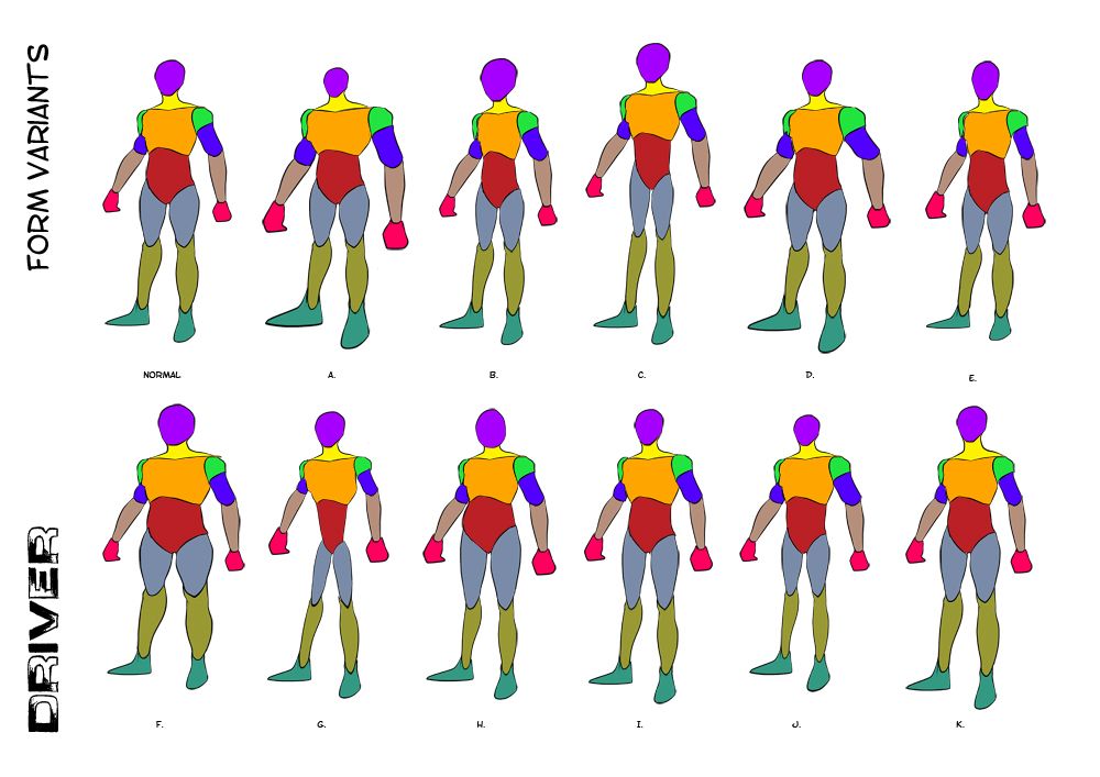
After fleshing out the basic form of an adult male I decided to go on a little journey (one I had never taken before). I wanted to put a little more of Justin's advice into practice (Shown above). I broke the male body up into segments and then began playing with the individual elements of form using the transform tools in Photoshop. It was just easier then having to draw out all of the forms and gave me much quicker results. From these I like E, I, J & K.
E I based mainly on the comic book genre, he's not overly muscly. The head is slightly bigger and the chest is slightly smaller making him less imposing... a regular guy. I tend to keep a little of the upper body mass, I extended the neck to inflate his upper this keeps him trim but big. J is based on the tough persona, notice the small head meaning he is a bit of an idiot but his upper body makes him indestructible. This is illustrated quite nicely against his small lower body. Last but not least K which I kept to be a tall normal again I extended the neck further on this one to make him more imposing, the hands are a little bigger too... You may notice that in more then one of them...
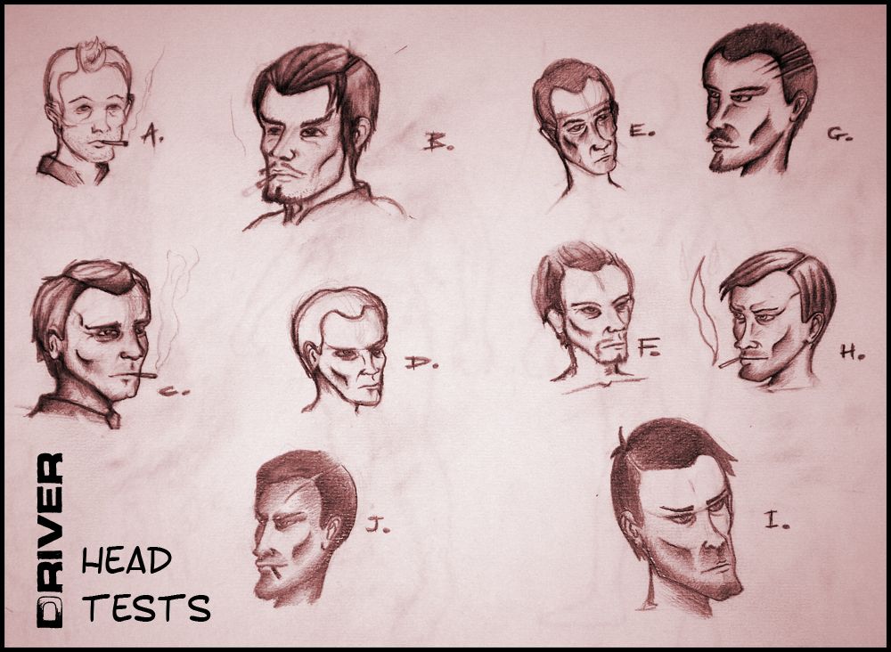
Next I began playing with heads, these were the best of the rest, personal favourites here are H, I & J. H makes him look younger to live up to the name "Kid" in some of the books instances. I tried removing the cigarette a few times but he just looked cooler with a trim cigarette in his mouth. I had the hair forward in H not to sure about that in the 1930s so I ended up brushing it back for the J image. I also toyed with the idea of giving him a scar or something to show that he's been in a few close calls over the course of his career.
The stubble really helps sell the cool image too, I just think it works. I wanted to keep him trim and keep him imposing, I found when I aged him (C & E) he looked less Kid like and more like an old petrol station attendant. I even had a play with beards (B & F) but I don't know they just didn't feel right to me... Made him look more posh and I wanted a bit of grit in his persona.
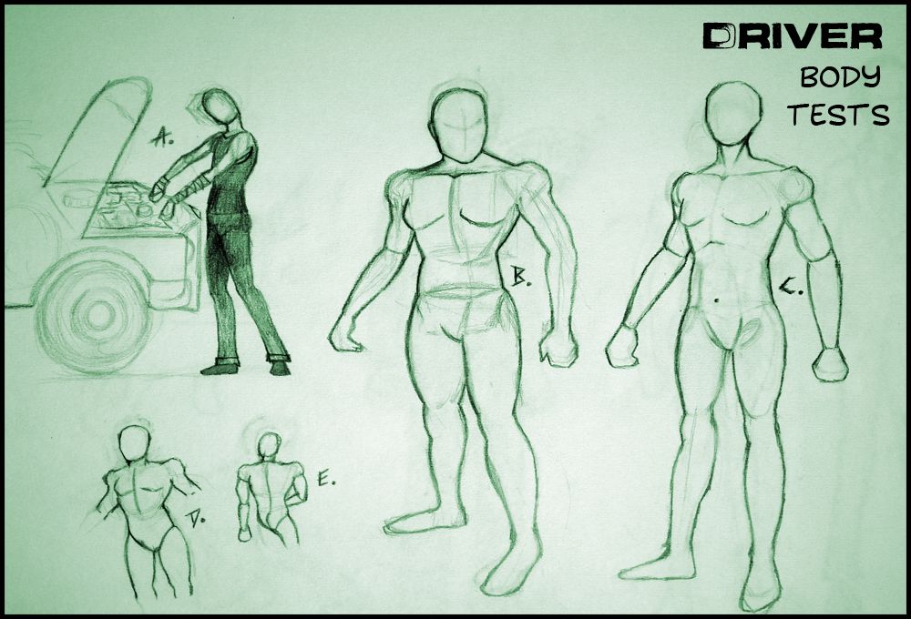
From there I went to play with the shape of his body taking it more into actual form shapes from the form variants at the top of this post. The first image I drew up had him very skinny (A), I liked this but I was not sure I added the car in just to get an idea of what it could look like him playing around inside his Pontiac. As I said from there I just wanted to play with a couple of other forms which gave me B making him really brute like but I was not sure. He looked cool stocky but I wasn't sure if it was him, I didn't want to take away from the character.
C, D & E were just further form exploration tests from different angles. I was just trying things out to try and imagine some alternate versions of the drivers shape. At this point I had more or less decided that I did not want him to be big, just smart and to know the roads like the back of his hand. And of course to be certifiably shit hot on the road.
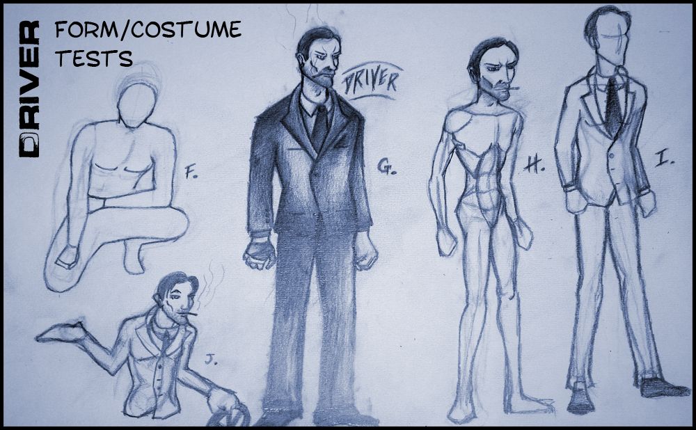
Last but not least came the form/costume tests. After playing with some basic shapes I had decided I didn't want him to be macho just cool. I had played with a pose idea (F) which just didn't work for me, "he's not in a boy-band" I thought to myself. I dropped the image flat and moved on to blocking out a standard version of "Driver" (G). I then dressed him in the suit using the reference imagery I had posted a few days back. I took the liberty of adopting the walking dead's "Giant Hands" which is why it looks like he has wrecking balls on the end of his arms.
The feet are also really flat as I also found from the "Walking Dead" so you can attribute that to them. I kept the head basic but had enough oomph to play with the hair and the cigarette. I liked the image, looked much cooler then some muscle bound idiot. Still he looked rather villainous to me which is good but it could be bad too. So then I moved onto H and made his head bigger keeping the body rather trim, just to see if it would pop, I liked it but I dunno I felt he lost a little something. I was a basic "phoenix wright" play, it certainly did make him more of a thinking man.
I helped me reach J which really fell into its own, his character seems more accessible as the character expressed in J. There is an element to him which could be friendly but there is also a shadiness to him. I kept the giant hands again for J and I really preferred it in this image, I also love the way the suit sat on his body, it looks less professional but professional enough to be a ground breaking character.
Anyway I will flesh out the Ideas expressed on these pages when I get over to Stage 2 and then eventually when I come to finalise them in Stage 3. I have other stage 1 ideas to play with yet but thank you everyone for being patient with me.
Take it easy!
Over & Out,
xXStItChXx
Awesome blog over here! Thanks for sharing this very useful information. 2d animation studios I will visit your blog again into a couple off days to check if you have some new articles
ReplyDelete