Hello Everyone,
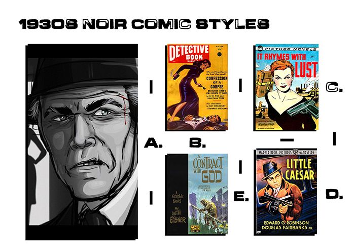
New day, new post, I have been doing a lot of soul searching for this unit but I have narrowed down my research tasks and I am pleased to say that this will hopefully be the last one. For this Unit I am adapting "Drive" from text into games characters... 3D Models - 3 to be exact, a first hand classic 1930s show car, a second hand classic 1930s hidden muscle car and the man who is to drive them all. I am plotting a synopsis for the fictional world which this driver inhabits, as well as Character Biographies, underlining the Driver and a little background on his key cars. Now that's out of the way, this post is about my visual influence more so then background of the period. Alan suggested that I look through classic style noir comics which I did my best to locate, the earliest I could find was mostly 1950s which stuff like the "Detective Book" and "A contract with god" by Will Eisner.
I decided to compare this to some of my favourite modern comic art among those Ashley Wood, Charlie Adlard & Tony Moore. I didn't like how in my pre-pitch presentation I had a rather vague explanation of what I meant by "graphic novel". At least now I can name drop and centre my ideas of comic styles that I prefer. I even went so far as to check out other types of 3D comic style art, stuff that I liked the look of and in some cases from media which I like. I wrap this up with some design choices (which I had already made in my pre-pitch) but I just wanted people to see where they came from and that I wasn't just making up decisions on the spot (I know how much my tutors hate that ha-ha).
Anyway Lets begin the post!
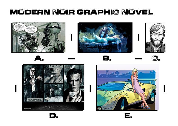
Before delving into whereabouts I wanted to place my work I decided to venture into what I liked in more contemporary noir. I found myself dredging up one of my favourites "Ashley Wood" (A) - "Metal Gear Solid" comic franchise. A form of line work with block forms, very nice and rough edged kind of gives the illusion of action in art. From there I went to looking at the regular "Dexter" podcast created by "Bill Sienkiewicz" again a kind of elaborate action based art using blocks of colour in horrific tones. Next of course (C) "The Walking Dead" Charlie Adlard and Tony Moore a real fine line approach, really gives the comic book vibe, to top it off it is completely black and white. Next, "Max Payne 2" (D) a classic from 2003 which ran a narrative along with the game in a surreal comic style. Last but not least (E) "Grand Theft Auto Vice City"... very colourful in comparison using a bright but simple colour pallet.
Next I decided to check out Noir as far back as I could go, the most recent being a deviant art piece by a man called "DJCoulz" I didn't want to have to name drop an Alias but there it is, anyway I liked the style of that image. I decided to contrast the image with comic styles past Alan showed the "little Caesar" image (D) to me and mentioned it as an old comic style feel. I found similarities in Fiction Houses "Detective Book", the paper isn't perfect so the images are slightly washed down. Things were not pristine in Noir for the 1930s mainly because of the types of paper and tools needed to create them at the time. Alan described it to me as a kind of watered down comic look. I think his vision for the 1930s style is to not have a pristine art vibe like the (A) but more like the detective book (D). It was nice to have that comparison just so I could justify what he was talking about in my creative minds eye.
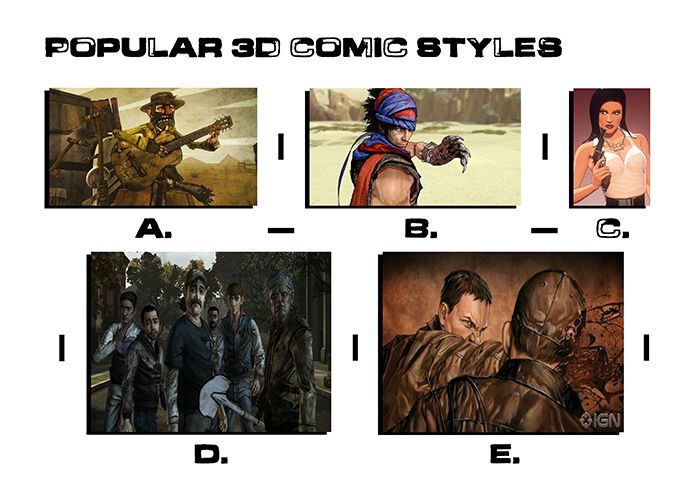
Next I decided to look into comic styles that have been used in 3D, something that is not pristine Alan had earlier suggested Bo Mathorn's "The Backwater Gospel" (A). A kind of run down low poly texture based exploit. From there I went to my classic gaming experiences namely "The Prince of Persia 2008" which adopted a kind of cell shaded approach with drawn on textures very much like "The Backwater Gospel" (A). From there I started contemplating the "Grand Theft Auto theme" expressed in the modern graphic novel style. That's when I stumbled onto artist Jasper Hesslings blog and discovered his "Comic Book Girl" (C) which looked cell shaded without the hard surface lines. Every edge is understated with the keys being in colour and tone. From there I regressed and went back to "The Walking Dead" games hard black edged style suggested in both (A) and (B). "E" is the Animated Iron Man comic "Extremis" which has a gritty sense but still suggests richer colour values (like C).
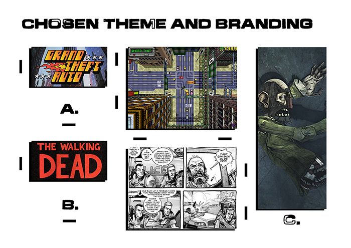
Last but not least I ironed out my final choices really, it would be nice to have a merging of "The Walking Dead" (B) and the "Backwater Gospel" (C) but in a 1930s setting. I would probably be more inclined to lose the colour entirely to keep it from falling into the closer territory of "The Walking Dead Game". The top down view (shown in A) - "Grand Theft Auto" is something that will be expressed entirely in my branding. I visualise my images on a page as top down buildings with lines being the lines in the road. If the game existed it could play like that and then return close to 3D cinematic's. Why does a building have to be comprised of windows, concrete & debris. Why can't a building be some ones interpretation of a building. Whose to say its not a cluster of images on a white page? I think a noir game world will be a nice place to set this particular tale, having had another good discussion with Alan today my next move is to find the scenario for this game.
So in conclusion I know that I want a comic book style which I am angling toward a noir style world in which a "Driver" spends his days crashing cars for carnival entertainment and at night drives criminals to jobs. The double life angle works and creatively I wish to make the style of the character and cars based on "The Walking Dead" comic in a 1930s setting. The backwater gospel is the style in which I will be implementing the 3D elements of the characters. The construction of the characters will be closely knitted in the style of Charlie Adlard & Tony Moore.
Anyway that's me done for this post, I will be getting on with a small Synopsis and structure next just to give some situation to my games world so people can empathise with it more.
Take it easy!
xXStItChXx


No comments:
Post a Comment