Been MIA most of the weekend but mainly because I have been trying to get into the head of my "Driver" character, far enough so I have enough development to show for the Interim on Friday. I am glad to say that I have been exploring vastly going with what Alan advised me to do last Thursday "go with what I feel is right". So I sat down and started knocking up facial sketches of "Driver" just trying to find out who I think he is as opposed to what any book says he should or should not be. I still have the body and clothing options to explore for stage 2 but after that I only have to consider a sole stage 3 concept, of course before then I will be exploring my turnarounds for the 3D models.
I have also not forgotten my other stage 1 concepts which are my other cars and some brief environment sketches. I will aim to have the majority of stage one complete by Friday after I have further explored my stage 2 Driver concept pieces. This shouldn't take too long I hope as stage 1 are just mostly sketches and are just me dipping my toe into the idea and quantifying it with a bit of research. This gives the stage 2 process more body and makes stage 3 look unbelievably polished, well it did for the last couple of units anyway :) I also have my target research to turn into a document and of course my character bios these will defiantly be done by Friday for the Crit.
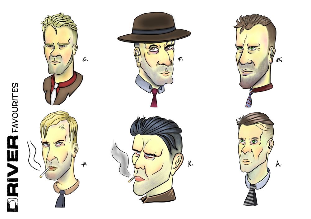
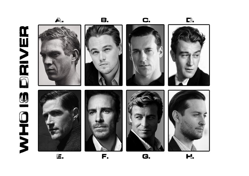
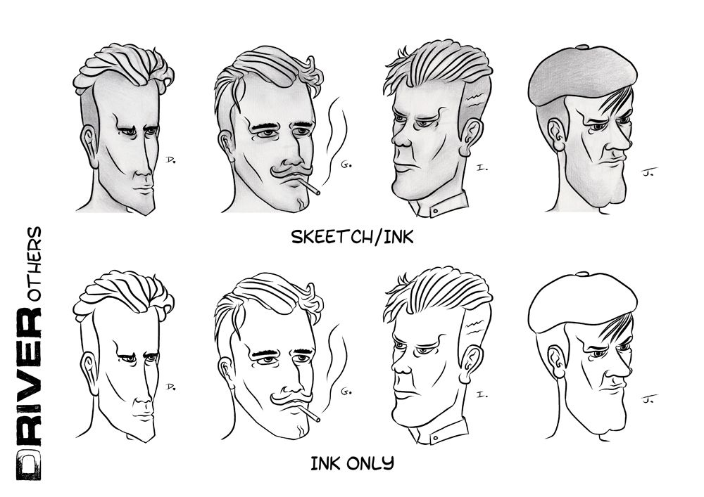
The Research above I had done last week but I like to rack a few things up before posting them up on here in a relevant post. Alan advised me to ask myself who this 1930s Driver is to employ an actor who I would employ to play them in this video game rendition of "Drive". Alan said I had to find faces that fit within the period so I grabbed a load that I thought could play this Driver. C and E were among the popular choices when I asked people what they thought. Alan thought the hair of D was more perfect so I went to replicating that and stylising it in my refined ideas (shown in Driver Favourites and Driver Others). The key element which I had wrong was the hair in my initial designs.
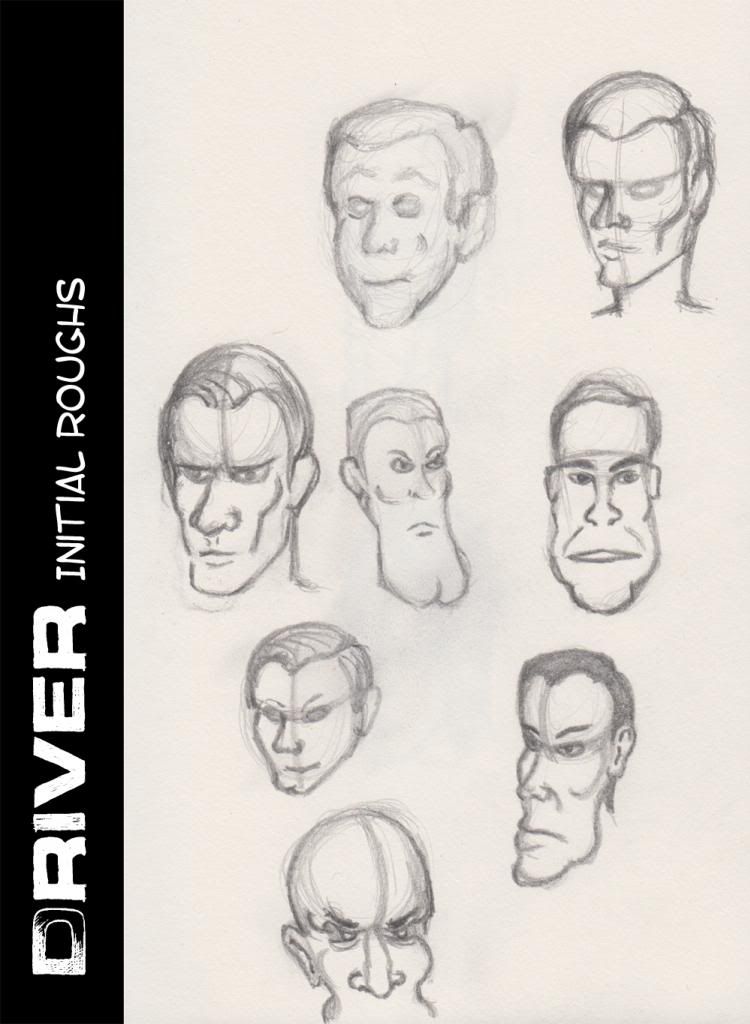
These were my initial roughs which I found myself playing with after studying a caricature book which I purchased from Amazon. Alan told me to find my way but what was bothering me was the fact that all of the faces I was drawing were not so stylised. I found myself slipping into a generic facial style. This was before my discussion with Alan but suffice to say after exploring this approach I could see where I was going wrong. I found myself even in this stage heavily dependent on the iron jaw, if anything I wanted his face to break iron. This is when I started exploring various head processes to structuring the human male skull.
This head process was originally knocked up in my sketchbook but I wanted to note this for my own understanding should I forget any of the fundamentals. I suppose I wanted to understand why some of my heads fell out of perspective when I drew them and it was largely because I find it hard to define the opposing side of a face mainly because its an issue of perspective. It has always bugged me when sometimes I draw a face and it works and sometimes not. I managed to refine this when I was playing around with my Stage 2 Driver sketches as they came closer and closer to the final designs. This process helped when I realized that the alignment of the brow is key to working out head perspective.
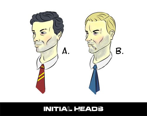
The image above shows my initial head designs which me and Alan both agreed were a little too generic. They just looked like text book images with nothing that really communicated a style to me I just wanted to explore it further. Alan also was not sure of the Tie in A and I almost felt like saying well that's actually a design I took from a 30s fashion catalogue but I managed to bite my tongue haha. This was also the conversation we had about the hair, which in these images is quite frankly too generic and does not have any wispy ness or any sign of grease. Still it was good to rule these images out as design options, they also got me thinking more of how I wanted to stylise Driver.
The image above (Drivers Others) only consists of 4 heads as I built 10 variants which I went through the shading process with. These were 4 others that got put on the side I was kind of gutted that I didn't get to explore D or J but I went with the ones which I preferred. G was my one and only play with a moustache, it being the in thing back then but when I considered my target audience (Teens). I thought the character had to be cool to Teens so I decided against using the moustache for the foreseeable future in my Driver design. Stubble became the key feature in all or most of my designs varying in amount. J was also my play with the old man cap still not sure about this for a prop item.
Tomorrow I will be cracking away on a lot of stage 1 concept but I will touch on my Drivers attire and physique, right now I would just like to get a little background for other elements in my final adaptation project (these being the cars and the environment). I need these covered somewhat so I don't go into the interim with only a character design to show. Still I am glad that I have explored Driver this far and now at least I have the head component somewhat fleshed out a little. I will probably be settling on the F head for the final design. Of course I will discuss my options with Alan and of course listen to any feedback any of you onlookers out there wish to give :)
Anyway, I have a full day tomorrow my graphics tablet is going to be busy of the next week or so just before my descent into the scary Maya and ZBrush territory. Still it will be games meshes so I am aiming for low poly and awesome texture detail.
Hope everyone's doing good!
Take it easy!
xXStItChXx


No comments:
Post a Comment