Thought I would post up my final head developments for my "Driver" character for all those to see. Feedback from our OGR the other day had me committing to a design method - what I prefer to think of as the "painterly" style. This was largely due to my rather inspired Driver cover art which was very loose but held together at its core by detail. Prior to the OGR I was knocking up other images but I didn't really consider any of them "final" more stages of development. I was also instructed to consider an alternate branding method by Phil something I am already looking into.
Well this post will be signifying the very last of head development as I go forward as far as I am concerned after this post the final design choice has been made. I will come back at some point to look at expression sheets just so I can breathe a little further life into the characters face. This does not mean that Driver has reached stage 3 just yet, I have to do my full posed version and of course my turn around profiles when I get to those so I can begin building him in 3D. The posed version will be the final costume with the final colour palette, all in all a complete entity.
Lets get down to the final facial and head developments - "Stage 2 - 3".
I thought I would kick this post off by showing the final facial concept which I spent all of yesterday knocking up. I wanted to maintain certain unique elements of the face but also bring about a sense of realism. The painterly effect tends to tighten in on detail for specific elements of the face (the eyes, the nose, base of the face, etc.) when it comes to the edge it is to essentially become more rough (the jacket). I also kept the background loose doing lots of active blending using the transfer effect on a custom brush. Believe it or not this entire image was made with a brush I got with a book.
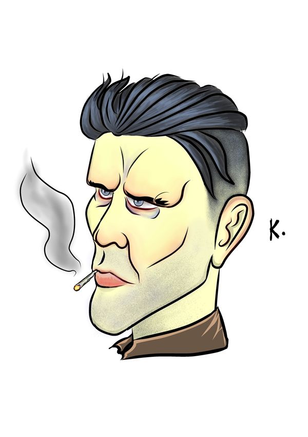
Next those of you that have been following my progress will probably recognise the face I call "Mister K" a face which just felt right to me deep down I couldn't explain it. Other people including my core demographic (Teen) gave this guy their vote fighting off "Mister F" which I have to say I thought would be more popular. Still I am not to stick my nose up at a design strategy when it is more favourable. I have to say I like the journey of this face has taken. As Phil has always said to me "a feeling in your gut is usually your minds way of trying to tell you something".
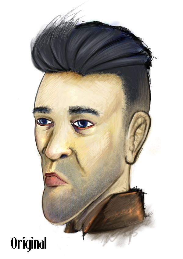
The image above (Original) shows my very first attempt of trying to drag the face into a concept, suffice to say this version creeped me out. I tried so hard to retain the features of the face while trying to adopt a strong colour palette which ended up becoming my downfall. Simply put the face was too bright from the get go, also it kept bothering me that the eyes were never exact opposites. That's currently my biggest Achilles heel, knowing the two sides of the face and how they look in perspective. I am learning but it tends to creep in if I don't pay attention - case in point.
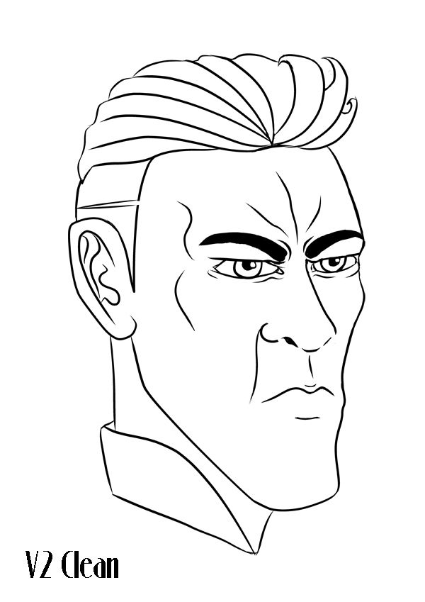 | 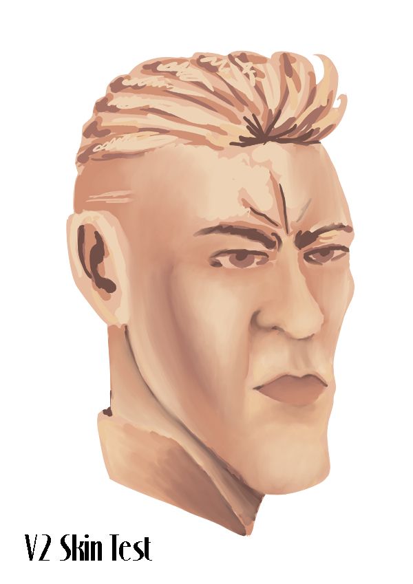 |
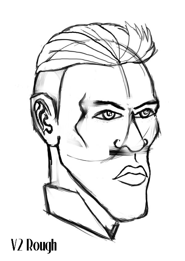
The images above were about as far as I took "Version 2" of Drivers head. I liked it and I found it interesting to begin learning about painting skin tones but the face felt way too Disney. Now Disney is great if its your thing, my style prefers to be the exact opposite, "something in the middle of hell and earth" as I like to think of it. My business partner does the bubbly characters I deal in everything and anything sinister. The fact that the Drive Novel is Noir really made me want to use the darkness I have inside, something which I have always been told to hide, I guess it took these images to make me realise I had to let the beast out. "Thanks but no thanks V2".
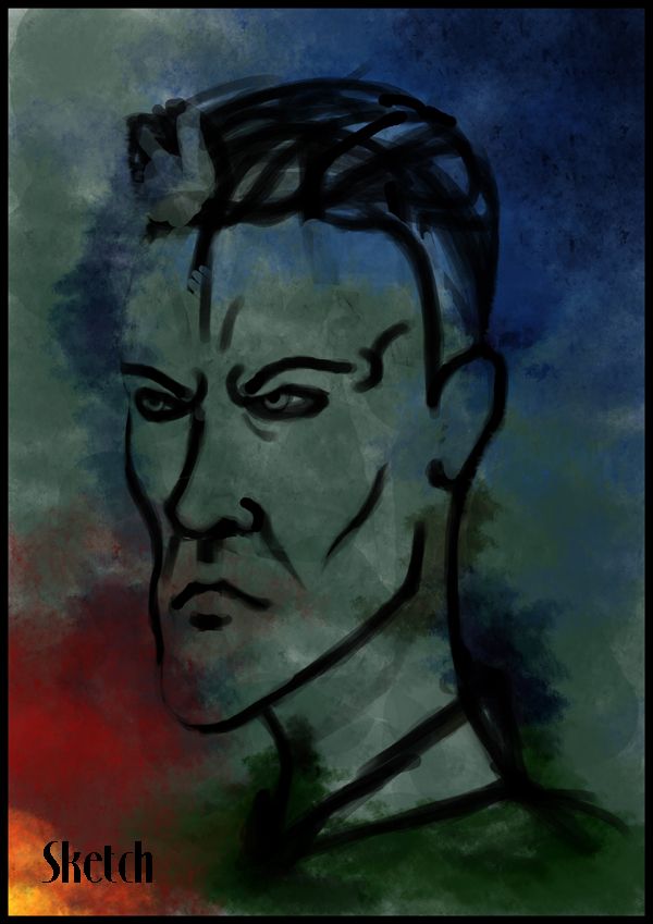
| 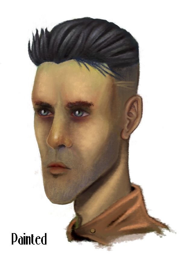 | 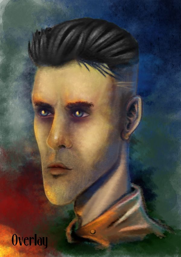 |
Last but not least "Version 3" (from Sketch to Paint) a complete burst of colour which I could not help but drape over the background. The sketch faze had Drivers face looking more sinister and a little older something which I felt more in need to lose as I went deeper into painting him. The painted final was to attain detail in the main features and gradually lose it as we depart his face to the jacket. The overlay was my attempt at complementing the colours, I wanted it to look as though an explosion had happened off screen and Driver's watching it marvelling at himself.
To get the final I found myself muting the colours with to make it seem a bit older and a little more sinister, a pale yellow was key. I have to say I am happy with this version, not only is this a completely different style to my usual way of thinking but it feels more refined by not being refined. I love that his key features are still present from the original K image (the strong chin, small eyes, thin lips, the cigarette which made the heads so addictive to draw, and the HAIR!). I think this finishes the thought of the heads pretty well and keeps it to that painterly feel I was advised to keep at the OGR.
Phil's advise also stuck with me from the Interim which said basically that I needed to reconsider my branding so I found a font which I think complements my thought of 1930s. Its more professional for the period but if I find something better before then I will probably look into it. I have learnt quite a few new tricks since starting this Unit, some I never thought I'd be able to do. Weirdly enough they just kind of came to me when I let myself go and let that inner noir monster out. I really have missed him, been spending too long doing things that are not me... he's angry lol.
Anyway that concludes this post, hopefully the next stages for Driver will be in the form of posed concepts with his full costume pulling some pretty cool actions. I have one thing I can check of my list now - heads complete :)
Take it easy!!
Over & Out,
xXStItChXx



He reminds me of Jimmy from boardwalk empire :)
ReplyDeleteHe could very well be haha I noticed similarities also the eyes particularly lol! still he looks cool :P
Delete"a feeling in your gut is usually your minds way of trying to tell you something".
ReplyDeleteThat's just a dodgy chicken kebab I'm afraid! ;)
Dude!! Don't mention chicken kebabs my stomach just gave a nasty groan!!
Delete