
I have a few posts to get out of the way today with the first being based on work from my prior unit (Adaptation). Phil asked me to dig out a prior image from my Adaptation project from last term. Usually doing this task would not take long and would thus not require a post to commemorate it... Of course this is me we are talking about here. The image of my Driver Phil liked was from an level 3 concept I made, a concept which I rendered at a low level and thus all the composited passes. I tried up-scaling it but it just looked a bit blurry in areas.
So I set out to recreate the image and also try my hand once again at compositing Weta concepts using my high polygon Driver model. This meant I had to render out everything again and play with blending modes within Photoshop to achieve a desired result. I tried my best to recreate the image in an A4 template which slowed my ability to move about in ZBrush a little. Anyway I did manage to create some awesome outcomes, so good that I thought damn I should post those on my blog. Phil if you are reading this please let me know which you would like to have!
Anyway the images below were made entirely from Multi-pass Rendering in ZBrush which were then composited in Photoshop.
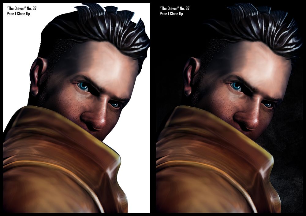
The image above shows a close up render which I built from render layers and a little bit of colour work in Photoshop. Phil said that the images maybe required on a white background but I preferred the black/textured when creating the design. Still I provided the alternative option in case black was a complete no go. I added the warmer reds in the face from Photoshop. I even added a slight inner blue shadow to illustrate the cool zones of the face. The jacket was completely pale so I had to warm that up. The eyes were the final correction... adding a slight glint.
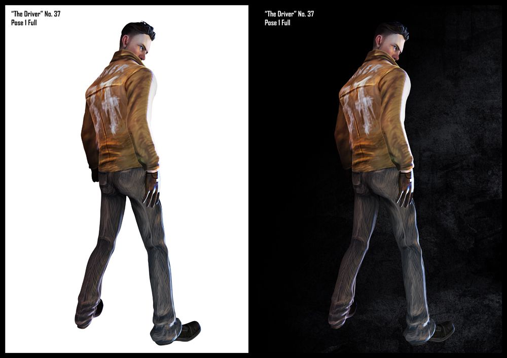
After completing the first image I thought as I have the pose here why not try my hand at multi-passing this too. Contrary to everything this is my favourite pose for Driver. It has that come and get some kind of look. Anyway the warmer colours particularly the blues and reds were added why splotches of paint and the colour dodge blending mode. I remember adding subtle blues and reds to Driver when I was doing the last concept... It was my way of simulating the flashing lights of a cop car, guess I forgot that this was set in the 1930s.
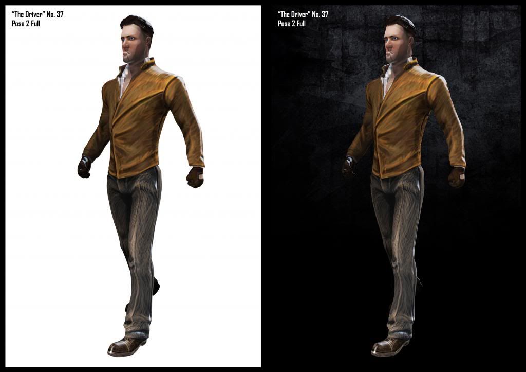
Last but not least is the pose Phil said he wanted, as I said probably the only thing that is different is the lighting here. The key light gives the form its depth which is why you are not seeing a great amount of light rays. What also doesn't help here is the angle. Phil if this is not okay please let me know. I am still coming to terms with the lighting options within ZBrush but as this is like my 4th attempt at multi pass rendering from ZBrush I think I'm doing okay. Anyway yeah I could not resist but to get my hands dirty if I was going back into this character for one last outing.
I thought I would put this up not just so Phil can decide which (if any) of these he prefers. Mainly though I thought this would be another opportunity to look into compositing and Weta Design. I really am loving it for character design. It will defiantly help in the future with other conceptual pieces. I will even try to do it for "& Son" if possible. It's actually quite fun once you start playing with the individual layers of an image. You can tweak the shadows, the light, the colours, the borders, the depth, it completely unpacks the image for easy use... Everyone should try it!
Phil let me know if there's any of these you'd like Ill send you over the A4 PSD's!
Anyway that's it for this post, its been emotional...
Back to our regularly scheduled programming.
xXStItChXx
Hey Stitch, thanks for doing this :) I'd like a face close-up on white and a driver on white (walking towards us). Many thanks :)
ReplyDelete