The studio blog design was a labour of love for us all purely because we were stuck with our studio name originally. Reaching a compromise we settled on Smoke Stack Studios, in my haste to get things going i worked on the banner image and the template design for the blog followed. Despite a few issues we agreed to stick with my original design, it was mainly because by then it fit in with everything and to adjust colours now would have meant an entire redesign of the blog... at this point we just wanted to get cracking with the work.
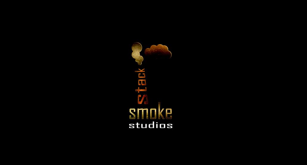
The image above is my first draft of the logo I wanted the text to convey something the text also felt perfect for studio I just scrunched it up. The stack took rasterising as I wanted to use the perspective transform tool. The clouds just came into there own and the texture over the top felt perfect giving it a bit of a old/worn look. It just felt simple but effective to me from minute one to my surprise it didn't take long at all.
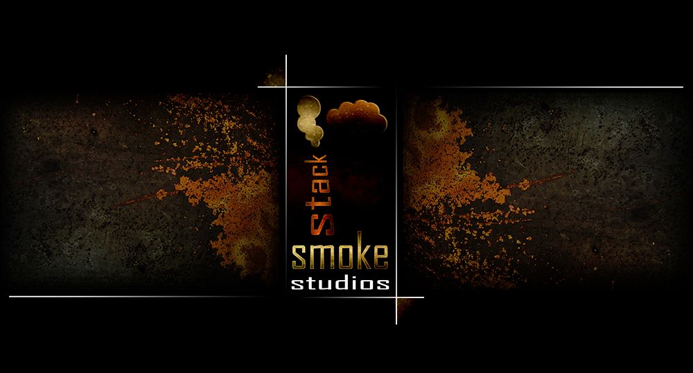
The design I made was originally just a place holder until we had a decent alternative but in the end the first design made the most sense to us. The rusted metal background (shown above) was a later addition but once it was in I thought it really made the logo punch from the deep and dark. I love rust and grunge textures and if I can find a way of incorporating anything like that I do so, in this case industrial just felt ideal for this logo.
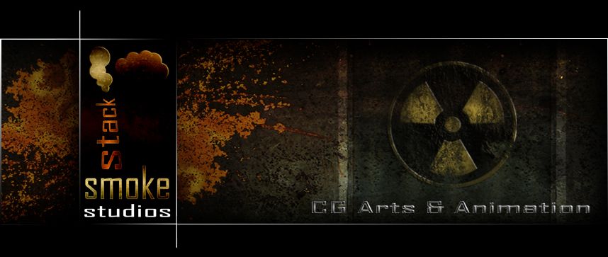
Having realised this design I decided to remove half for our banner I didn't like the logo being in the middle it felt like a side winder. Of course once i put it to the side I had no idea what could fill the right side. This bit was the only thing that felt a little out of place for me because I don't even think they were considering radioactivity back then so for me that's where the banner falls a little short. I might revisit this later down the road.
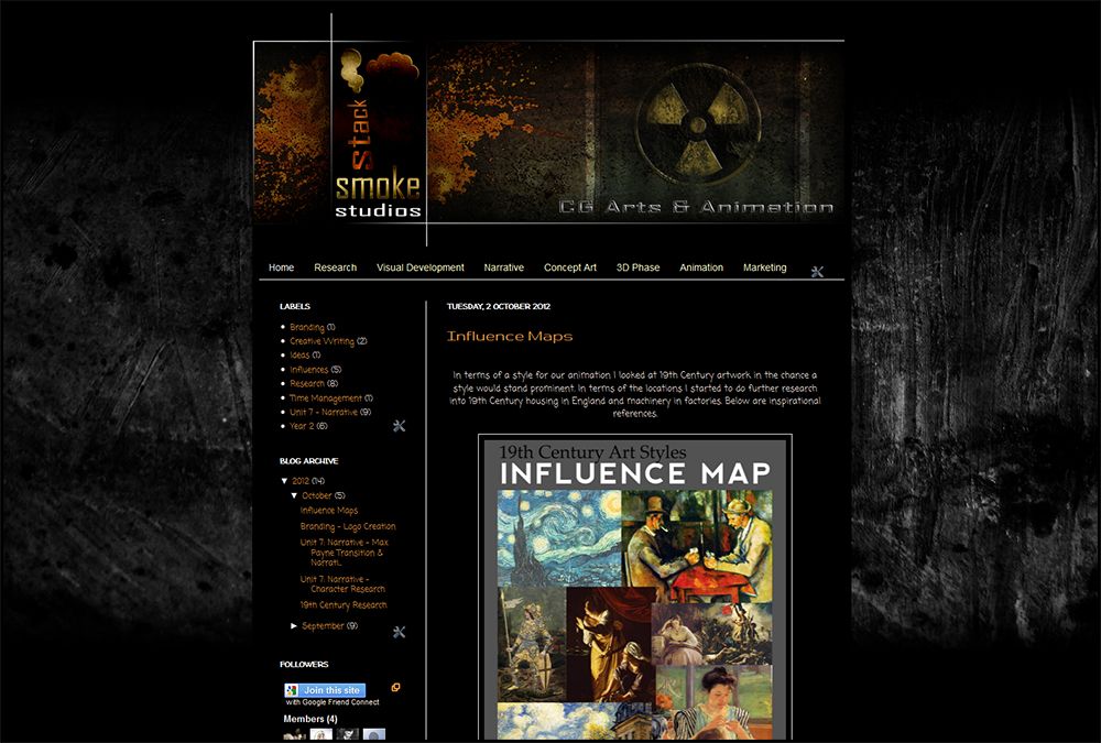
As you can see the design (above) just works on the page especially when you consider the rustic background which originally had colour but for me the main body of the blog stuck out more when it was behind a grey scheme. The blog colours work well with the design for the logo and no matter what I view it in the design works (including IPAD & IPHONE).
The last thing I created regarding the blog was a small uncomplicated version for documents such as scripts and research books. I figured you just want to see the logo there with no real complication. Originally I was going to keep the black background but I liked the text to work on its own in this instance (shown below).
Well that concludes this little post and I hope that the next few weeks go well for smoke stack studios. If you still don't know where are blog is and would like to visit we are at:
Take it easy people,
xXStItChXx

Great Logo :)
ReplyDelete