Firstly just like to say thanks for the comments, not used to people actually reading what I have to say so thanks for that. Most important of all thanks for your opinions and critiques they are invaluable.
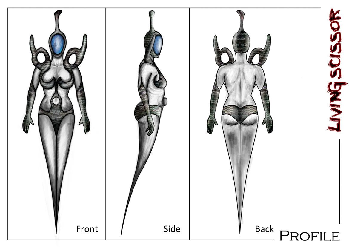
I have spent the last 2 solid days working on these profiles, I'm still not 100% happy with them (mainly due to some minor lighting issues and form - particularly with living scissor). Maybe I'm over fussy or I dunno, maybe I'm just tired and just want to shut my eyes.
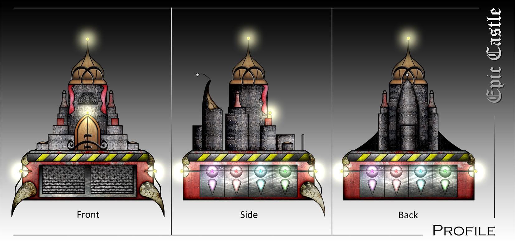
I reverted back to my original design for Epic Castle as I wanted to use some of the insp sheet items on the structure itself. This brief wanted me to think creatively (not draw a bog standard castle). Its got my rusty vibe with a bit of a futuristic slant, anyway enough chatter.

Well this is my living scissor profile if you view the detailing post below you can kinda gather that I took this entire design from the shape of the scissors and integrated a female figure. I couldnt get out of my head how some of the shapes on the insp sheets were femanine and some were masculine thats how I got this concept anyway.
My side profile is the part im probably most unhappy with, the form is out due to the arm but hey I've done worser side profiles.

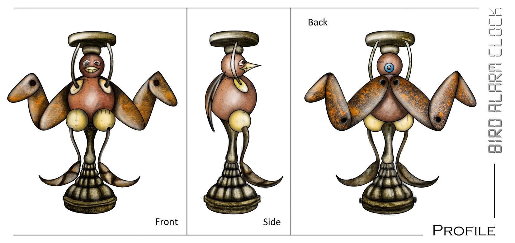
Next came the infamous bird alarm clock, this is probably the one I'm most happy with. I managed to spend more time on this concept so I think thats why it worked out best. I love the rust on the back of the wings thats probably my most favourite part because I got that just right, its certainly broadened my horizons.
If I was being picky Id say the curving of the head aparatus frame is a bit out of whack on the other perspectives and its missing the blue sticking out hole on the back of his head on the side profile. Other then that I just love it.

Last but not least came the "Epic Castle" this was the longest by a long shot. The amount of textures you wouldnt believe, lights galore (as it drains energy from the earth and stores it). The dark background was a necessity to showcase the lighting which I thought was a highlight. The lights surround the tower storing natural minerals.
My main problems with this concept were I didnt get to do a top level lighting pass on it (and thats because I'm physically exhausted and havnt showered in 3 days). Anyway, ideally I'd put more time in (ALOT MORE) but I guess I just underestimated things... it wont happen again, I hope.
Right, thats me done for now, I'm going to go and roll into a coma for a few hours. Thank you everyone for commenting its appreciated, I will do the same tomorrow at some point... too tired now...urgh
zzzzzzzzzzz...
Over & Out,
xXStItChXx

No comments:
Post a Comment