Well here goes another one, I spent today fixing up my little clockwork alarmclock (I have to say its come a long ways from the original flawed design (which I knocked up when I was half asleep).
I think its quite cool though, kinda kiddy (which isnt me) but I found a way of putting my own gritty stamp on it (my choice of paint & textures mwahahaha). Its a rusted kids toy now which makes it a kind of a post apocalyptic toy. Its pretty spesh, anyway enough chatter please read below.
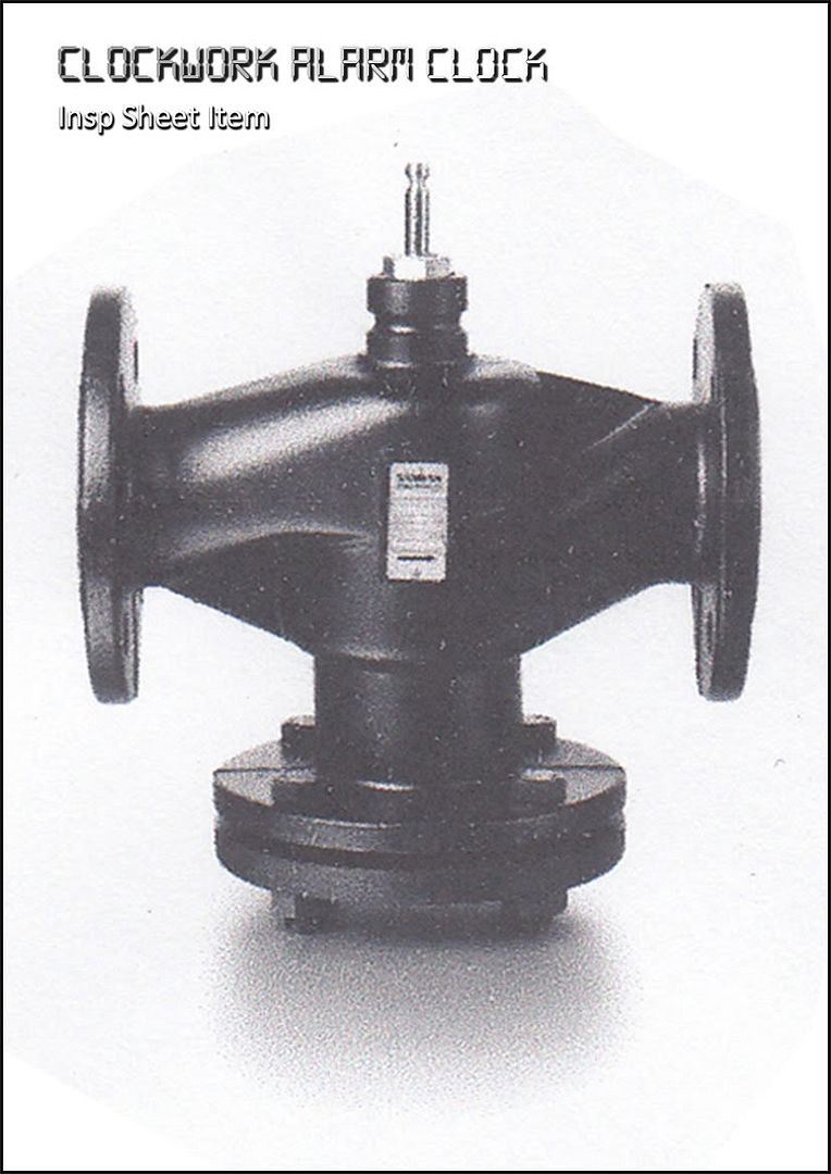
This was the item provided on insp sheet 1 that I have infamously been talking about. I have no idea what its called, probably something for some machinery (yawn). Anyway this is what I started with... this is how I broke the sucker down.
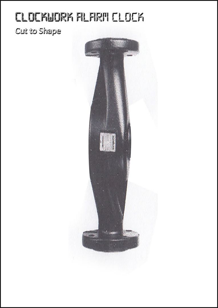
As you can see this is where I distorted the image, I wanted a big alarm bird, mainly so I wouldnt be limited for space. I removed a number of Unnecessary bits that were sticking out which I knew would inhibit the original design.
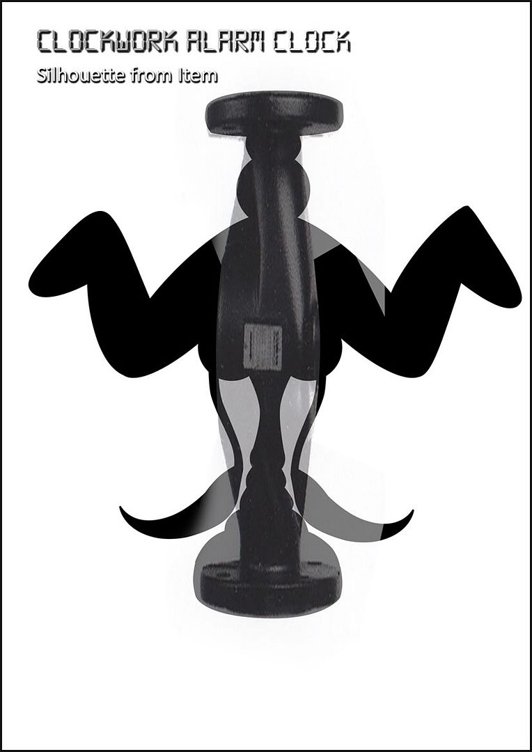
The next step was creating the Silhouette, I used the original drawing to create an accurate black border using the line tool. The shape was directly taken from the insp sheet item with a few additional sphere objects and cutouts for wings. The fact that the item was originally shaped like an hour glass just made it even easier.
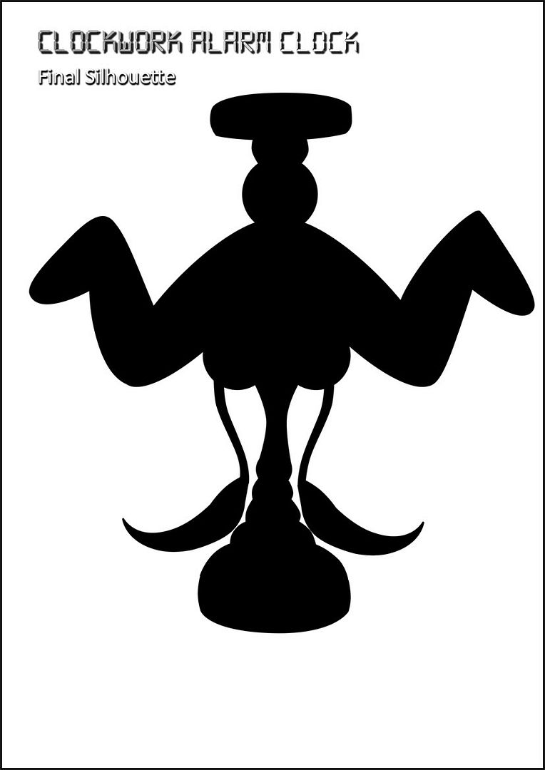
After I had the silouette the item itself was no longer required, I had what I needed the next step was to create the line art (which would be relatively easy due to the sphere shaped design). My saved paths also made this task even easier.
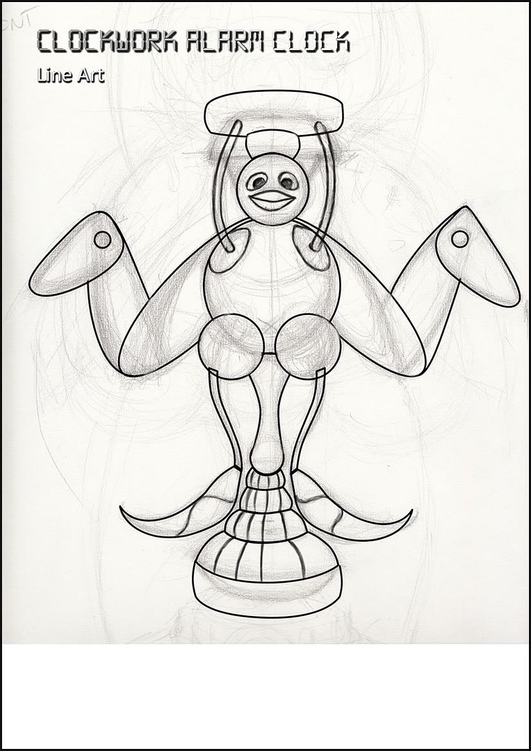
I decided to add a few little extras after the Silhouette process was complete, cannot remember why but they are there and I prefer them. The line art was smooth with a small minor bit of rubbing out, the initial sketch below helped me plot the final line locations.
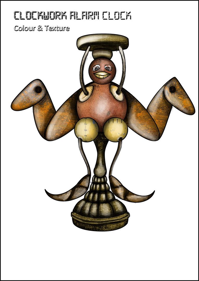
Next was my standard colour and texture pass which was a bit slow getting there but it really popped once some lighting and shading was added. The rusted effects were my stock metal textures which I bust out whenever I want to age something (which is quite often - gotta love rust).
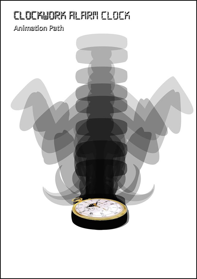 | 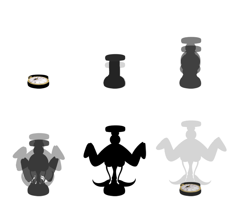 |
Well there goes that, so much for detailing and now its looking like I have to detail up all my turn around images, going to need some kind of a miracle for tomorrow.
Think I'm going to rest up for tonight.
Catcha later folks.
Over & Out,
xXStItChXx

Really nice methodology, 'Stitch' - charming design! I look forward to seeing in profile etc. so I can 'see' it in all its clockwork quirkiness (and it IS rather cute!).
ReplyDeleteQuite an innovative idea with the animation, very nice :)
ReplyDelete