Still a little nervous about posting artwork (still not confident) despite my best efforts, but I think I did okay today and yesturday. I'm probably gonna be in trouble tomorrow, been getting up late alot lately (workloads urgh).
Anyway onto the fun stuff. I decided to do a running completion of my orinal (naff) notebook sketch for the "Epic Castle" stucture concept. For every mile stone I saved a small snap shot, I didnt get to complete it fully but I think its acceptable, if not ill do more.
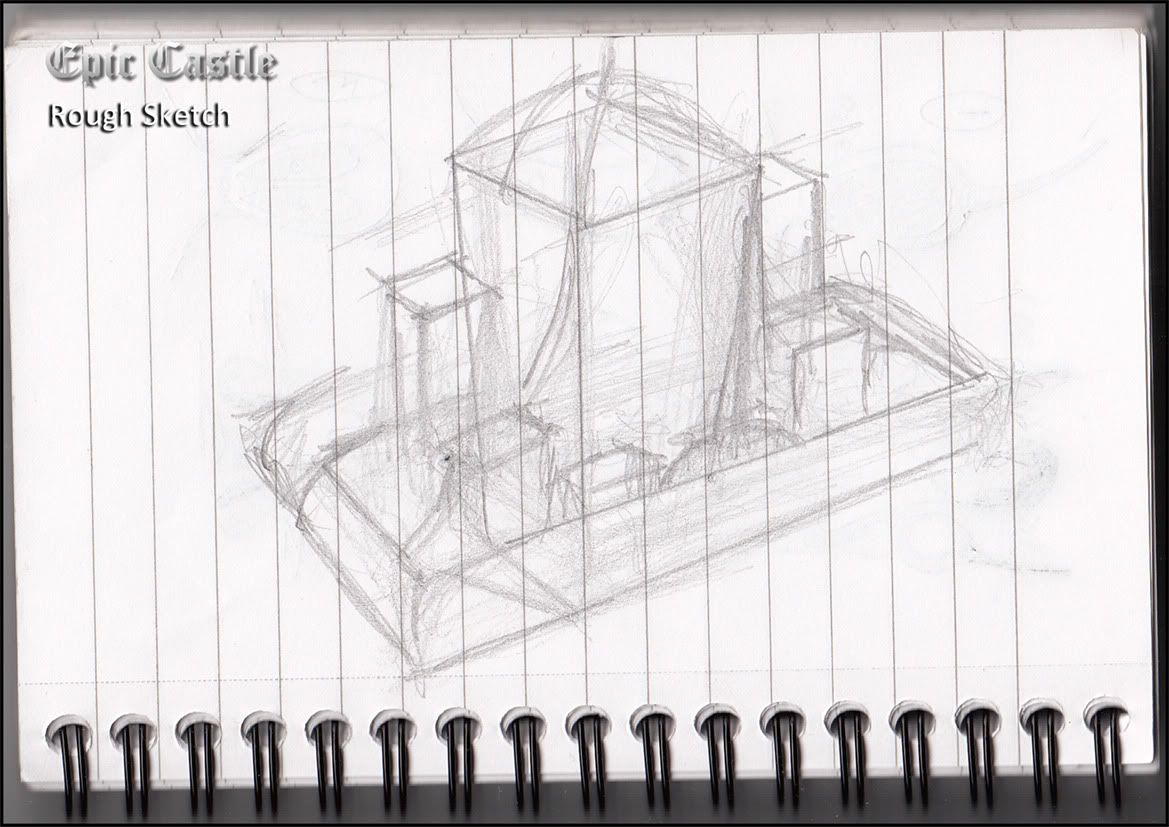
As you can see from the sketch faze, I just roughed it out. It was only inspired by the caterpillar shaped object on insp sheet 1 and that was only due to the perspective it provided. I chopped and changed a few pieces around to get the effect required.
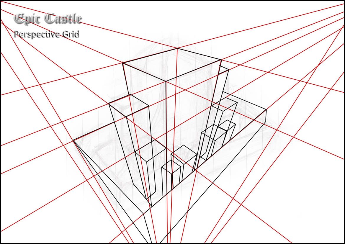
The next step came the perspective grid, the original sketch was (of course) incorrect perspectively. I took this chance to lable a shot from 3 perspective points (which i found kinda difficult). Plotting this design is what took the longest to accomplish.
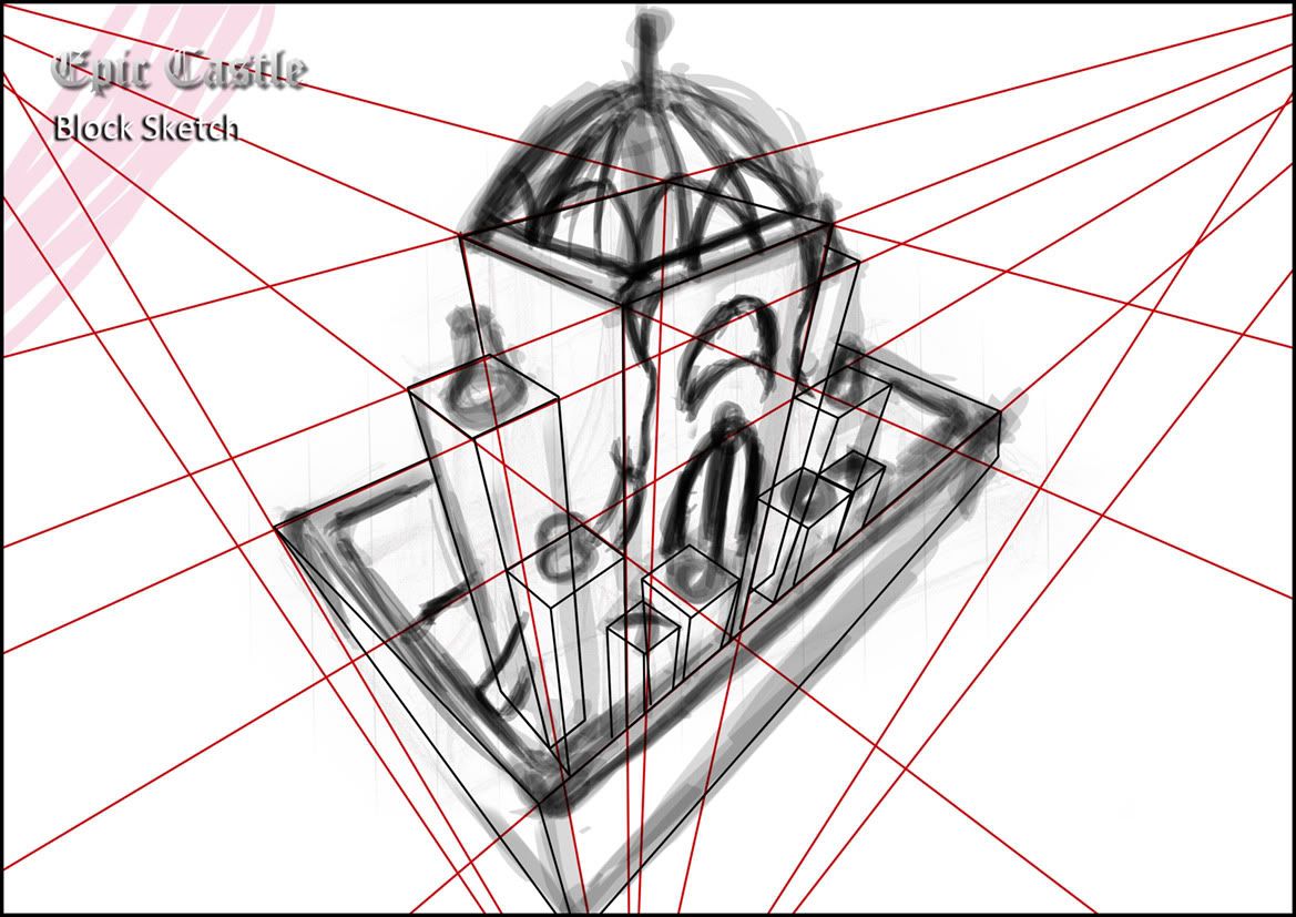
Next came what I call the "Not So Epic" block sketch, this was just to rough out the design so I had an idea of what I wanted. At this point anything was possible, I chose to incorporate steam funnles and a decorative steeple style roof.
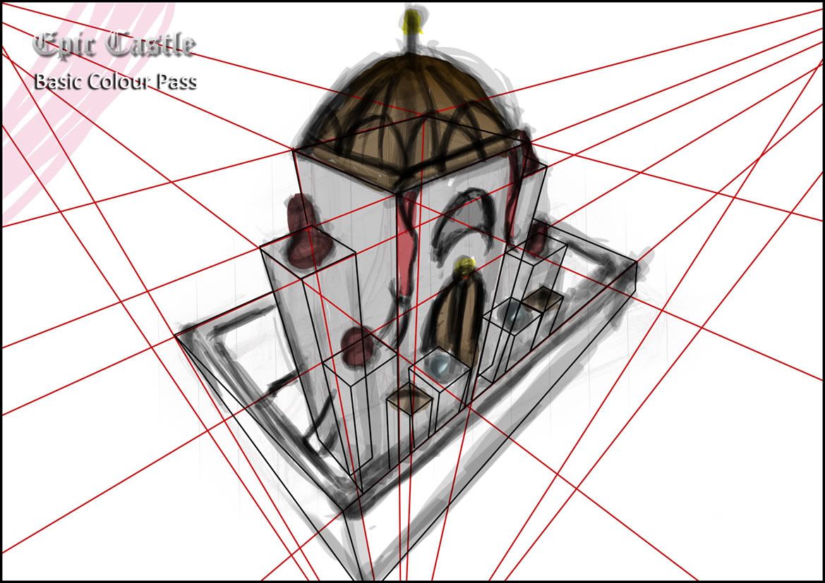
This stage was a bare basic colour pass so I could get a feel the colours. Barny the dinosaur isnt my style so I knew the castle would consist of natural greys and blacks, the drab cloth I thought royal, red being the ideal. The roofs and door would be wood (brown).
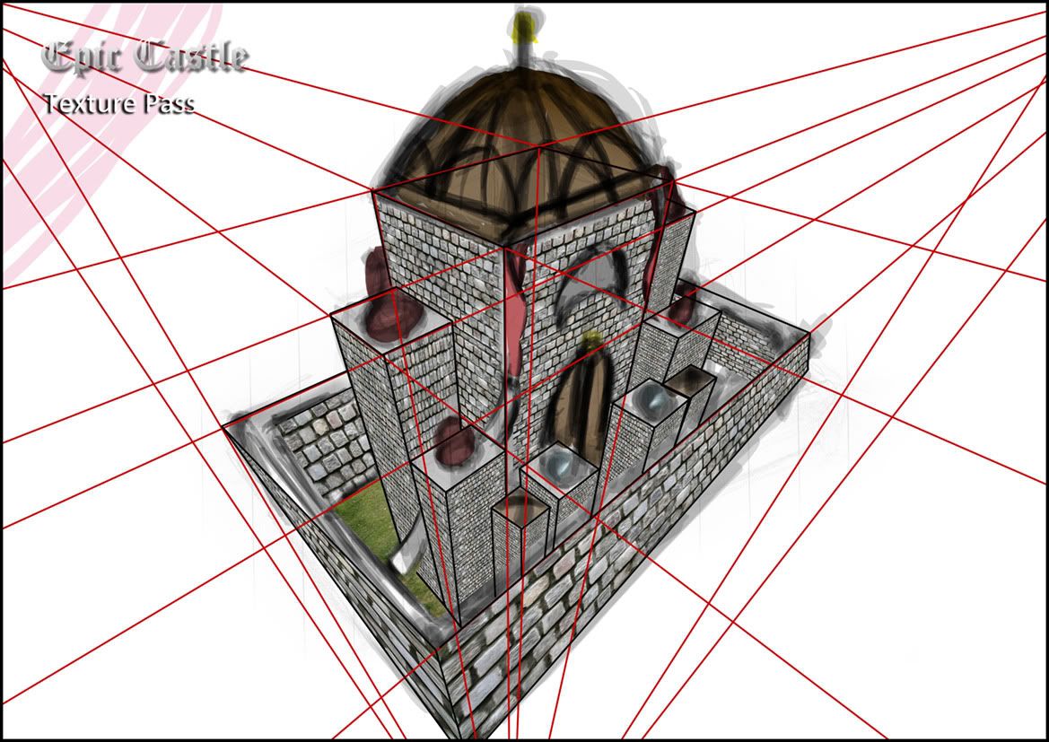
The texture pass was the most dull and became the most repetative. The blocks were looping too much for the smaller items which is why there is a sad looping array of some of the wall types (this is why the concept isnt complete). There is the odd perspective issue, but for me thats a learning curve.
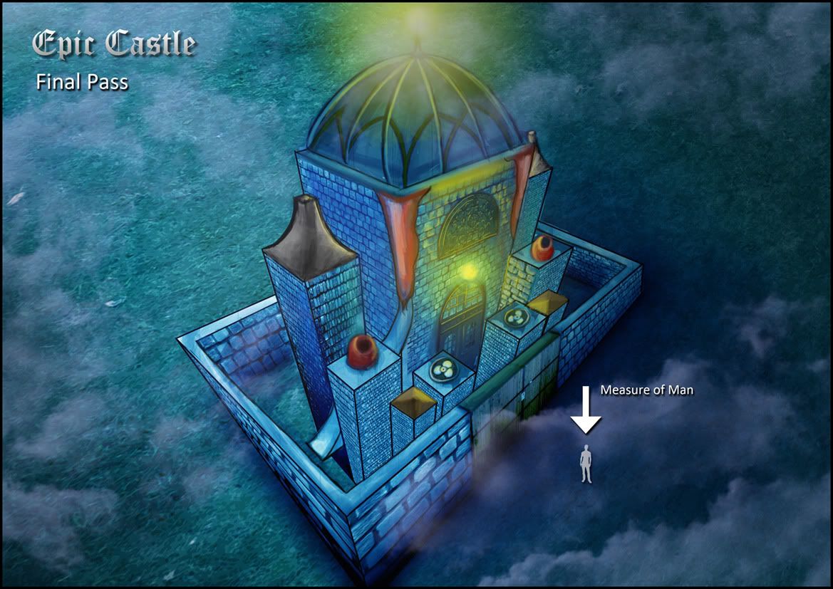
This is the final pass, I hand painted the additional details (with the odd block of colour still visible). I wanted a night scene, as stated in my previous post... I'm kinda into villanous stuff, and dingy settings it's me all over. I added in a "Measure Of Man" icon to give the scale.
I think I didnt do so bad with the end result, considering I dont really draw landscapes (ever). I know its out perspectively in certain points but I attribute that to this being my initial experience into detailed structural drawing.
Anyway, I'm exhausted, its nearly 5am.
Night, night people...
Over & Out,
xXStItChXx

Hi Stitch! I'm new to this malarkey as well, so I'll be meeting you for the first time on Monday (ohgodohgodohgod is it really that close?). I really really like this - you have a far greater mastery of perspective than I do! For a first shot at structural drawing it's fantastic. I will say that the final night-time effect seems a bit too saturated, but other than that I am dead impressed. Looking forward to seeing your final outcomes!
ReplyDeleteThanks for the comment Meg appreciate the critique (i hate it when people just say its fine without commenting on a single flaw lol). I agree with your statement, on my laptop screen its lighter but that just proves I cant trust the saturation levels on my laptop lol.
ReplyDeleteI wouldnt call it mastery lol just luck of the draw and perspective grids really.
Saw your blog recently too, very nice stuff I love your life form (kind of mammoth thing isnt it?). Very nice stuff. Yeap cringing in my boots for monday, not particularly good with new surroundings.
Hey ho,
TTYL!
Hiya! I will also be joining you on Monday. I am going to say its fine without commenting on a single flaw, cos it looks ok to me! I'm looking at it on a very tiny ee pc tho!
ReplyDeleteI'm not good at new places either but there don't seem to be very many of us (not on the blogger anyway). When I did the access course I couldn't even switch the computer on. At least you can clearly use photoshop!