Hello Everyone,
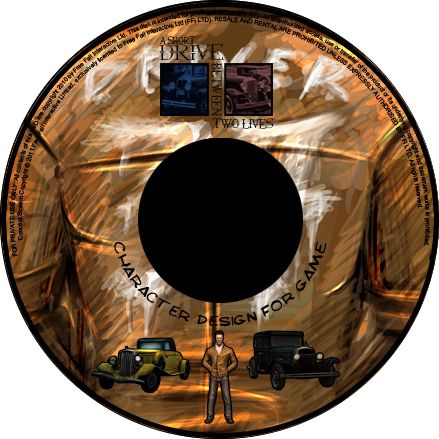
I just got finished with my Disc stuff so I thought I would put that up, this is probably my most favourite DVD design I have done this far. It just looks wicked I wouldn't change a thing. Well we are on the last 100m hurdle now really. I have decided to crack out the art of next just so I don't have to worry about it later. The demo reel among other things will be done either in the early hours tonight or tomorrow morning. I think I have already mentioned I didn't think I would be sleeping and this has more or less just confirmed that little theory.
I decided to make this case design all about the Driver as he is the man for this Unit. I had a bit of an internal conflict because I really wanted to use his Jacket, I managed to find a better way of using the Jacket. I decided to stick with a the dark/orange theme with some blue tinted highlights here and there. This disc art is all about being rough in places and "sketchy" in others. It is probably what this whole adaptation unit has been about for me and my Driver. I need some R&R over the summer I think I may spend the first week just catching up with Z's.
Anyway please enjoy the submission disc artwork!!
Well you know I said I found something to use the jacket on? Well here it is the submission disc is all about the Drivers Jacket. One of my favourite concepts on my disc really chuffed to see it personally. I'm not sure if you can appreciate the logo of the game on the disc as it has to be small to fit on the damn disc. You also have a little preview of all 3 of my game assets underneath the hole in the disc. Yes that's right they are all together for the first time on my disc! I had to put them together post Maya for this concept but don't worry I will do a group render.
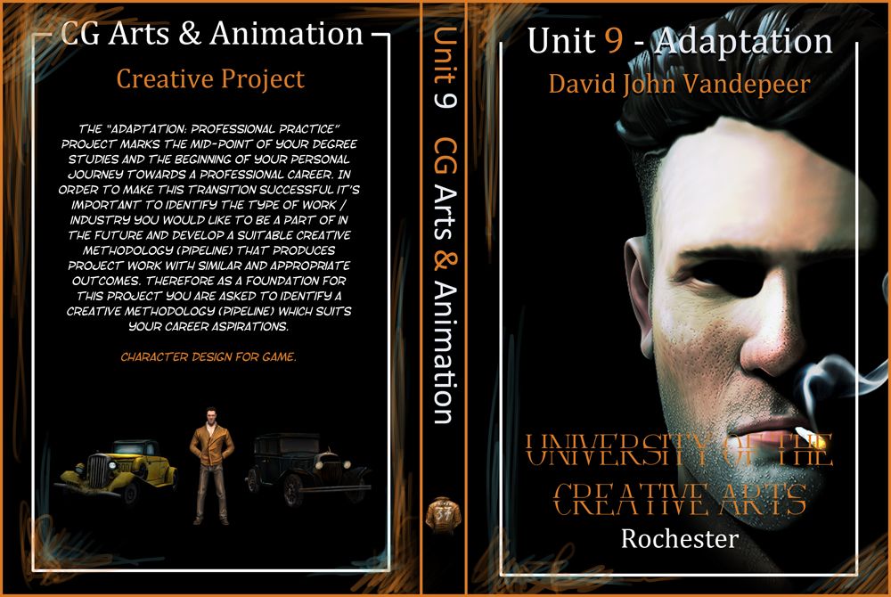
The case artwork is above... I know it is flipping sexy, I will be so happy if it prints out exactly like this. As you can see on the edges though I added a few little whiffs of colour just to get people feeling the textures of the Jacket and thus the models. The front image was a render which I did and accidentally stumbled into. Instead of post it up as another concept I thought it would be better to use it on something that needs doing. I think this is how I fell into the submission disc artwork earlier... Just playing around and before I know it I'm doing something else lol.
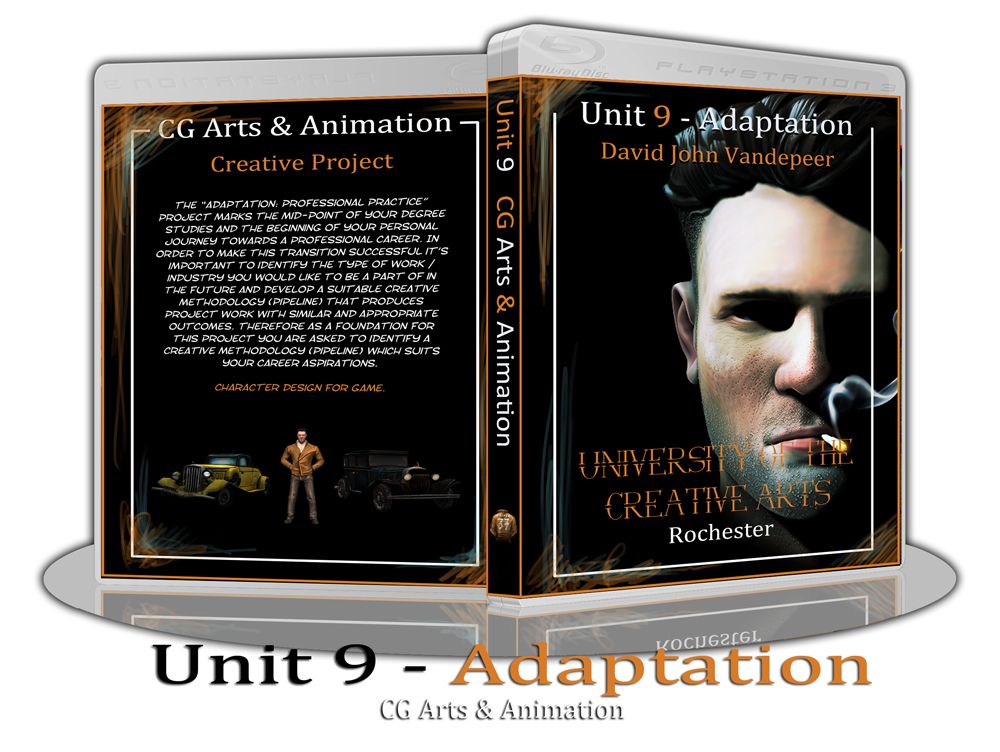
Last but not least comes the disc display stand. I couldn't help myself again. Each time I say to myself this display is a waste of time. Something else inside my head always talks me round to doing it for each unit... I told you I'm a fussy git. Now I cannot wait to see this disc artwork on my blog this is just the best one ever. For those of you that do not know about my fascination with sinister and dark stories I apologise for scaring you. This unit gave me the perfect excuse to get back into the darkness that drives me... Ha-ha... there's a joke!!!
Well hopefully the next thing you will see will be some turnarounds, I wont post the art of until the very last post which will be the red light post. I will do the art of before anything else though, I don't want to jinx my ability to get that done and dusted. I am so tired but still somehow my hands are moving so I must be okay. I may go next door to get a red bull in a bit, I really want to hit the next few hours hard. I hope all of you guys out there are having fun or if you are smart have already finished this project. I cant wait to be kicking back... I need me games!
Catcha Later!
xXStItChXx


is now a bad time to tell you that it's 'University *For* The Creative Arts'?
ReplyDelete