I am back with a my last bit of Driver development! Hip Hip Harrah! Nah I will miss working on this guy it has to be said... He has made the cars enjoyable to model because I am retroactively thinking of design choices that I know he would have. Now this post is another Weta concept which I have replaced my stage 3 drawings with. Basically it is a series of render passes that individually export layers of a scene (for example shadows, depth). They can all be edited individually, Weta is the practice of creating a concept from Renders that can be adjusted in Photoshop.
I did a Weta concept for my Night car which was a little bit of a flop due to its darkness. I told the masses there was no time for a reconsideration sadly. In this case I have kept things brighter and followed a couple of online tutorials for layering Z Render passes. I have formulated a couple of final versions just to see what the masses think (if anything). This post will illustrate the passes used and the end results achieved. I have also thrown a video in for good measure of the model prior to its journey into the Render land.
Okay lets get onto the fun part :)
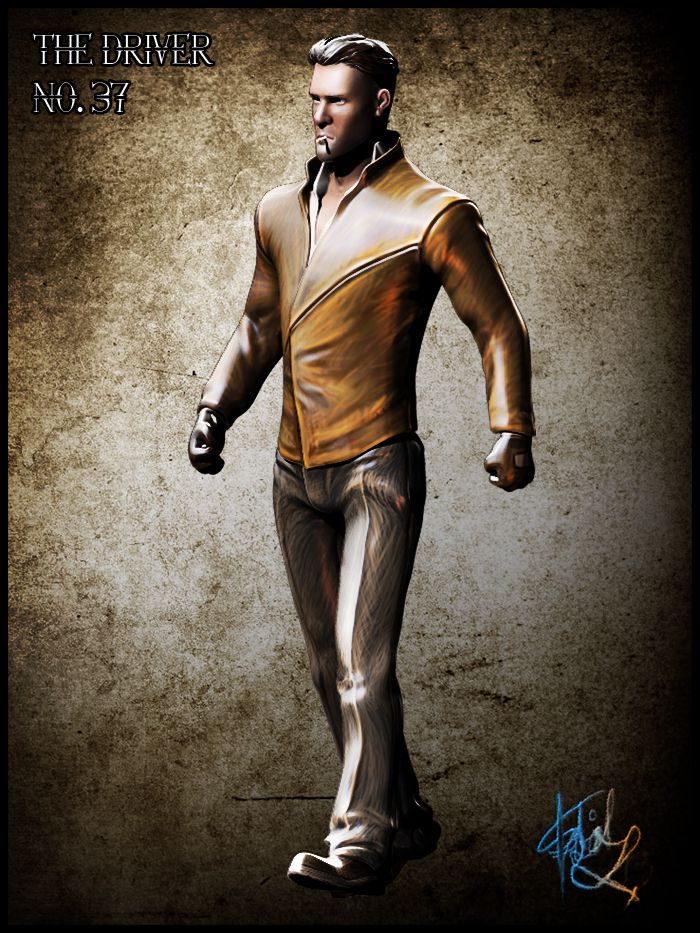
The image above is what I managed to achieve from following a couple of online guides. Basically you have to create a number of different light passes along with the standard render layers. The background is a paper texture I took from Google which I felt kind of went with how he looks. The pose was one of my many reject poses that I didn't want to throw on to the in scene Driver. As a concept however the pose has come up pretty nice. You would not believe the hell I went through in bending each one of his fingers... It took so goddamn long...
1. POSED & TEXTURED MODEL
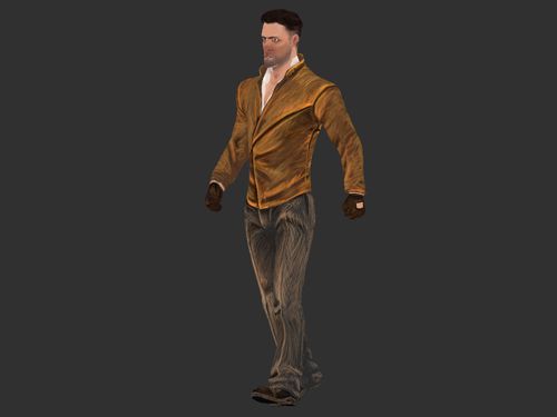
The video above shows the pose I made in ZBrush, I thought it would be best to show this now before you guys begin to unpick the journey the image at the top took. Now nothing is particularly wrong with the render passes from ZBrush which more or less add a decent amount of depth/shadow and occlusion. Still it is nice to have a play with the individual layers because you can do so much more then what a standard render engine does. You can tweak the colours and the intensity of the dark. It allows you to customise everything if you take the time to put it together...
 |
 |
 |
 |
 |
2. BASIC RENDER PASSES
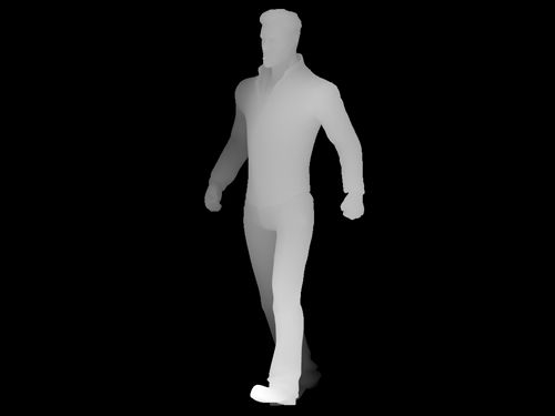
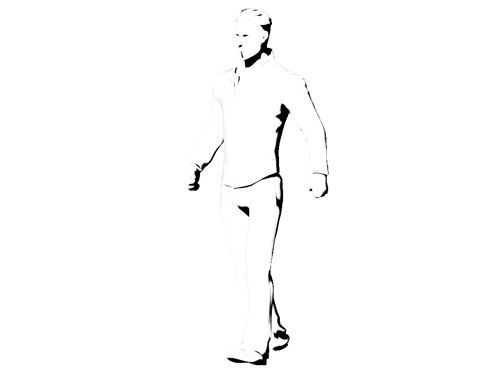
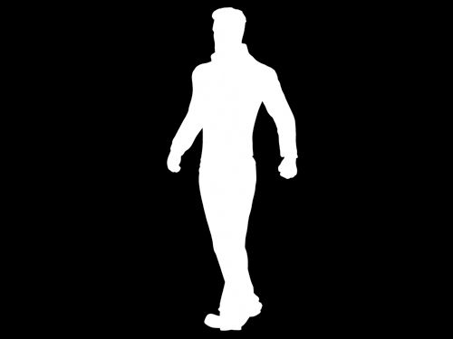
This Weta concept began with the a basic flat render directly from ZBrush giving me the colour values from my Driver. From doing a BPR render in ZBrush it creates the other passes with a standard render so you don't have to mess about making each one. Just click the ones you want and there they are. The ones it made were the Depth. Shadow, Occlusion and Mask. Now usually I have tonnes of masks and for good reason they allow you to isolate areas on the body... In this case due to time I kept the mask count to a minimum and rubbed out areas I didn't want on the layers.
3. DIFFUSE RENDER PASS
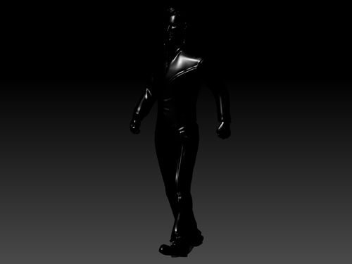
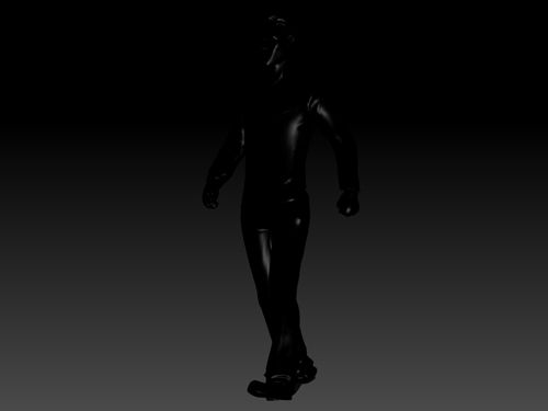
Next came the diffuse which essentially requires you to fill your mesh with white and a basic material (no reflectivity). Prior to this I was advised to setup 3 light sources for the concept. There is a key light which emits the front of the Driver. A rim which outlines his shoulders and an area behind him. Last but not least comes a Fill light which fills the character a little kind of like an ambient light. These are all in the render above though probably not overly noticeable I guarantee you they are noticeable in the final conceptual renders.
 |
 |
 |
4. LIGHTING RENDER PASSES
Next comes the Lighting Render passes. I mentioned these briefly above, basically they illuminate parts of the model. They can be as strong or as dark as you like. The key light is the far left as you can see it covers the chest area of my model. The fill is in the middle slightly dimmer then the other 2 to provide a go between. The rim is the far left illuminating the back side of the Driver. These are all done on a black model... why you ask? Because when you lay them over your other passes in Photoshop the Black goes transparent... Leaving you with a white shine...
 |
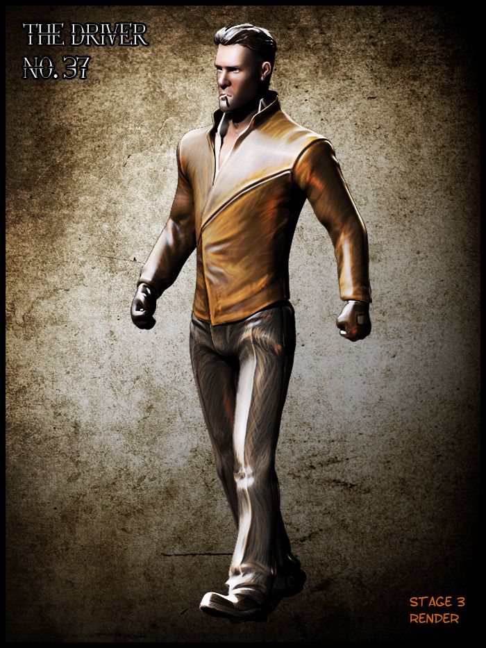 |
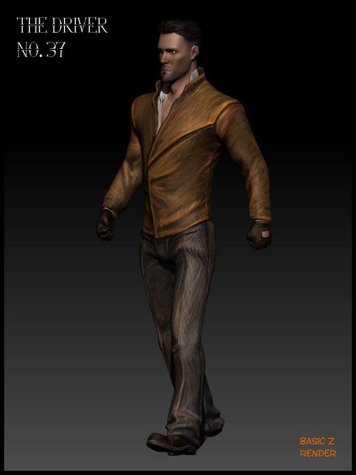
STNDARD Z RENDER VS. ZRENDER PASS RENDER
As you can see from the results above the render from ZBrush is still quite nice but the render layers really make something pop from the image. This is largely due to little tweaks you did not know made a difference to a render. I could have tweaked it a little more had I actually had more time on this stage. Alas there are other things that need my attention, still I am happy with the result I achieved on a pose I otherwise hated. In this context though I think it works, he looks like he's about to go and hit someone ha-ha.. I put the cigarette in too!! It is textured you just cant notice in the scheme of things...
 |
 |
ALTERNATE VERSIONS OF STAGE 3 DRIVER
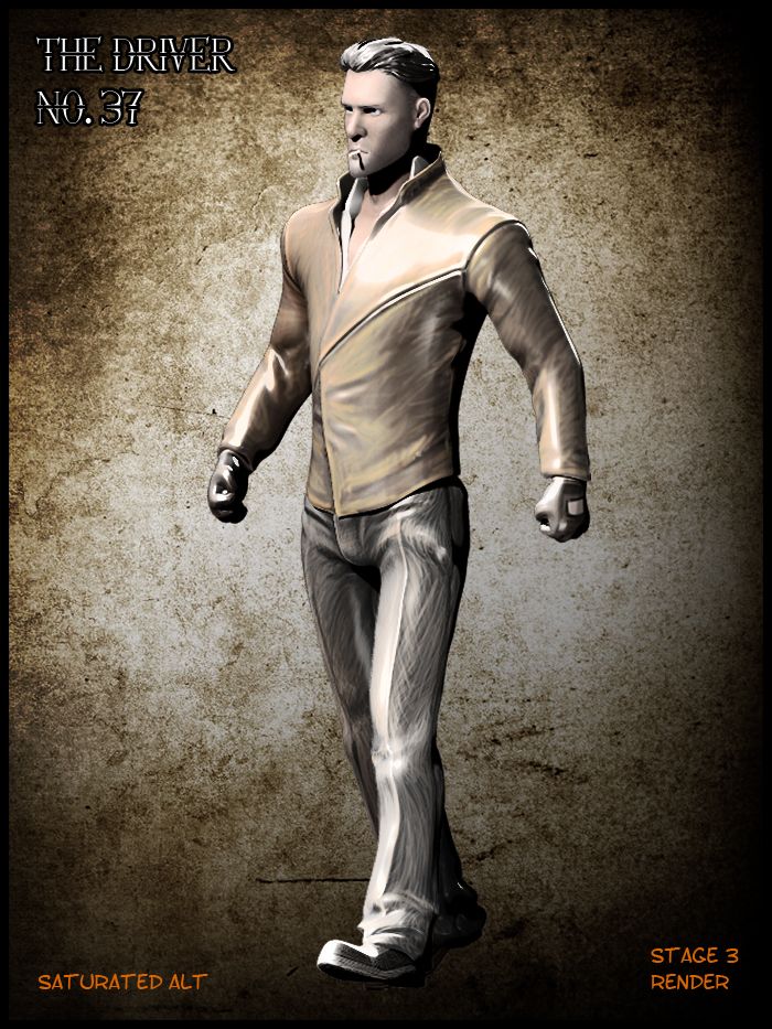
Last but not least I'm putting up 2 other versions of the Driver which I made just altering the settings slightly and adding an extra beauty on top. The saturated look blends with the texture more then the other image but it loses its sharpness. For the normal alternate I placed a beauty version of the Driver on top of the other layers and just knocked the opacity down. Again it does still pop but not as much as the shiny version. I am unsure here but never the less they are certainly not black nor do they lack depth so already I am one up on the night cars Stage 3 submission.
Well I think I will saver the taste of this last Driver post before the big Crit presentation. I still have to fit all of this work into a damn PDF document yet. Luckily I have the rest of today and tonight to get other things finalized. I'm just worried not sure if I will have time to craft any complicated environments, there just isn't enough time. I still have to get the Day car going which hopefully should be done today at the very latest. Still at least this post makes me one post closer to the end of this battle. Not that I won't miss seeing the Driver in his wicked Jacket :)
Anyway take it easy people!
xXStItChXx


I think this character is pretty damn cool-looking and pretty darn sexy too (I'm expressing that in as professional a way as possible!). He really looks the part, Stitch - well done :)
ReplyDelete