I've had alot of problems on this end, food poisoning last week put me back some and this week I dunno things have just been really slow. Doing my best but if it keeps going this way I may not be pitching, still gotta write up a few little bits on my script and get the storyboard going asap.
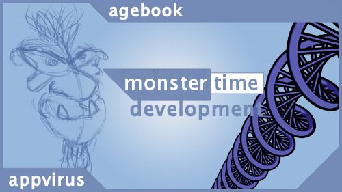
Been watching everyone elses stuff as it comes along though very nice stuff :) Suffice to say I feel I have let myself down a little here, however I will do my best to get my finger out before the crit at the very least. Anyway this little post is kind of a here and there idea but I thought id think about it, its basically considering my little virus/app as a monster - particularly known as monster time as time is what ages our telomeres and thus our DNA.
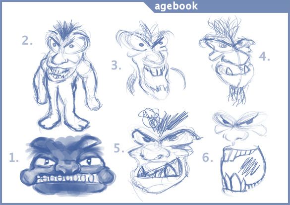
Far fetched maybe but I think its quite funny to think of it as a monster, initial thoughts to final are as follows:
My initial ideas (shown above) began kind of with an angry Garfield I used the app box sidewards to try to create a face and ironically it came out with number 1. Number 2 made me chuckle and I felt the need to expand it a little considering a few other expressions mainly thinking about the teeth. 5 is my favourite.
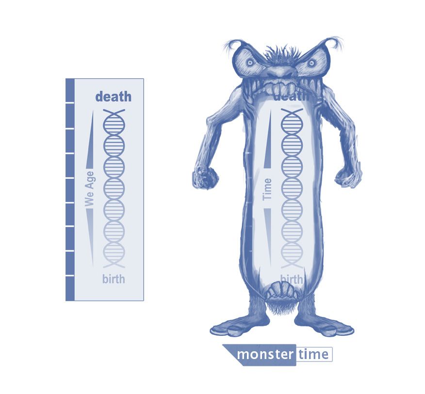
My final monster time design is above as you can see it is a conversion of the box so people can associate this box as something more then just a flat GUI design. I kept the tones simple I wanted to keep it face book themed also notice the lack of capital letters because face book never use them in their logos neither will I...Well this concludes my thoughts on the monster design, I didn't want to commit too much to this just in case it was thought better without it. I think he is quite funny and I love he has an expandable mouth perfect for eating telomeres.
Take it easy people!
Over & Out,
xXStItChXx


No comments:
Post a Comment