
I meant to post this up the other day and nearly did until I realised that time was slipping through my fingers, I literally looked at the clock and realised I had about 2 hours to get a presentation together so this kind of got pushed to the side while I prioritised that. Never the less the design aspect was not overlooked in fact I kind of liked the result using the whole classic map vibe to create not only my design doc but all of the case side of it too. I had planned to print them all out and present it as a kind of treasure map but again time constraints so I had to get this going never the less it still looks pretty cool and I did my best so I am pleased to be able to say that.
I kept the design very simple I even created the custom paper here using the grid layout to construct it 2x its original size in my book that makes the entire layout mine haha. The only problem is when I shrank the "X waves" logo image it kind of disappeared into the CD design, a bit annoying but the characters on the bottom created a nice counter balance. Anyway I hope people are having a good time out there I will be with you all very shortly!!
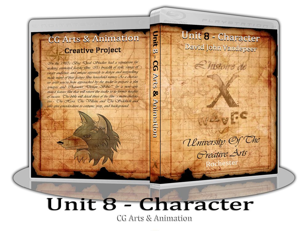
Lets get down to the case design!
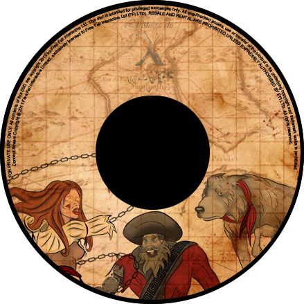
As I said above the CD design is cool I'm just a little gutted that the logo disappeared I probably could have corrected it by strengthening the drop shadow but then I feared it would no longer be right for the design as faded lettering is key for an ancient treasure map. I was kind of fighting logic against fantasy again so its hard to say. Still when I placed the characters in things seemed to be popping a lot better and despite it being redundant the text on the edge really makes it feel like an authentic disc (a personal touch of mine).
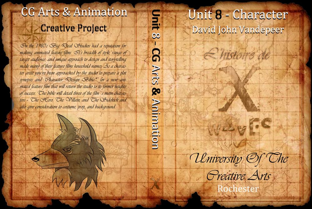
I love the case Design - I used the Vivaldi font to create a classic hand written style lay out - very me I love my books and hand-written fonts. I don't know if many of you noticed but my design style tries to communicate the theme of the period or situation in documentation or paper. I want to tie as much as I can into the world I am trying to create, it makes it more real for me on a personal level. I don't like making an outfit and slapping it on anything, it needs to mean something to me and if its fiction I have to be involved in that world for it to exist, If I can't go there myself then I don't see the point of it existing. Fantasy has to become reality for me for every idea...
I have enjoyed this unit even though it has been a bit more of a chase then a catch up. I am glad its behind me but now I have to be up to speed with adaptation and I will be getting on that ASAP throughout most of today anyway. I hope that everyone is having a good time with their respective tasks, I have been checking peoples blogs out, I am loving the progress, making me feel even more guilty for being behind lol...
Anyway I'll catcha ladle!!!
Over & Out,
xXStItChXx
No comments:
Post a Comment