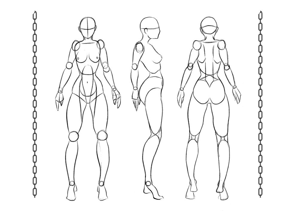
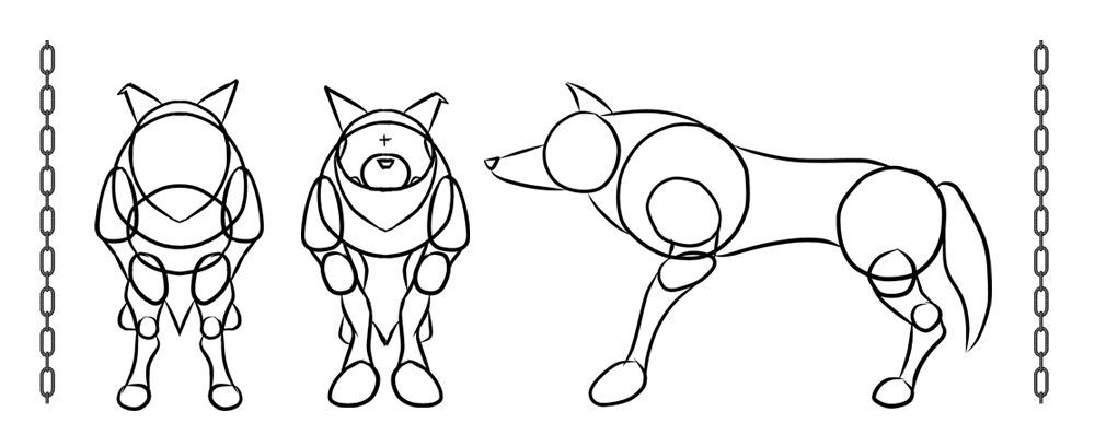
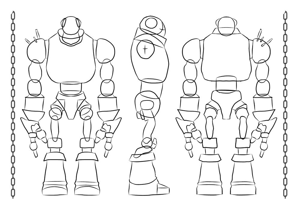
I have dug out my original turn around drawings I had a moment of fear earlier when I couldn't find them luckily they were buried in a PSD under another drawing that I had made *wipes sweat from brow*. Anyway I used these basic designs to flesh out the later levels of my designs as we all know is the early stage in the character building process. I was able to appreciate it more once things had seriously started drifting beyond the sketching phase when Ink made me realise the correct route to structuralising my characters bodies.
I found "Peter" (my Villain) probably to be one of the hardest designs, he is completely rigid so there were not many flow curves I could express with line. Still I think they all turned out okay and as I keep saying it could be worse... I guess. I used these designs to begin fleshing out character costumes and perform a number of costume tests (still to come). The finalised turnarounds require a small amount of cleaning up but they are there for the most part. As I said the wolf doesn't really have a big costume consideration so the hair phase was vital there...
HERO
The proportions of "10 Waves" hero "Clare" were based on comic book proportions (as I'm sure I mentioned in a previous post which was illuminated by a progression sketch). I took the designs I knocked up and threw ink over the top of them and of course I had to consider the back as I hadn't sketch that one to that point. I'm quite pleased with this turnaround, me famously stating again that I think I have improved drawing wise, it just takes a confident me to achieve it... I hope I can find him more very soon lol.
SIDEKICK
The proportions of my K9 sidekick Banner were more difficult to isolate, I have absolutely no experience in drawing animals so I apologise to the professionals out there. In the end I just found myself trying to refer to references of wolves and trying to somewhat mimic their proportions, I then went away and adjusted them slightly to make the design my own, the lower body was smaller and the legs were a complete shot in the dark but it made sense to me. I even cut the shape of the face into the primitive circle so I could see if it worked and I think it did.
VILLAIN
Last but not least came the very sinister villain "Peter Creek" design, this wasn't easy but was defiantly quicker then the wolf. The boots were of course my favourite bit to design they just looked so clunky. The proportion even makes more sense to me then it did, specifically the hands they needed to be giant so I could really convey how much damage this monster could do. The waste was kept small to empower his upper body and make him look like a walking tank (another little result I am totally satisfied with :)Well that concludes this little post, I have a few others on the way I just have to get tidying a few more things to locate them all. I'm pretty sure I have most of my hair designs on the IPAD so I will be hooking that up in a minute to have another scour. Looking at all of this work now it really makes me see how far I actually took this project, while I was doing it there didn't feel like there was so much but now that I am rooting through it I can safely say that there is a LOAD.
Anyway I know all of you guys are working away on the adaptation Unit and hopefully I will be joining you all very soon with some much needed updates of my own.
Catcha Later!!
xXStItChXx


I'm not sure if you mentioned in a previous post, but your female base sketch seems to have been heavily referenced by the talented Warren Louw.
ReplyDeleteSee here :
http://3.bp.blogspot.com/_wlBMY9EjbNU/TTAGb2dBIcI/AAAAAAAAALc/7zhtj-hYoes/s1600/TIP-3---UNDERSTANDING-WHAT-YOUR-DEALING-WITH.jpg
There's nothing wrong with this, just make sure you credit the appropriate sources to save problems down the line.
Hey John,
ReplyDeleteI did credit the comic style used to Mister Louw in this post: http://stitchshift.blogspot.co.uk/2013/01/unit-8-character-10-waves-final-roughs.html when I knocked up the original designs. I didn't mention him constantly but I did make reference.
Either way its nice to know I'm not the only one who appreciates his designs :)
Fair play then mate, carry on :D
ReplyDeleteI didn't go too far down to see so my mistake.
I love Warren Louw, his style is wonderful. Definitely a good idea to draw from his work in order to figure out his style.
Here was my attempt at trying to adopt a bit of his style into my work : http://2.bp.blogspot.com/-KgqqmxlnXm4/UEhnlSXh_eI/AAAAAAAADCE/J9TnN2rajfo/s1600/48.jpg
Excellent :) Ahhh water under the bridge mate, I did draw it but he was a big reference really loved his turnarounds.
ReplyDeleteJesus that image is awesome! I'm not as good with colour as I'd like to be... Still trying to find my way around this creative lark lol.
Hah!
ReplyDeleteYou should check out the artist ' Bruce Timm ' - I only mention it because I just bought one of his art books, he's extremely good at comic book characters.
Oooh I'm gonna have to have a look at that I love comic book characters too. Always been keen to do one myself (I had a comic assignment in College - really got me into the idea).
ReplyDeleteI'll have a look at that artist, thanks for the shout Jon!! :)