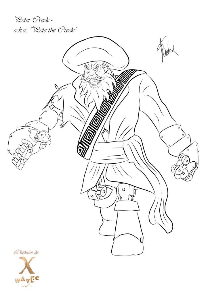
I have been slaving away and finally have completed the final poses for this Unit. I didn't want to rush which is why they took so long. Usually if I rush I create utter garbage which these poses were up until yesterday. Anyway I am counting down to my final few posts now, lets hope I have time to get the last few up. I am providing 2 passes of each concept just to cover all of my bases, I think the line art is cooler then the coloured versions (I dunno call me crazy). It's just I've never been good at line art so its a breath of fresh air to have a few that I am proud of. The poses I have done feel dynamic to me and are not so "stiff" or "rigid" I really like the fluid movement of the pose I got on Clare, even Banner doesn't feel flat and oh my god if I could relate to you the nightmare of drawing Pete's hand in perspective... complete nightmare...
There have been a few uphill battles as there are in all of the units I have done till this point, I am usually up on D-Day finishing little bits and pieces but when the chips are down you have to be willing to make sacrifices for the best work possible. I will be posting up my red light crit post after the submission disc artwork (which is standard for me). I still have a few hours to get a few little bits together for the current brief (adaptation). I'm just glad to be almost up to date, still I only have myself to blame here, now is the time to return to the zone and get the best work possible complete for any and all tasks the university set me!!
Please enjoy the final poses, I just hope they look good I have been working hard on them...
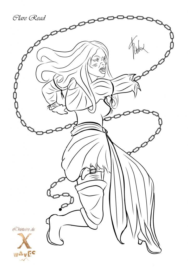
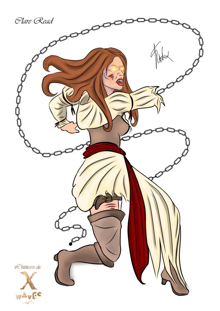
HERO
Well as you can see I have gone to town with Clare, I have put a couple of hints of metal on her but the main focus is the eyes and chain. I toyed with the idea of making both arms chains but this felt more correct to me. It shows the conflicting sides of her and I think that's pretty cool. The clothes are pirate, I have books from the library to thank for the costume design as I said, I have never been big on clothing so I am proper glad that this worked out in the end. I also think that Clare and Peter Creek contrast well, as Joey wrote down below you have different colours for different moods. Clare has the red sash which could be confused for villainous but also cream which is comforting... I like this contrast kind of sets me on edge a little...
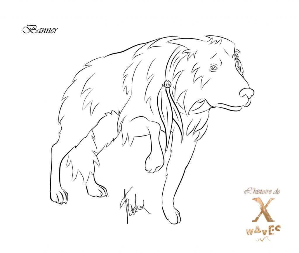
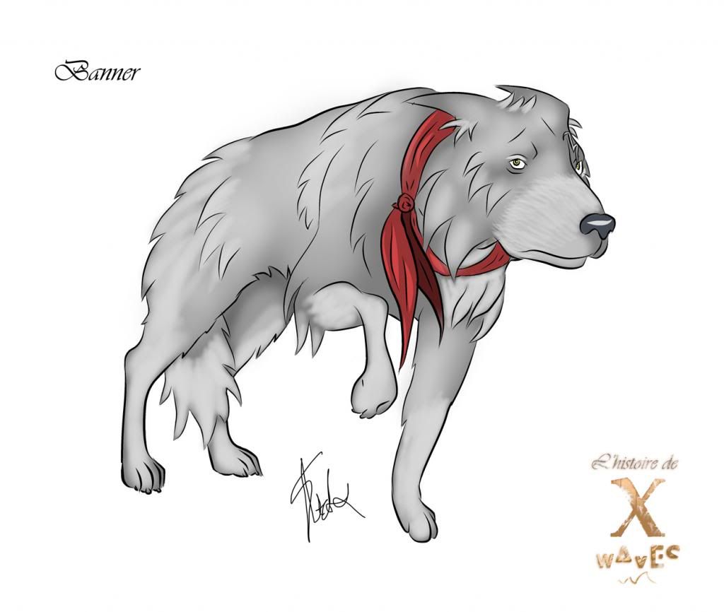
SIDEKICK
Like usual Banner is second, I found him once again rather difficult but I wanted to give the sense that he is afraid, afraid of what his masters have/may become. I found fear difficult to communicate but from research I found that dogs cower when threatened and of course the classic tail between the legs, that had slipped my mind until I dug it out from Google. I have mentioned previously that I am no master of drawing animals but I think this pose catches the emotion I am trying to convey. I am not 100% happy with the face, I kind of wanted something a little more sad. I kind of ran with one of the expression sheet images I drew previous and took it into a pose... perspective may be a little out I think the tail should be a little father back maybe...
VILLAIN
Last but not least the infamous Peter Creek, my true Robot/Pirate, I will take this initial point to apologise about the pattern on the belt I was rushed so I didn't have time to align it properly, the hands and feet took the longest. I also ran a small temperature zone pass on the stretched face not that you can see it very well past the glowing green eyes. I could have done a little more work on the lips but it got to a point where I just wanted to get it done and begin cracking on with other things. I am rather proud of myself for having to be able to get these done at this level. Problem with me is I usually dread the brainstorming process, I love doing the job once its decided and I just have to create the body of work... I think I live for that little moment... Alas we must do it all to be truly creative!
I only have a few more posts to put up now that this concept has been created, I don't think I will have time to post the little bonus that I was going to but I will get that up at a later time once I have played with it more. I will take this moment to tell you that it is awesome and its the future of character design for concept artists! If you are intrigued you should be because its totally awesome I will post about it in the near future when I am not catching up on a backlog...
Anyway I think that's me done for this post, I hope this process has been appreciated even though it is late and I'm sure Justin is doing his thing by now, but as I said its my bad I just have to keep my mind in the game from now on and try not to stop to think for too long...
Catcha Later People!
xXStItChXx

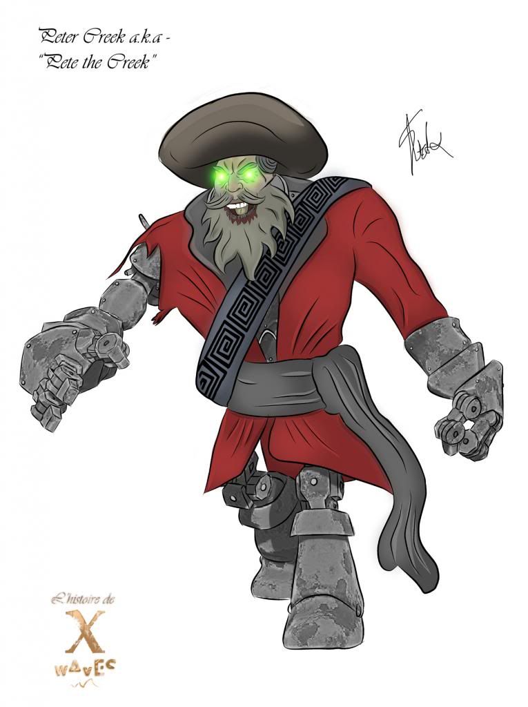
Hey, nice work, although the hero looks like a villain with glowing eyes
ReplyDelete